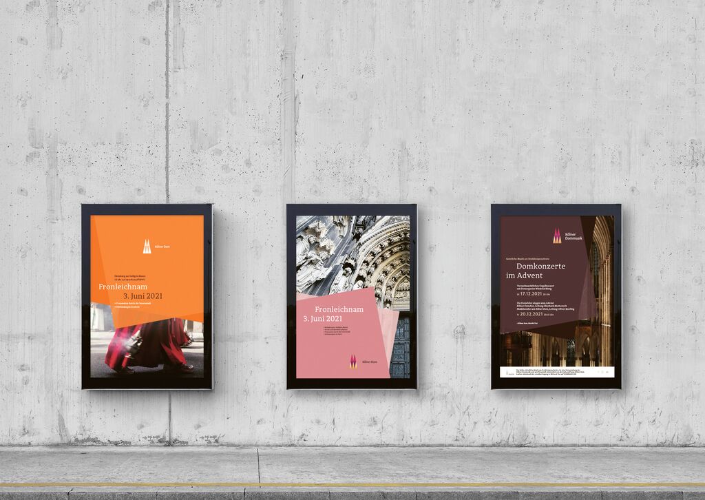
Rebranding

Metro Taipei 

Back Download

On occasion of its 25th anniversary, Metro Taipei sought to communicate a corporate image that goes beyond transportation services, as the company evolves into a service brand operating in various fields. The simplification of the original logo has freed up space and created a broader field visually. Much attention was paid to adjusting the colours and typeface. In response to the need for more diversified digital presentations, Metro Taipei has employed a dynamic identity which enhances the public experience of corporate graphics in the stations.

Red Dot

Others interested too