Beautifully packed: beauty products from Asia
Glowing and flawless skin is the embodiment of beauty and youth. Women across the globe strive to accomplish their personal aesthetic goal. Therefore, they rely on always new ingredients, beauty rituals and trends. At the moment, beauty products from Asia are on the rise. These do not only convince with their “inner values”, but also enthuse with an aesthetic and elaborate outer appearance. Red Dot takes a look at the booming cosmetics markets in South Korea and Japan, and introduces four outstanding and award-winning examples for the packaging design of beauty products.
Well-balanced
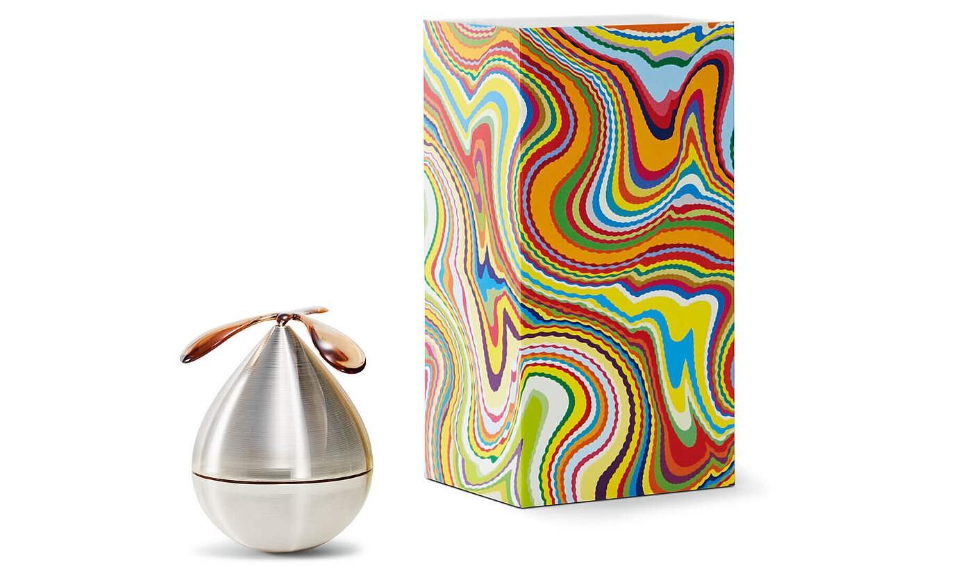
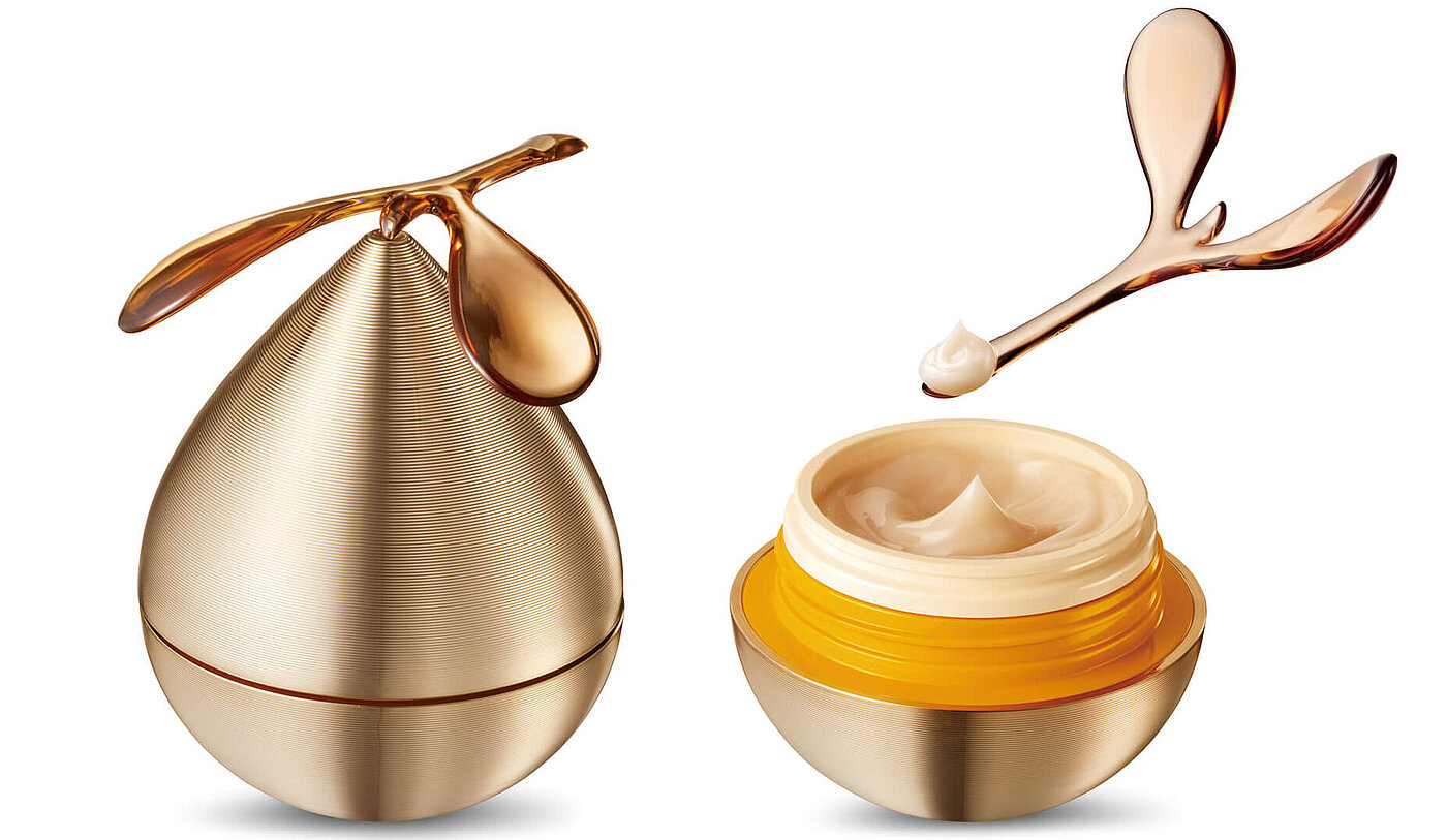
With the help of the right cosmetic treatment, Asian women in particular ensure that they look way younger than they are. Aging-care creams like the Japanese „POLA V RESONATIC CREAM” can contribute to achieving this. It enthuses users with a Red Dot award-winning cosmetic packaging which consists of a jar that returns to an upright position and a spatula that is balancing on its top. The special construction of the packaging aims to surprise and delight the user with revolving motions that convey the image of resonance. The overall design has been meticulously calculated to yield the ideal movement and centre of gravity. The jar is complemented by an outer box which features a colourful marble pattern. It hints at the emergence of something new and symbolises a melange of diverse personalities.
Statement for inner beauty
Likewise from Japan is the beauty brand “THE BOOK”. Its eponymous packaging design was awarded with the Red Dot: Best of the Best in 2018. The brand approaches beauty from both an external and an internal side to also factor in the mental aspects. That is why it wants to inspire women to search for their own unique beauty independent of someone else’s standards. The packaging of the cosmetic series is reminiscent of a book what is further emphasised by a kind of slipcase which makes the user feel as if each droplet of the product encapsulates important words. Each is given a name that could become someone’s life hint, such as “inspire”, “release” or “discover”. When placed together in the box, the pieces form the letter “B”. The vital significance of inner beauty is further underlined by the refined cream colour and delicate writing in gold.
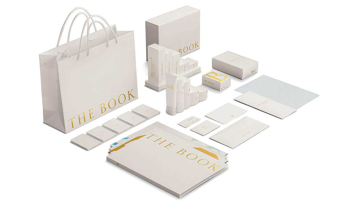
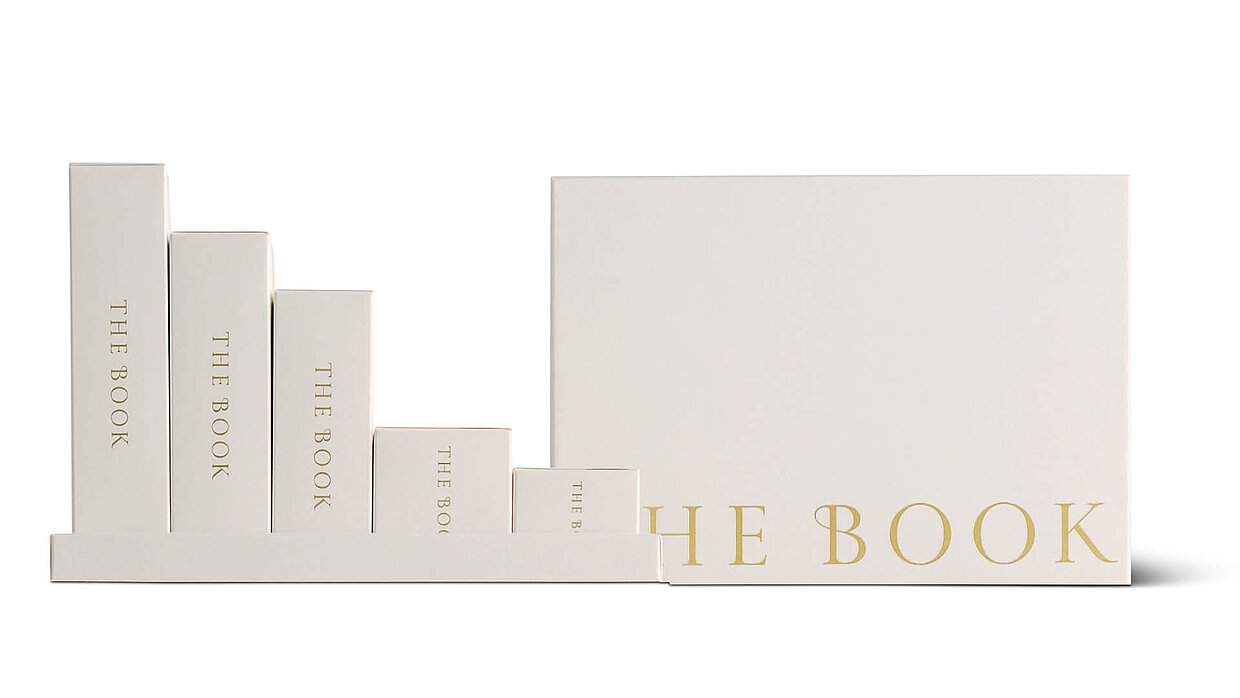
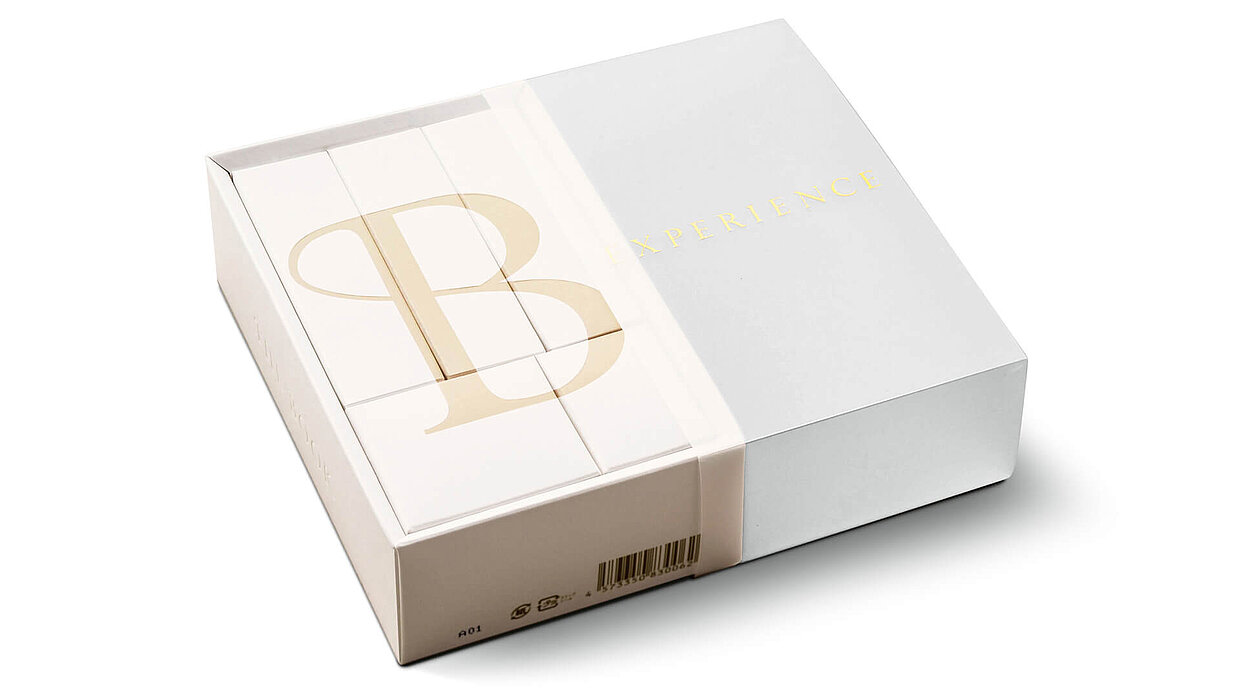
canaria designed this packaging for ACCORDER and enthused the Red Dot Jury: “Striking in the simplicity of its design, fantastic in its idea, and highly aesthetic in its execution – these are immediately eye-catching features of the packaging design for the cosmetics series THE BOOK. The idea that clues to beauty can be found in oneself just like in a good book, consistently merges with the clear design, exclusive colour choice and haptic quality to form a wonderfully harmonious whole.”
Special kind of paint pot
With more colour comes the cosmetics packaging “SAEM Paint”. The design for the cosmetic paint series visualises the high quality of pigmentation and the fixation perfectly. The boxes look like paint pots, thus conveying to customers the feel of painting their lips and eyes with a wink. The packaging deviates from familiar concepts, yet allowing for simple application as usual. The container’s top part has been designed to make the contents seem visible. In addition, the tops feature numbers, allowing one to easily note the colour of the lip and eye paint.

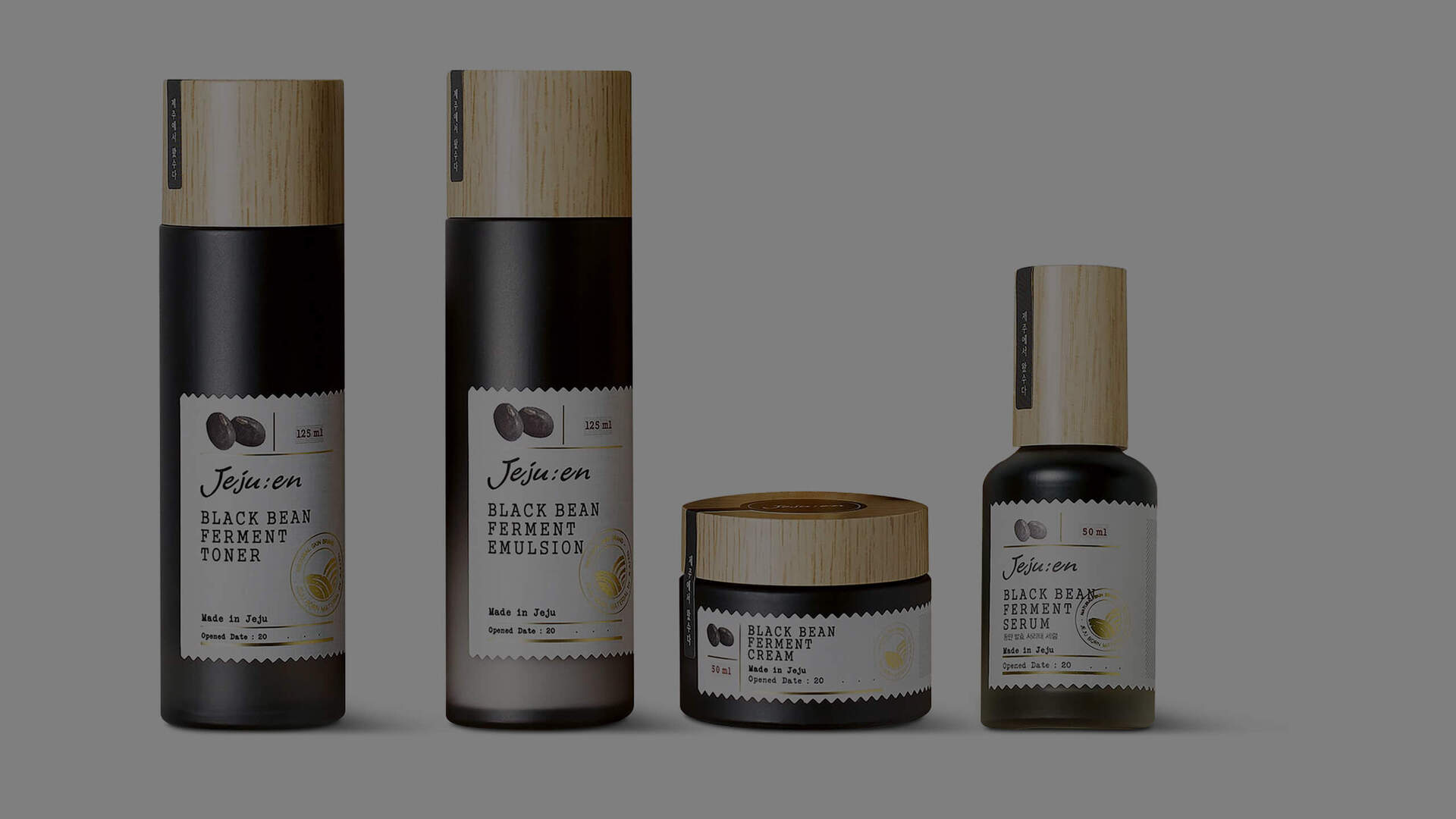
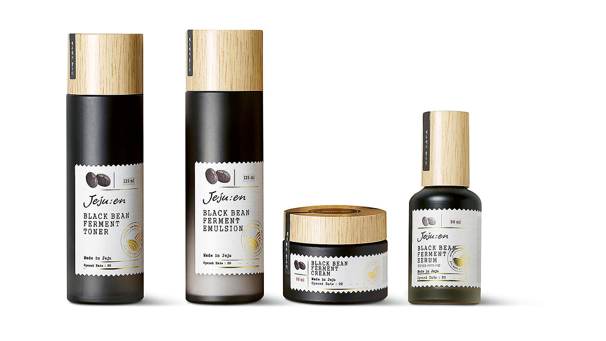
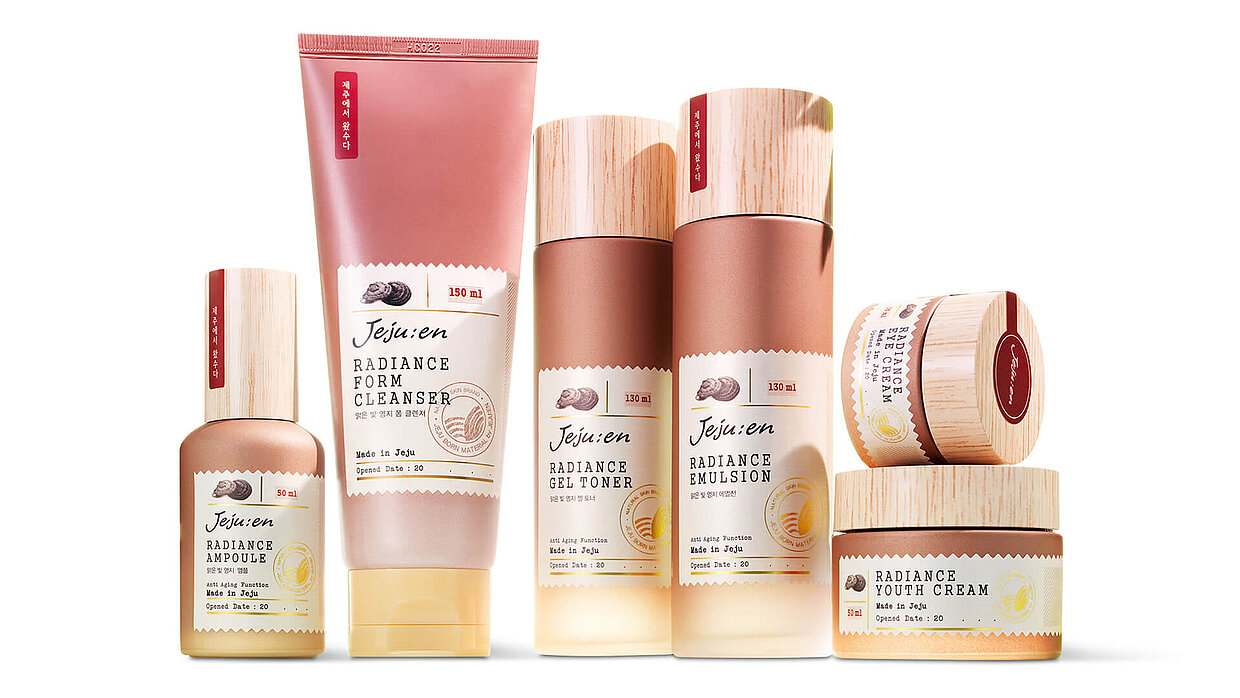
Jeju’s natural power
AMI Cosmetic from South Korea won the Red Dot for the packaging design of two lines of skincare products, “Jejujen Radiance Line” and “Black Bean Ferment Line”. They reflect the valuable ingredients and blend the product information into the overall aesthetic appeal with the help of a stamp-shaped label. In order to emphasise the characteristics of each line of the brand and to visually highlight their identity, the container features the colour of the respective main ingredient. Furthermore, the slogan “Came from Jeju”, which is written on the top vertically from the cap, indicates that the products originate from Jeju Island, a volcanic island in South Korea which has become a beauty oasis due to its wealth of skincare ingredients.
Participate with packaging design in the Red Dot Award
At the moment, the Red Dot Award: Brands & Communication Design 2019 is in search of well-designed packaging. Beauty products, food or technology – companies and brands from various industries as well as designers are invited to submit their elaborate packaging in the international competition until 28 June. Besides “Packaging Design”, 16 further categories are available for participating in the section of “Communication Design”. Furthermore, brands can apply for the distinction “Red Dot: Brand of the Year” in 36 industries, using their well-designed brand communication.