Packaging design: more than a beautiful shell
The art of packing does not only play a role in the private sector, for example with regard to presents, but also in economy. Being an individual design discipline, the design of packaging carries great weight: frequently, they add essentially to a product’s success. In the Red Dot Award, creative minds regularly prove that packaging is more than a beautiful shell and enthuse the Red Dot Jury with their smart design approaches.
Packaging design: discipline with potential for the future

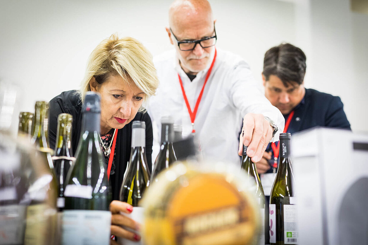
“Regarding all of the competitions we organise, packaging design is far and away the largest category,” explains Professor Dr. Peter Zec, founder and CEO of the Red Dot Award. “And this field will keep growing in the future. That means that we notice how important design is, especially at the point of sale, where the products need to speak for themselves, and how important it is, at this point, to lead the product to success with the help of excellent design work.”
Packaging and product success
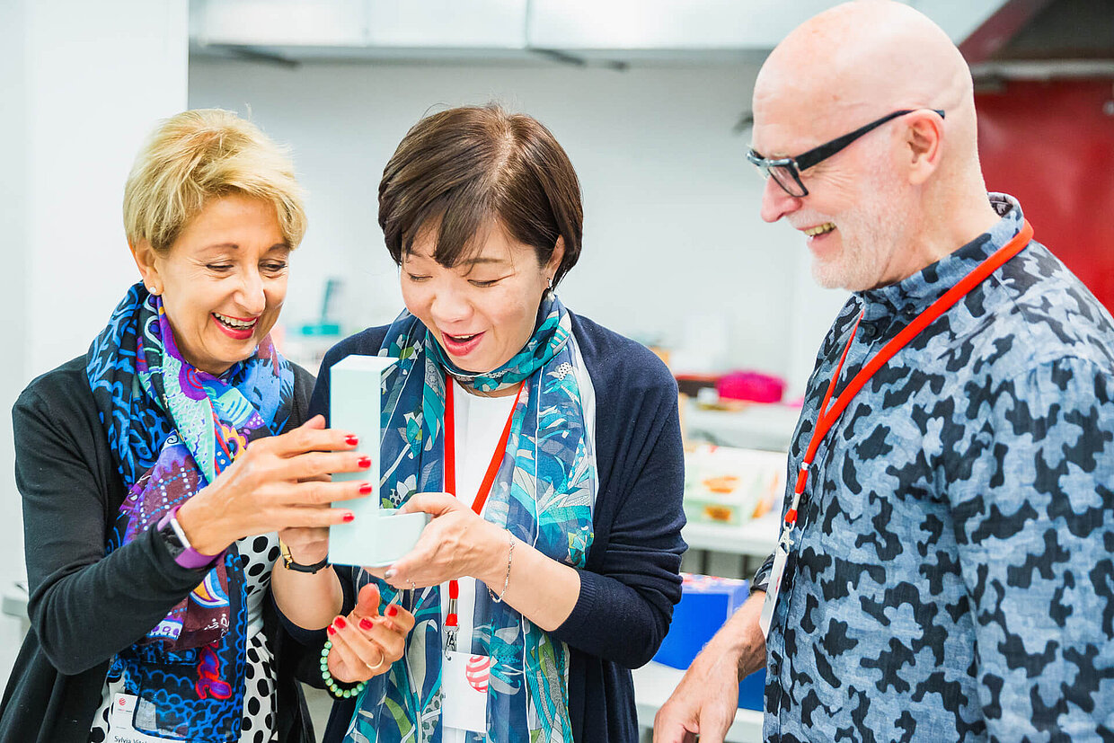
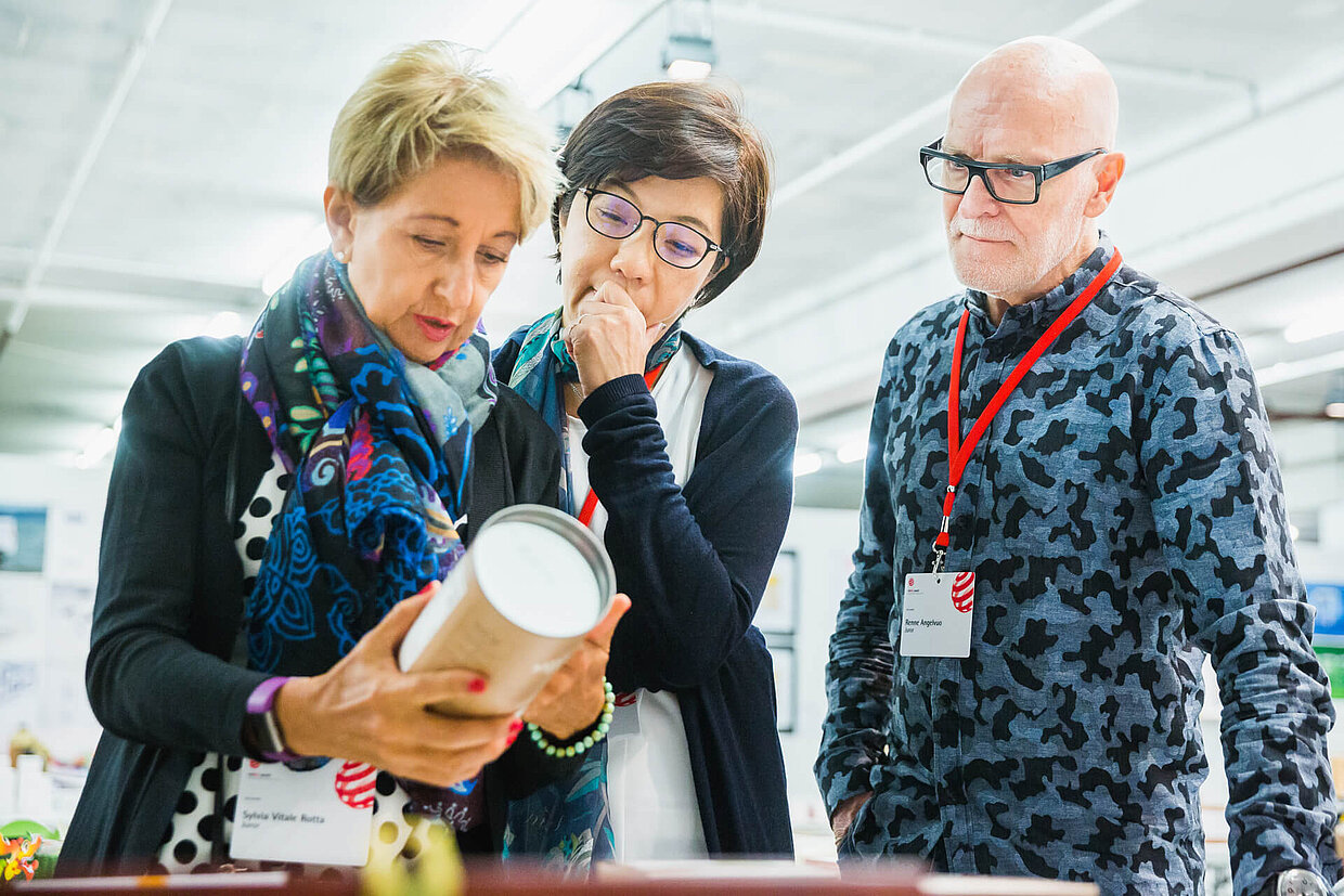
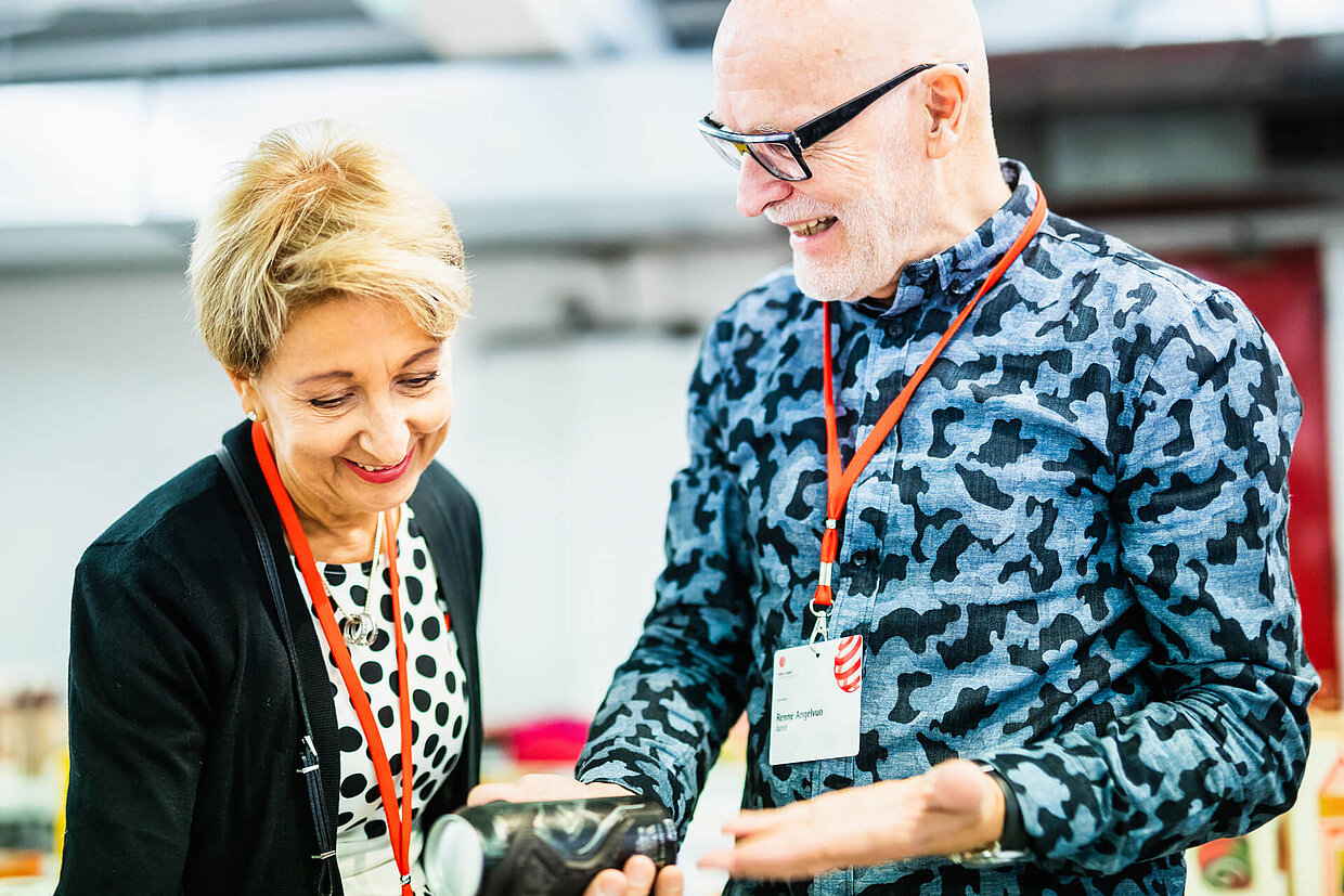
Red Dot judge Sylvia Vitale Rotta, president and CEO of Team Créatif Group, knows why packaging design is so important for a product’s success: “Packaging is one of the only medias that you actually ask consumers to buy. Because in fact, he or she buys the packaging with obviously the product inside. Packaging is also the passport to your brand and to your product. Without the packaging, the product has got no name and of course the packaging carries the distinctive assets: the logo type, the colours, the key messages and also explains what is inside.”

Her jury colleague Uwe Melichar, Packaging Partner at Factor and President of the European Packaging Design Association, explains the changed perception of packing: “I think, in the perception of consumers, packaging is much more important. If you look at all these unboxing videos, for example, you find millions of them on the Internet.”
Not only consumers, who publish videos of unboxing products on the Internet, place value on packaging. Likewise, manufacturers have realised its potential. “Also on the firms’ and companies’ side, packaging is having a higher value, it is like their business card on the shelf and they really recognise that with sustainable ideas or with presenting the product in a different way, they really can get ahead of their competition,” explains Uwe Melichar further.

Convincingly packed food
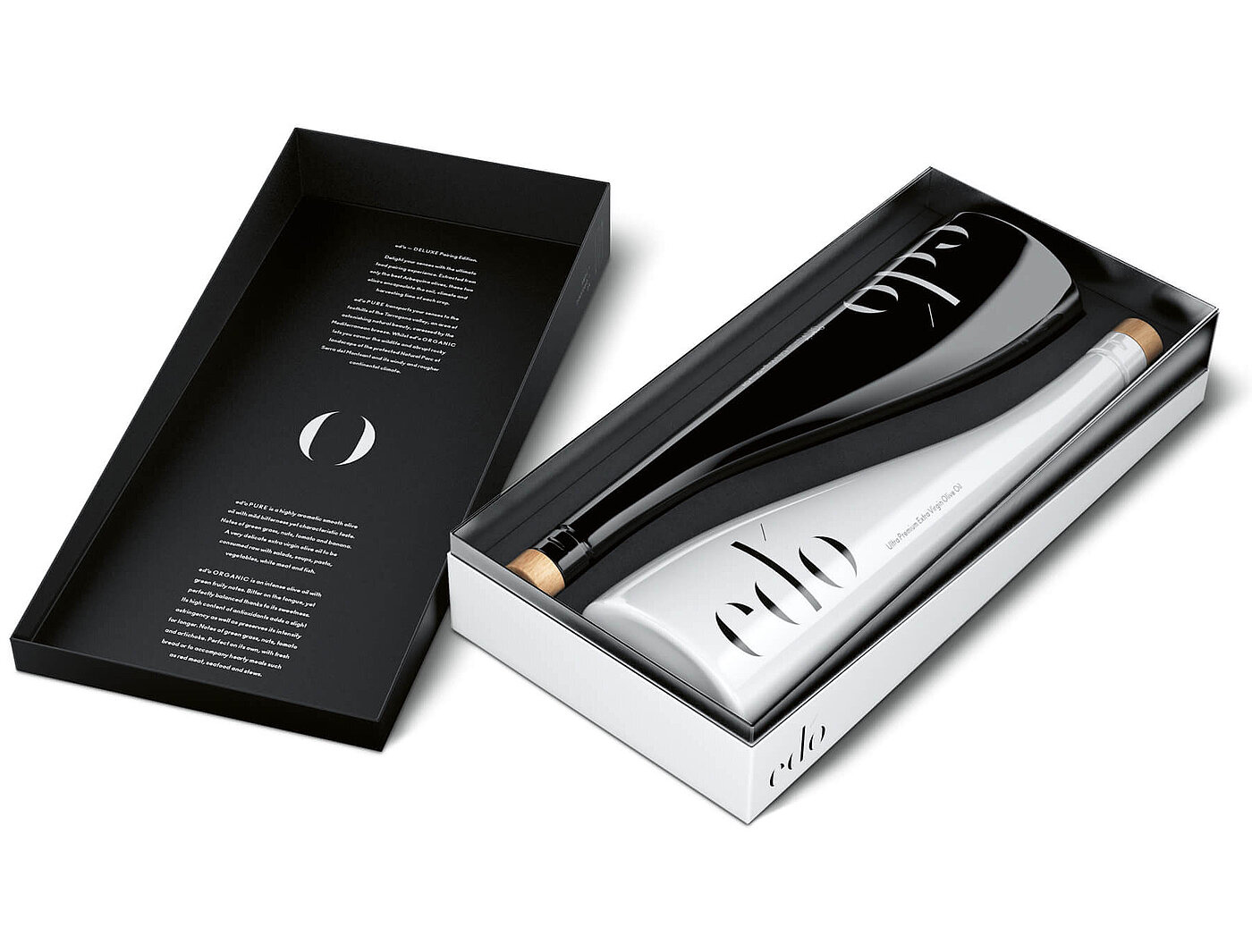
In the Red Dot Award 2018, numerous packagings convinced the competition’s jury, but only one of them secured itself the Red Dot: Grand Prix. The top distinction for outstanding design, which goes to the best piece of work in the “Communication Design” section, was won by Taller Design from Goteborg and Mediactiu from Barcelona with the packaging design “ed’o Olive Oil – DELUXE Pairing Edition” for Spanish gourmet food trader Selective Export. The high-quality olive oil of this limited edition was filled in two glass bottles, which preserve the nutritional properties and rest well in the hand. Their wave-shaped silhouette is reminiscent of the Mediterranean Sea, where the olives ripe. The white bottle contains “ed’o PURE”, a fresher olive oil, the black bottle is filled with “ed’o ORGANIC” which has a stronger character. Positioned together, they look like a yin-yang arrangement. The logotype of the name underlines the elegance and quality of the products further.
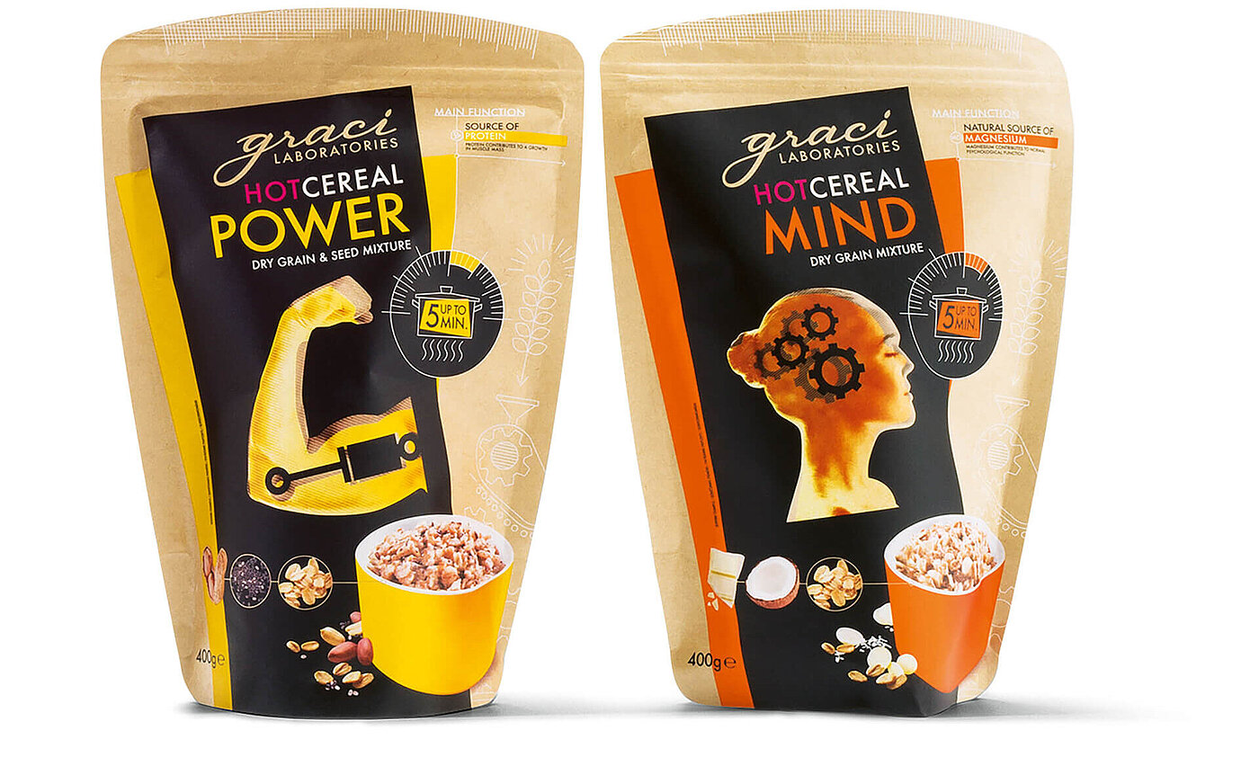
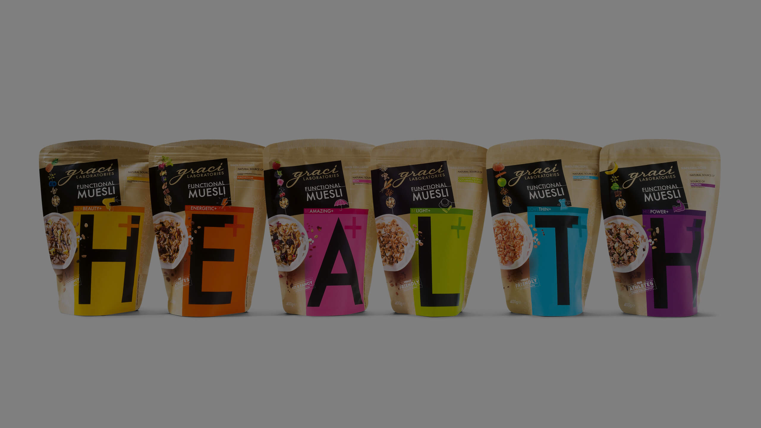
Also the food packaging “Graci Cereals” was able to enthuse the jury. The design, created by DPJN Diena Pirms Janu Nakts from Riga for Felici SIA, received the Red Dot: Best of the Best in 2018. “This beautiful food packaging for a breakfast cereal producer impresses with a holistic approach that merges the healthy ingredients of the products and their associated notion of naturalness with the environmentally friendly, recyclable packaging material into a unity,” explained the jurors. “In a modern, colourful and appetisingly novel way, the design conveys a wealth of important information, pointing out the benefits that the various kinds of muesli have to offer.”
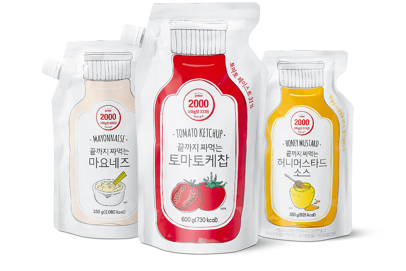
Another successful example for a clever packaging is “Squeezed to the Bottom Sauce” by LOTTE MART from Seoul, which won the Red Dot. Its innovative design enables consumers to squeeze out the product down to the very last drop and it was inspired by the sauce packaging of Western sauces. Because of its slim form, the packaging is space-saving and uses much less plastic in production. The illustration of a traditional bottle bridges the gap to this new, for this type of sauce unfamiliar packaging design.
Packaging in the Red Dot Award 2019
Whether for foods or other goods – packaging design is especially important everywhere where similar products compete for the consumers’ favour. A well-designed appearance addresses the senses and provides clients orientation in order to convince him or her to purchase within only a few seconds. Not only at the point of sale the first impression counts, but also in the Red Dot Award: Brands & Communication Design 2019. In July, the competition’s jury will convene to assess, discuss and evaluate among others the submitted packagings with regard to their design quality. The registration phase runs until 28 June: designers, agencies, manufacturers and brands can participate in the 17 categories of the “Communication Design” section and also enter their brands in the 36 industries available in the “Brands” section.