Strong brands and creative communication design from Scandinavia
Natural colours and materials, clear shapes and a certain simplicity – typical features of Scandinavian design, which is noticeably influenced by the nature, landscape and culture of the Nordic countries. The hallmark is often the reduction of complexity, which is reflected in communication design through elements such as the colours, typeface and layout. The fact that the design quality of the projects from Denmark, Sweden, Finland and Norway is exceptional, is proven annually by manufacturers, designers and agencies in the Red Dot Award: Brands & Communication Design. Whether with creative communication design works or strong brands - many of them successfully emerged from the competition in 2019.
Three awards for Scandinavian brands
Two brands from Sweden were awarded for their consistent and holistic brand image, which they created through their communication measures across different channels: For example, the premium outdoor manufacturer “Thule” was honoured by the Red Dot Jury with the award “Red Dot: Best of the Best”. The brand convinced the experts with a brand image that was implemented very consistently and engagingly. The company's clear and appealing brand message is evident in all communication measures, from the website to the product and packaging design to commercials.
The Swedish brand “Dometic” was awarded with the Red Dot. The company's claim “Mobile living made easy” is reflected in its visual appearance and product range. The rebranding with the new, simple word and picture brand was successfully implemented across all communication channels and at all points of contact where the brand and customers meet.
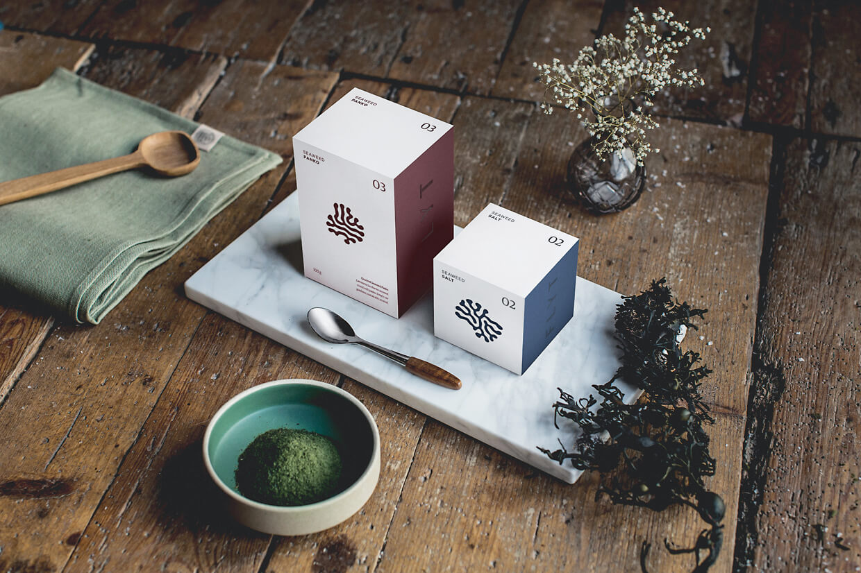
“Flyt Seaweed” was delighted to receive a Red Dot in the “Food & Beverage” industry. The young Norwegian company “Austevoll Seaweed Farm” is dedicated to the cultivation and sale of seaweed. The visual language of the brand is characterised by organically shaped symbols and inspired by the appearance of the algae. The symbols can be scanned with the Flyt App to obtain information about the individual products, the harvest and the people behind the company as well as recipe ideas. This gives the brand an additional communicative dimension to strengthen the target group's loyalty to the product.

Creative communication design from Denmark, Finland, Norway and Sweden
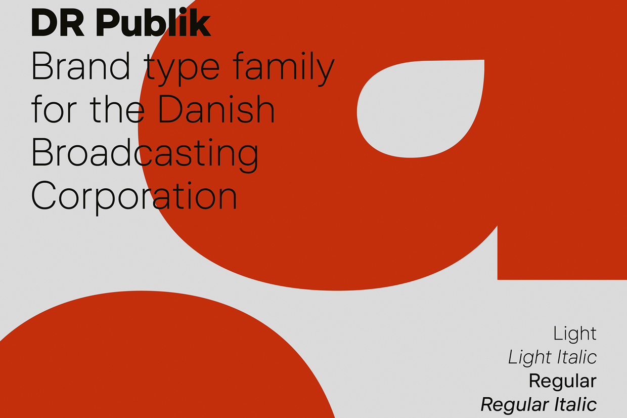
Also the excellent communication design projects from Scandinavia convinced with their clarity. The custom-made font family “DR Publik” of Danish Broadcasting was developed by Overtone and DR Design for “DR - The Danish Broadcasting Corporation”. The jury awarded the project with a Red Dot. The aim of the new font family was to improve readability and ensure visual consistency across the company's platforms, enhance corporate branding and create a coherent visual expression. The slender, no-frills typeface family reflects the clear, simple Scandinavian design aesthetic, and is characterised in particular by almost monoline line weights and horizontal or vertical endings.

The visitor center “Pro Nemus” in Finland presents the versatility of Metsä Wood's wood-based products. The centre is built entirely of ecological Finnish wood and serves as a stage for interactive digital experiences for visitors. The main focus is on information about the life cycle of a forest and the impact of the bio-economy in a world increasingly dependent on renewable resources. The modern visitor centre was designed by the agencies “Great Apes / HiQ” and “MKTG”. The jurors awarded Metsä Group the distinction “Red Dot: Best of the Best” for the following reason: “The Pro Nemus visitor centre is highly fascinating, interactive and holistic in its stunning architecture. The exhibition and installations not only offer a playful and stimulating introduction to the world of forests and their complex natural contexts, but also make sustainability an experience that appeals to all the senses.”
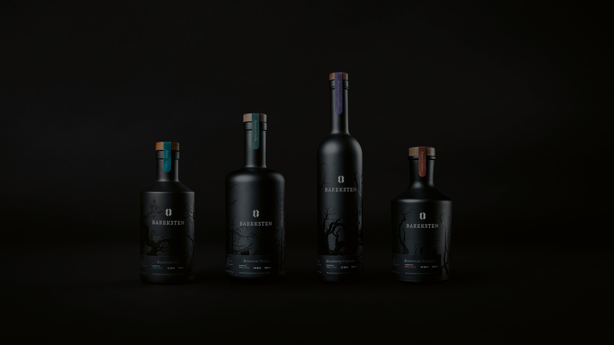
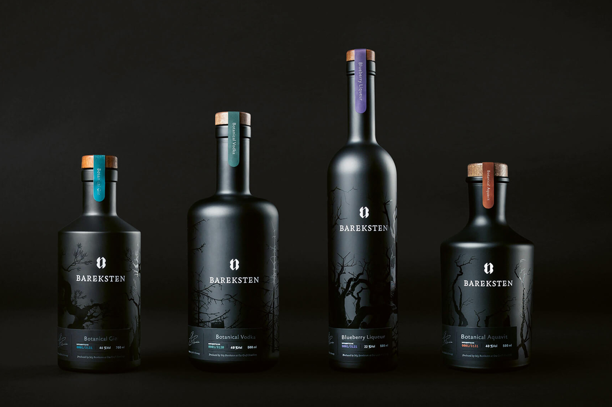
The Scandinavian origin of the design is also clearly visible in the packaging, for example in the four Gin bottles “Bareksten Spirits“, designed by the Norwegian agency “KIND” for the company “Oss Craft Distillery”. Inspired by the Nordic fauna and its dark legends, the packaging design has a wild and mystical as well as unmistakable character. The differently shaped bottles are dyed matt black and decorated with the image of a skeleton forest. An ambigram and the product name in high-gloss white form a strong contrast to this, which is the focus of the design.
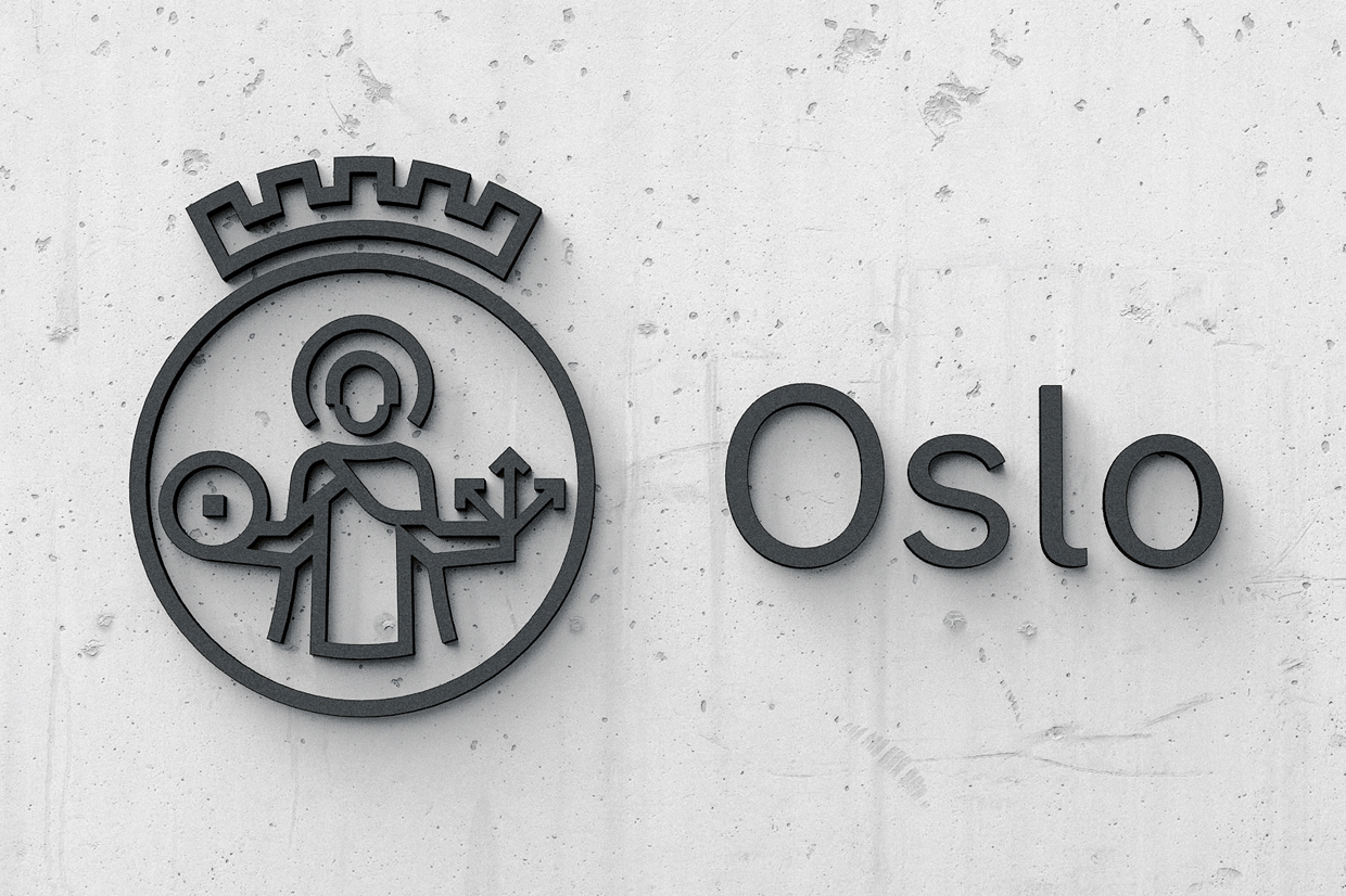
The corporate design "City of Oslo", which was awarded the highest distinction "Red Dot: Best of the Best" last year, also comes from Norway. The new visual identity of the City of Oslo impresses with a contemporary revision of the city's logo. The Red Dot jury was fascinated by the word mark's modular construction system, which is not only playful and aesthetically appealing due to its angular and round elements, but can also be flexibly and easily adapted in terms of design.
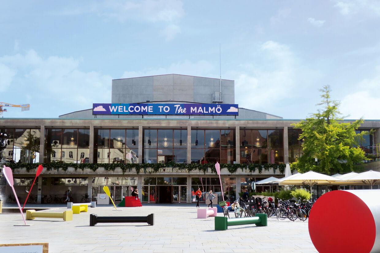
The sound concept “The Heart and Mind” was designed by ÅF Sound & Vibration for the company “Media Evolution Southern Sweden”. The project is based on the visual presentation of the international technology conference in the Swedish city of Malmö. The strong colours and geometric shapes were the template for this soundscape. The triangle, the square and the circle were translated into sound waves, which were represented acoustically by instruments such as bass clarinets, string instruments and Moog synthesizers – and visually by decorations on the conference site. For this sound design, the studio and the company received a Red Dot last year.
Registration for the Red Dot Award: Brands & Communication Design 2020
Designers and companies from all over the world can register brands and communication projects for the Red Dot Award: Brands & Communication Design until 5 June 2020 and have their achievements assessed by the jury. The 24 experts will decide on the awards in an online evaluation process.