The power of design: Why good communication is important in times of crisis
The world is in an exceptional situation. In a crisis that affects everyone in their daily lives and that we must learn to deal with. Communication can make a contribution to this, creating transparency and enlightenment, especially in difficult times. With the help of creative design, people can be informed and receive orientation. In the Red Dot Award: Brands & Communication Design some works were awarded in the past, which show that good communication design can help to present social problems and inform the population.
Campaign against female genital mutilation
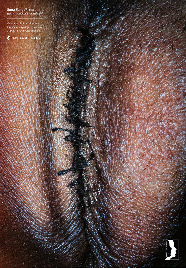
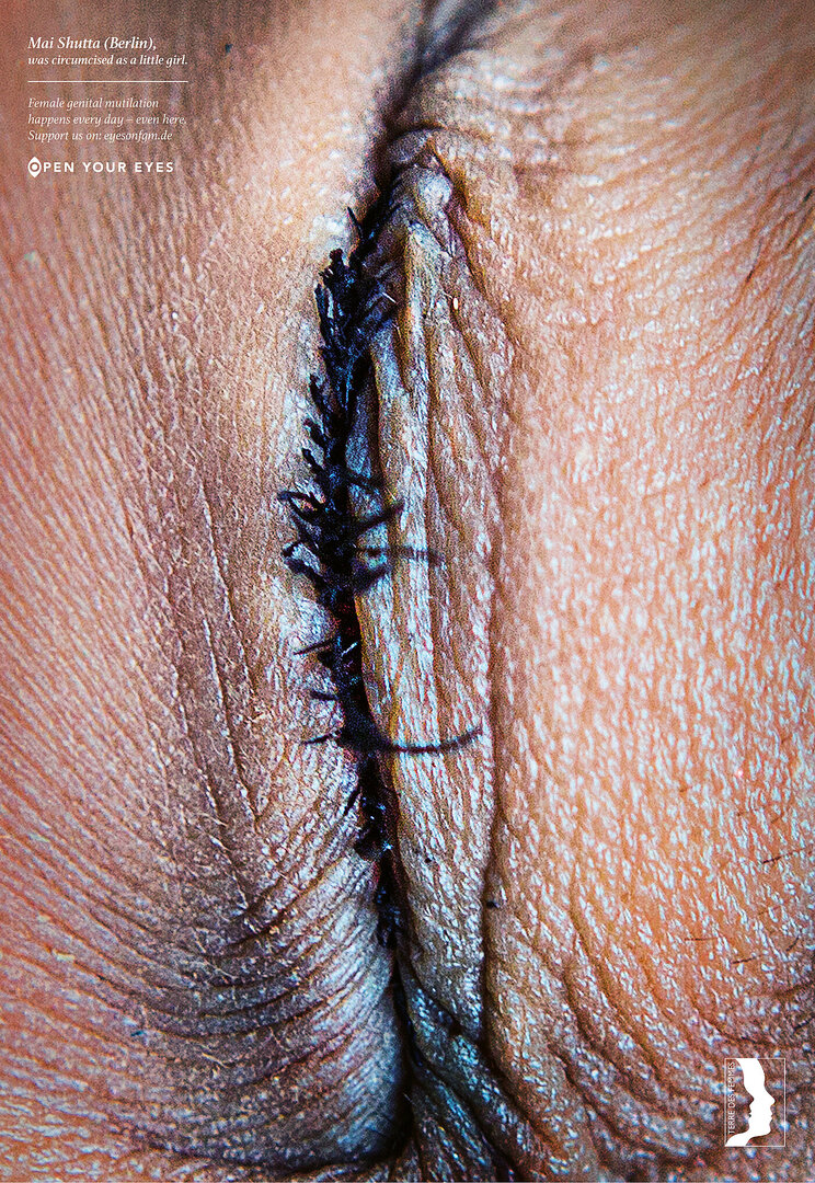
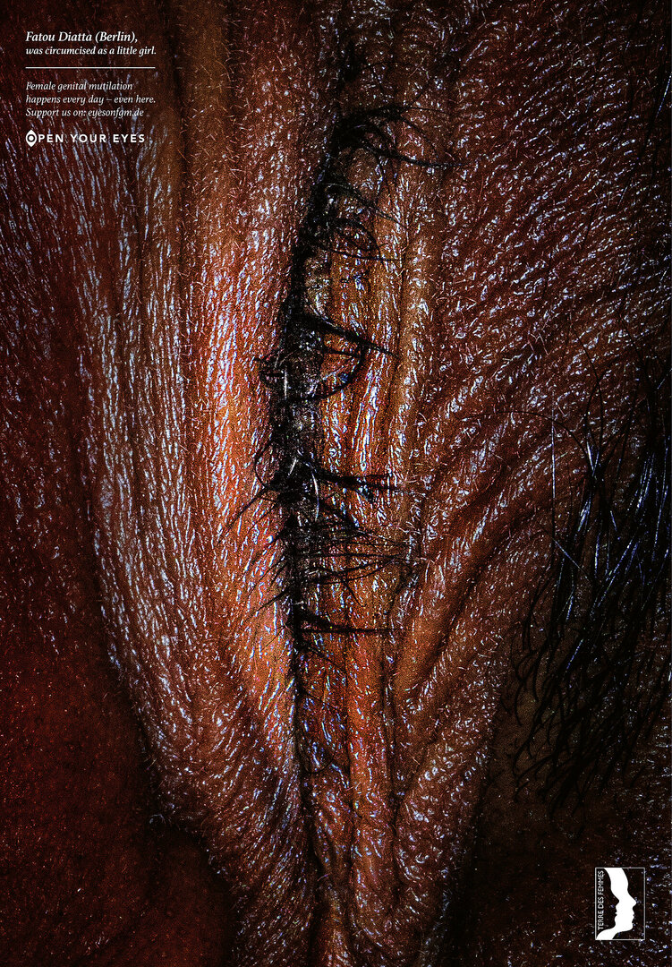
One example of how to draw attention to grievances and sensitise people to a specific issue is the “Open your eyes” poster campaign by TERRE DES FEMMES against female genital mutilation. The German agency Grey designed the campaign with the aim of opening the eyes of the viewer to this topic. At first glance, the poster shows circumcised female genitalia; only on closer inspection does it become clear that the eyes are closed. This strong image was combined with the claim “Open your eyes”. The campaign was supported by an online platform with personal stories of the affected women, showing how depicted eyes open. The work was awarded a Red Dot: Best of the Best in 2018.
“Made in Fukushima”
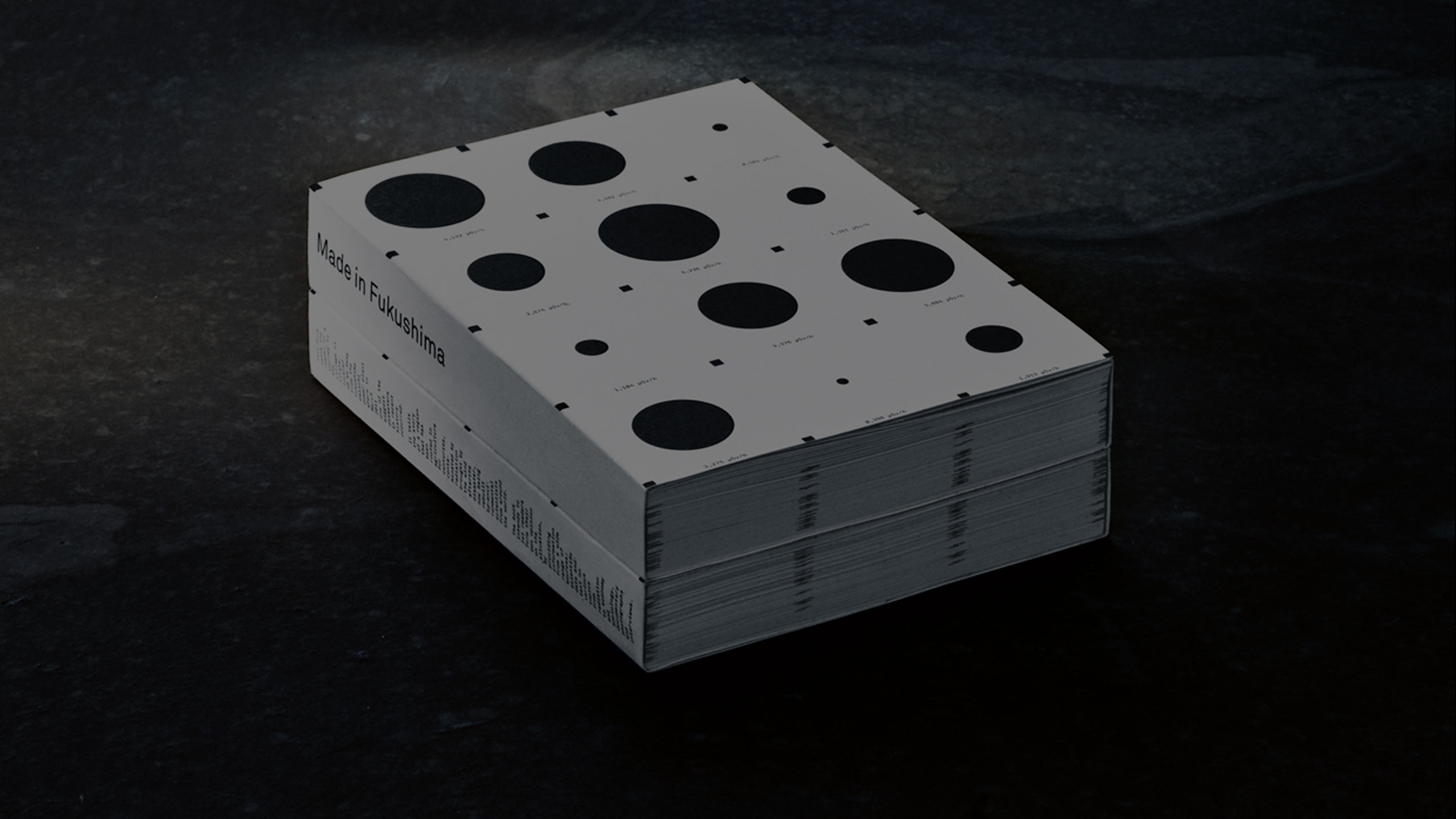
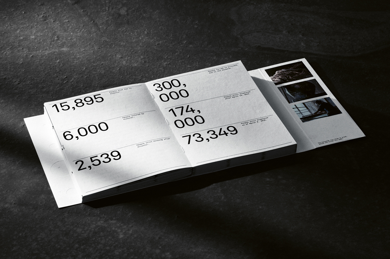
The book “Made in Fukushima” also points out problems in society. Through articles, photos and infographics, the publication informs about the long-term work of soil remediation to support local farmers after the nuclear disaster of 2011. The special design feature of this project is the material: The book consists of rice straw, which is grown on contaminated fields in Fukushima and processed into paper. This is to draw attention to the fact that the label “Made in Fukushima” is still strongly stigmatised, although rice can be safely grown there again thanks to a sustainable decontamination method. For this achievement, the agency Serviceplan and the company METER received the award “Red Dot: Best of the Best” last year.
Projects for more attention against human oppression
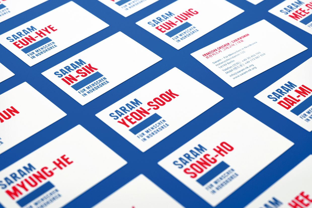
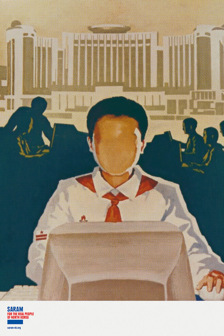
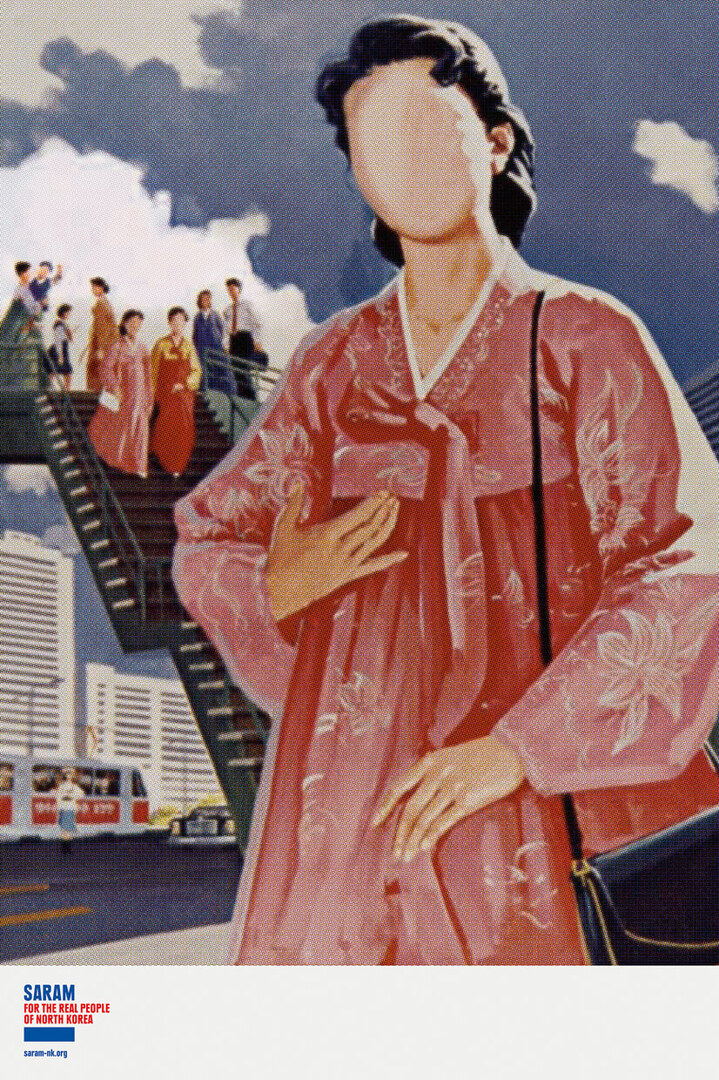
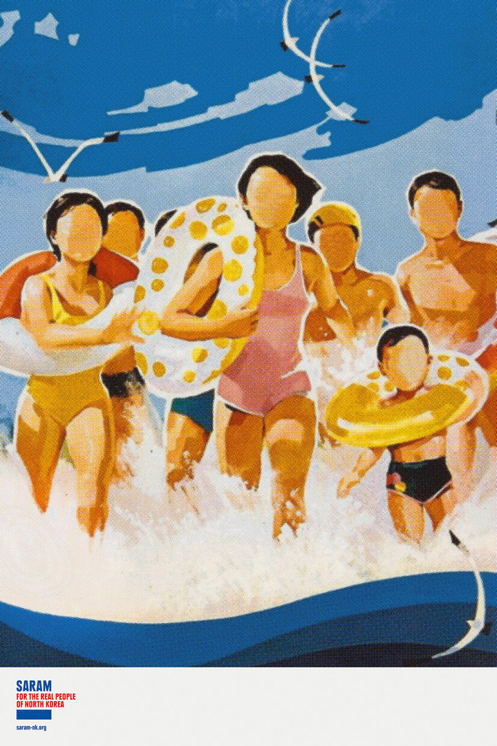
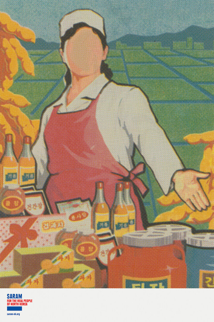
Other examples of how to draw attention to a crisis are the poster series “Faceless Suffering of North Koreans” and the relaunch of the corporate design “Human Identity”. Both projects were designed by the German agencies Grey Germany and KW43 BRANDDESIGN for the human rights organisation SARAM and were awarded the Red Dot in 2019. The aim of the work was to raise awareness abroad for the catastrophic living conditions and systematic oppression in North Korea. By redesigning the logo on all media, the individual victims of the regime are brought to the centre of public attention and made visible, as the first names printed in red capital letters stand out clearly from the other colours. The design of the poster series is based on the fact that there are no images that could show the oppression of the people. Therefore, the familiar aesthetics of the staged North Korean propaganda is taken up. The faceless figures on the posters stand for the fact that the people in this system literally have no faces. With this simple trick, the beautiful illusory world of propaganda is reversed and unmasked.
Red Dot Award: Brands & Communication Design 2020
As these projects show, strong communication design can help in many situations. That is why designers, agencies and companies are invited to register for the Red Dot Award: Brands & Communication Design again this year, when so much is different due to the corona pandemic. Not only individual creative works can be submitted, but also entire brands. Winners can use the Red Dot winner label for their communication to prove the high design quality and holistic brand identity. The registration portal for the international competition is open until 5 June 2020. Due to the current situation, the submissions will be assessed online in July.
