
The power of design: outstanding pictograms
In the fight against the corona virus, solidarity and the right behaviour of each individual can be decisive. Well-designed communication in the form of easy-to-understand information makes an important contribution to this. Everyone, regardless of their culture and language, should be able to understand the recommendations for correct behaviour during the pandemic in order to protect himself and others. Well-designed pictograms are one way of doing this. Whether instructions on how to wash hands properly, sneeze and cough or on how to implement social distancing – the simple icons make it clear what is meant with just a few lines, even without words. A current campaign of the initiative “Germany against Corona” shows how good communication design can help to contain the corona virus. But pictograms cannot only provide orientation in the current situation, agencies have also proven in the past that they can convey messages in a simple way. For this, they were awarded a prize in the Red Dot Award: Brands & Communication Design.
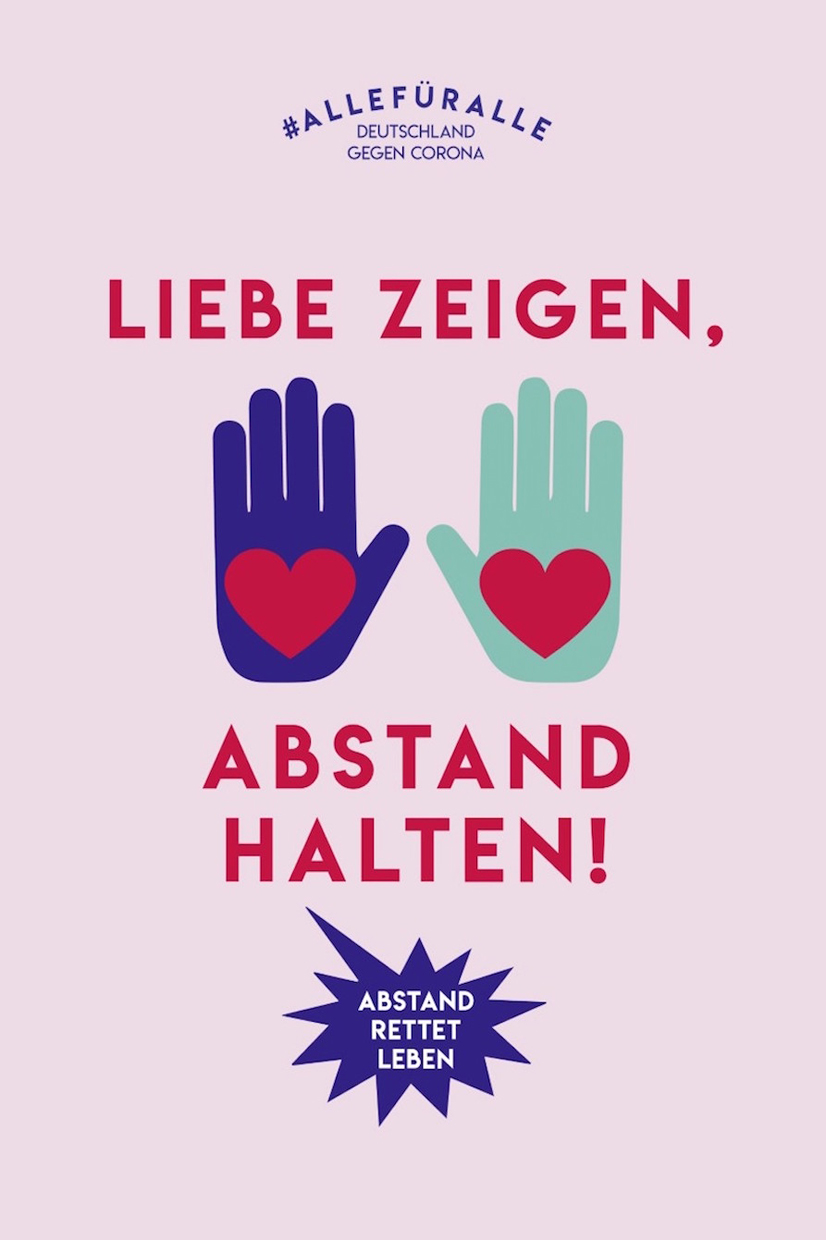
“Keep your distance – and together”
In the current campaign #allforall of the initiative “Germany against Corona” the message “Keep your distance – and together” is conveyed with the help of pictograms and simple illustrations. Various poster motifs are supported by an online campaign. People are encouraged to express solidarity under the hashtag #allforall. This aims at motivate other people to keep the necessary safety distance in public space, to help others and to promote cohesion. The agency Fischer Appelt has designed the campaign for various partners from business, media and culture. In 2018, Ligalux, the agency for visual experience design of Fischer Appelt, was awarded a Red Dot for the interactive sound experience “Wall of Sound”.
Red Dot winning pictogram systems
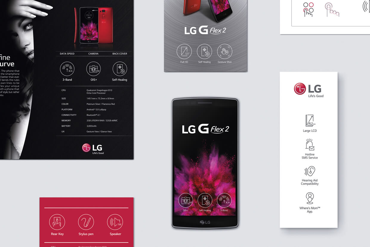
In everyday life and also outside of the Covid-19 pandemic, we come across pictograms again and again and they help to clarify facts quickly and understandably for everyone. The design of the pictogram system “LG USP Pictogram”, for example, was developed to effectively provide LG consumers with information on complicated functions of mobile products. LG received a Red Dot in the Red Dot Award: Brands & Communication Design 2015 for the design, which is based on a circle and a geometric grid system, with lines being removed in some cases. The remaining dashes are sufficient to easily express and recognise more complicated features, even when printed in a small font size.
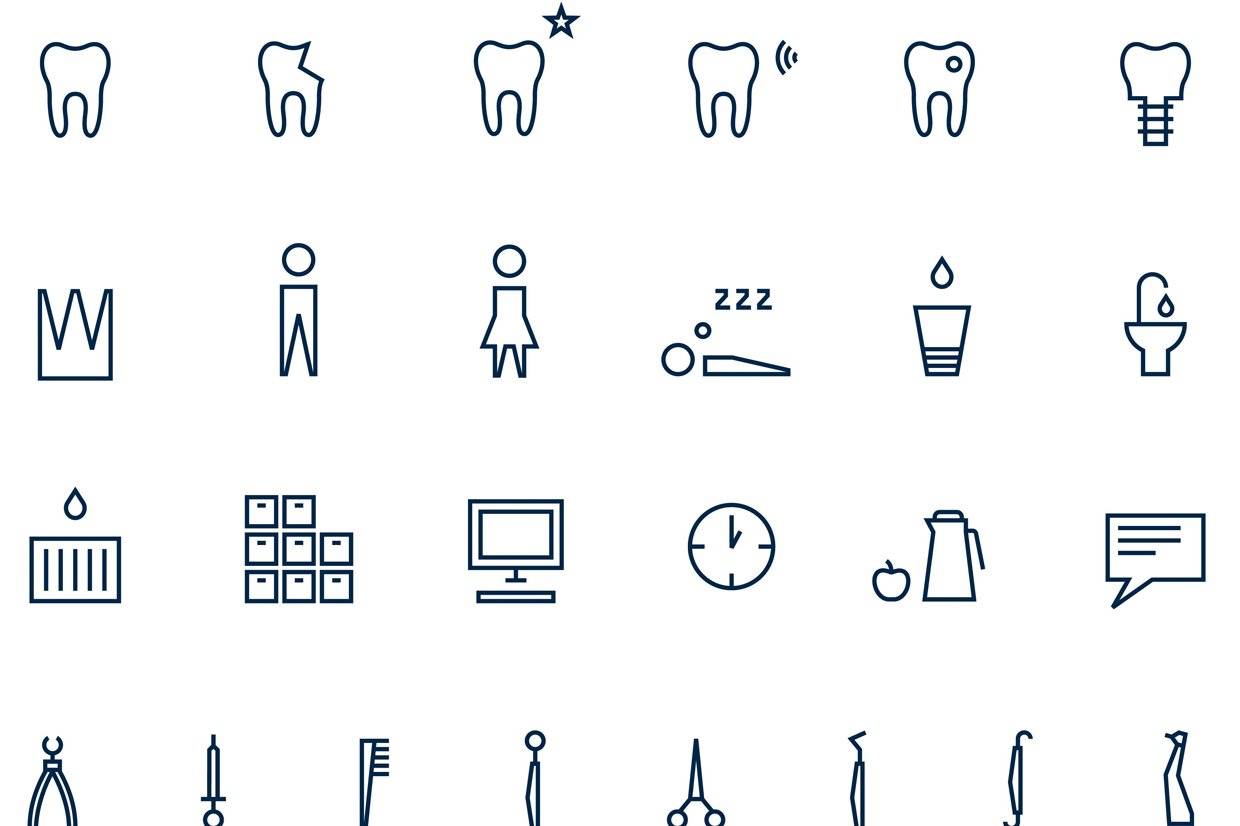
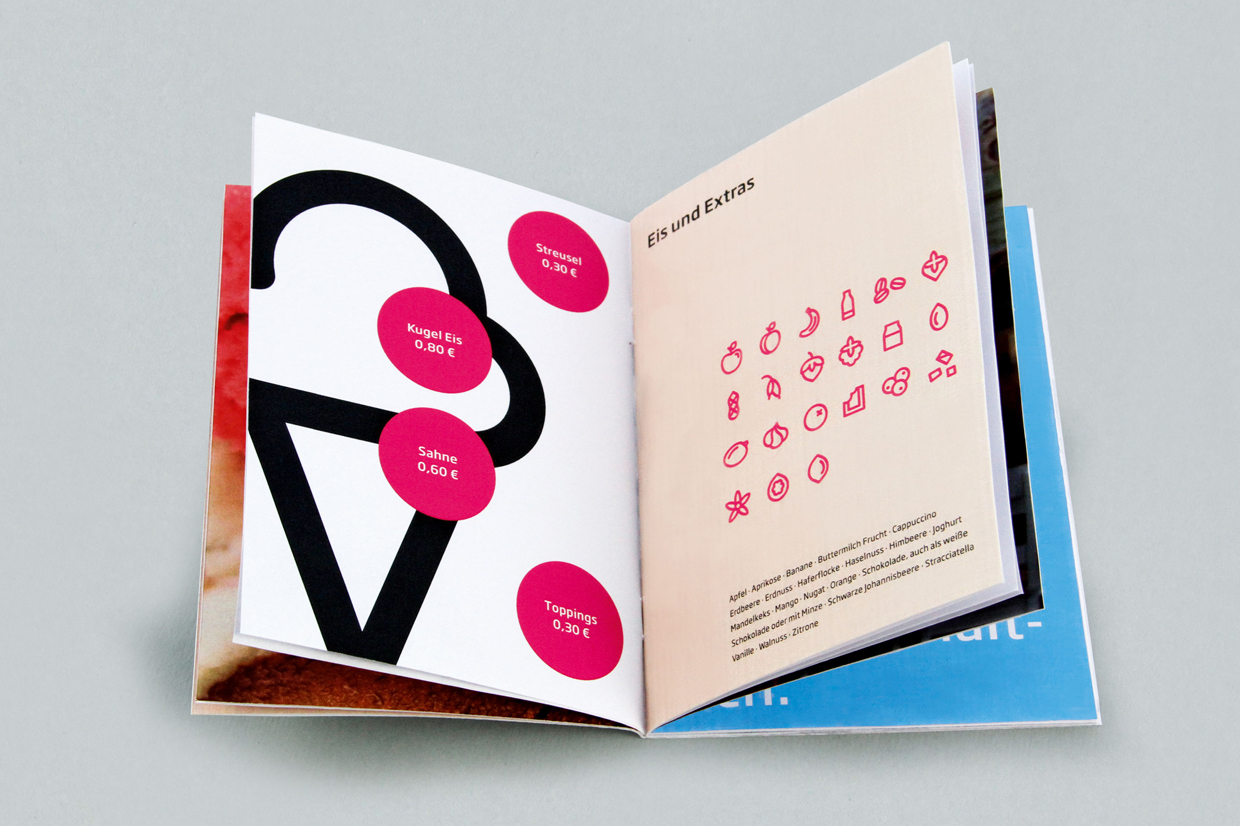
In the past, the German agency Lockstoff has won several awards the competition for the design of pictograms. In 2016, the agency created the pictogram system “Re-Think Bitumen” for the company Albrecht Supply Concepts, for which it was awarded a Red Dot. The self-explanatory and minimalist pictograms enable the internationally active company to communicate without any text. The black and orange lines harmonise with the company logo. Despite the strong minimalism, the sign system has a playful lightness and is versatile: It can be used for the presentation of specialist knowledge as well as for functional purposes, such as navigation elements on the website. For a dental practice, Lockstoff developed the pictogram series “Laughter is healthy” to underline the practice’s comprehensive portfolio. The individual pictograms show the entire range of services in dentistry, from prophylaxis and cosmetic treatments to oral surgery. Embedded in the existing corporate design, the pictograms adapt to the style of the typography and reflect the dentist's working world. The easily understandable pictograms serve as an additional image level in the visual appearance of the practice. Lockstoff also received a Red Dot for this design in 2014. In the same year, the agency and the client “Scoops”, a German ice cream parlour, were awarded for the pictogram series of the same name. The design of the word mark was inspired by the name Scoops. Accordingly, a font with a round, spherical look was developed, which gives the logo an ice cream character that conveys fun and enjoyment. The individual letters are made up of circles and take the shape of ice cream scoops. A well thought-out colour concept reflects the variety of flavours; both the round shapes and the pictograms with these colours visualise the entire product range.

Registration phase ends on 5 June
As these examples show, pictograms can be found in all areas of life and everyday situations. They guide us to take the right action, strengthen solidarity and offer us orientation. Especially in the current situation, strong and easy-to-understand communication design is therefore becoming increasingly important.
In the Red Dot Award: Brands & Communication Design, agencies and designers can submit their pictogram systems as well as numerous other creative projects and works. In addition to the “Typography” category, 16 other groups are available for this purpose. Companies can also enter their integrated brands in the international competition. They can still register until 5 June.