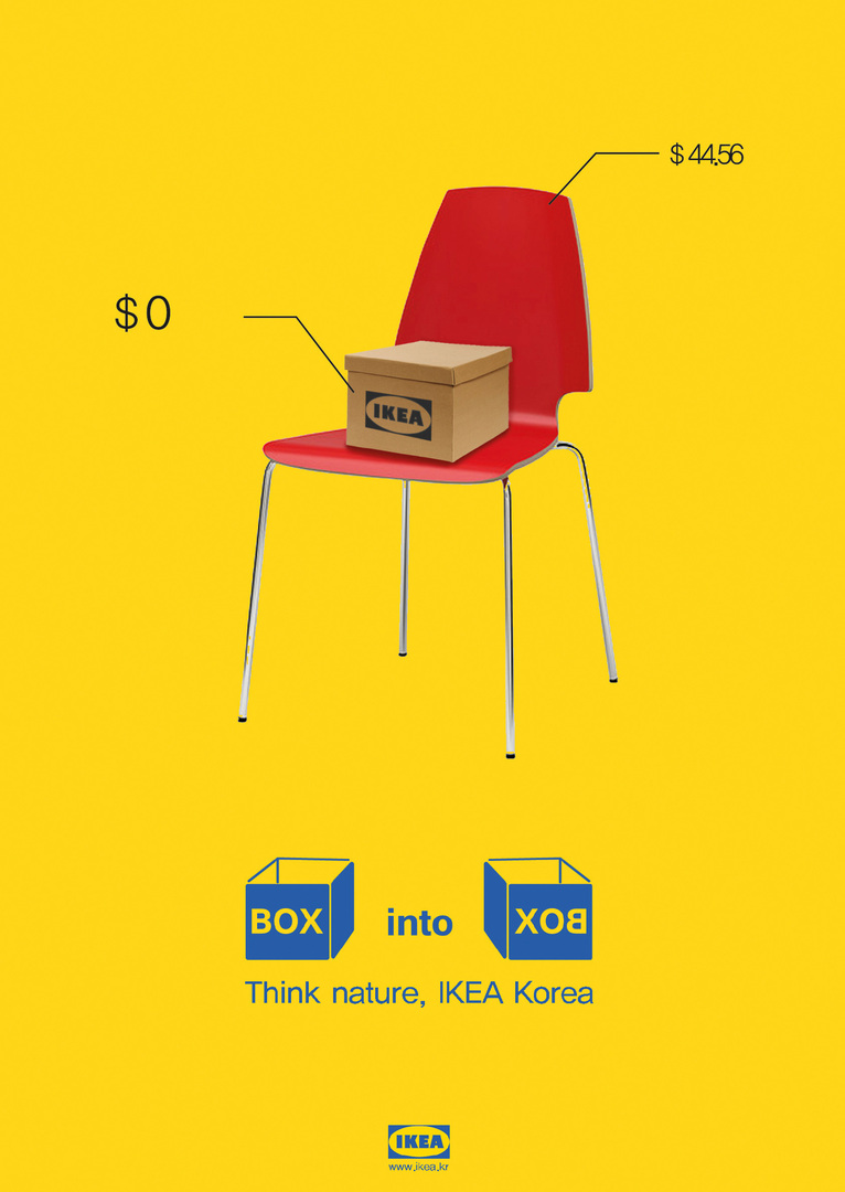
A–B Magazine Issue No. 1 – Right of Asylum

Zurück Download

A–B magazine is about the movement and migration of people and, against the backdrop of the current refugee crisis, explores the underlying forces of safety, security and refuge. In three chapters – “Contemplation” on our inner self and the universal desire to seek safety, “Refugee Crisis” on the refugees and their struggles around the world and “The Mundane” with a view on our regular asylum camps – the magazine aims at a better understanding of the asylum seekers. With a study of the history of migration, going back to Adam and Eve, as well as numerous impressive photographs and drawings by refugee children, the subject is examined from many different angles in words and images. The relevance of the topic is underlined by the orange colour that runs through the entire book and is also featured on the outside, in the form of a fluorescent zip pouch made from the characteristic ripstop nylon of refugee lifejackets.

Begründung der Jury

“Safety – a Human Right?“ A magazine about the refugee crisis? Hasn’t everything already been said, written and broadcast about this topic? Edward Lau also asked himself these exact questions when searching the right topic for his final project at LASALLE College of the Arts in Singapore. The very fact that this topic is extraordinarily widely reported on in the (social) media ultimately made it challenging for the young designer to find a new approach. When he started creating his concept, he probably didn’t yet realise the extent of the emotional reaction the A–B magazine would trigger. Tabs formally separate the three-part printed work, which lets the reader begin with the proverbial Adam and Eve and their banishment from paradise. The universal desire for safety and security, for a place to live without danger, a place to feel at home, has probably always been part of the human experience. The first section provides a glimpse of the situation from above, a kind of survey of this basic need – across national boundaries and without any judgement – and allows the reader to arrive at the conclusion that a sense of security is as existential to us as food and clothing. In the second part, Edward Lau then pulls us right into the drama that unfurls day after day in many locations across the globe, namely the struggle to regain precisely this lost sense of safety and the sudden realisation that making the journey in puny rubber dinghies is just as dangerous as staying at home. The decision, made a million times over, to risk the lives of the entire family in order to maybe find a safe place to live … someday, somewhere. Using vivid photos – generally monochrome images combined with a bright orange – and an otherwise very restrained page design, this magazine compresses the refugee crisis in succinct and hard-hitting visuals. Overcrowded boats, corpses in the arms of helpers, but also children’s drawings that show the desires of even the youngest refugees who cannot yet express these in words. Finally, in the third section, we are released back into “our” world, which is so fundamentally different from the impressions we have just seen. What do we associate with a sense of security? A variety of quotes list many different aspects ranging from the blanket for sleeping to being with friends. Places, items or experiences that represent security in a very individual way. Sometimes it’s mundane things that we are not consciously aware of but that translate into a feeling. This section also features an interview with Ai Weiwei, providing lots of food for thought. This strong content-based concept combined with absolutely consistent execution – a balancing act between seeking attention and exercising restraint – shows just what design is able to achieve. It can literally force readers to sit up and pay attention and can open up new perspectives. For the former, Edward Lau chose a symbol that is likely to be synonymous with the refugee crisis for all time and no longer associated with a harmless boat trip: the first one hundred copies of the A–B magazine were packaged in hand-sewn life jackets. The bright orange is ultimately also the graphic element that links the three sections – one single cleverly chosen colour achieves the most emotionality possible. It also touched the emotions of the jury, which awarded this work with the Red Dot: Junior Prize 2019.

Red Dot: Junior Prize

Andere interessierte auch