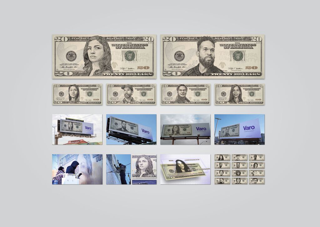
In this tea packaging designed as a gift box, red refers to China’s national colour. The brand has been developed and passed down through thirteen generations of leaders somewhat along the lines of the Chinese idiom of “to pass the flame”, which seemed to fit perfectly in this context. A UV process is used to create an element of “fire” in the box design in order to communicate the theme in a clear manner. Opening the box reveals two tea tins wrapped in paper. After unfolding the wrapped paper, the whole picture becomes visible. When the tea caddy is pulled open, it features delicate intaglio graphics creating an immersive user experience.
Credits
Client:
Shenzhen Yanzhi Brand Management Consulting Co., Ltd., Shenzhen, China
Design:
Shenzhen Lingyun Creative Packaging Design Co., Ltd., Shenzhen, China
Project Team:
Xiongbo Deng (Creative Direction)
Jinfei Yang (Project Management)
Xing Liu (Illustration)
Hui Li (Illustration)
Haitao Wie (Illustration)