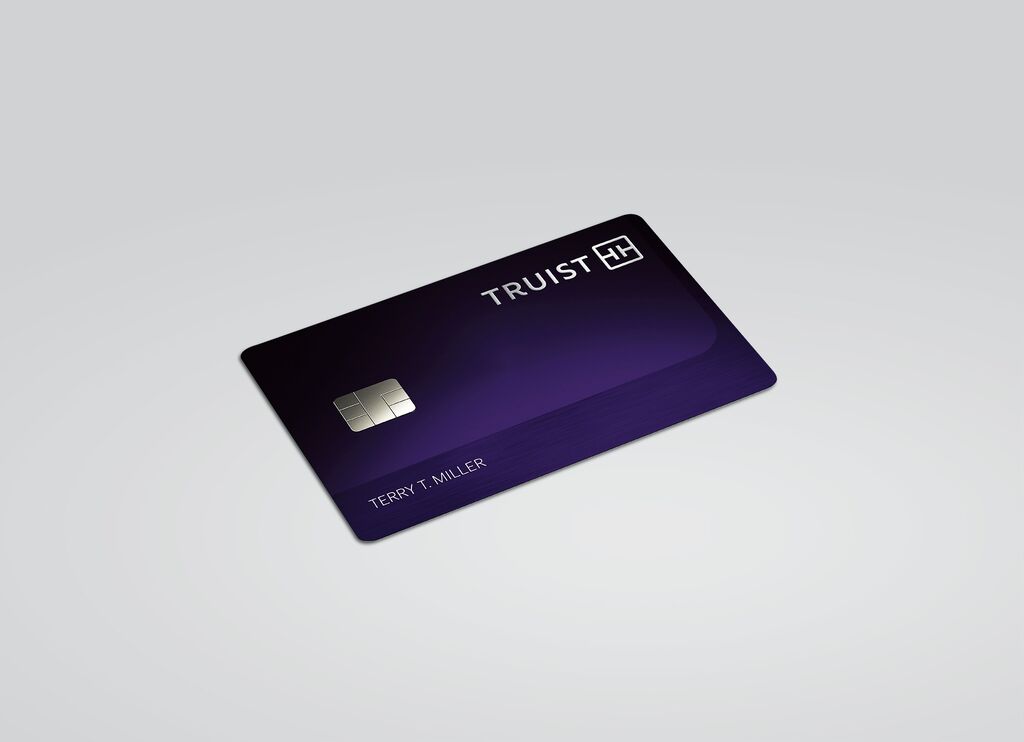
Corporate Design,Logo Design

Berlin Decks

Zurück Download

Berlin Decks is an innovative campus for entrepreneurs and creative people that is being developed in an urban neighbourhood with an industrial past. The naming was inspired by the waterside location near Berlin’s docklands, while the dynamic corporate design was influenced by the building’s modularity. In digital form, the logo changes shape, with its letterforms extending to resemble ship decks. The simple typography is a reference to the bold lettering on shipping containers. The two corporate colours were chosen to form a strong contrast: while the vivid orange, which is often seen on industrial machinery, signifies the location’s industrial past, the light pink is used to project a contemporary, digital-hub vibe.

Red Dot

Andere interessierte auch