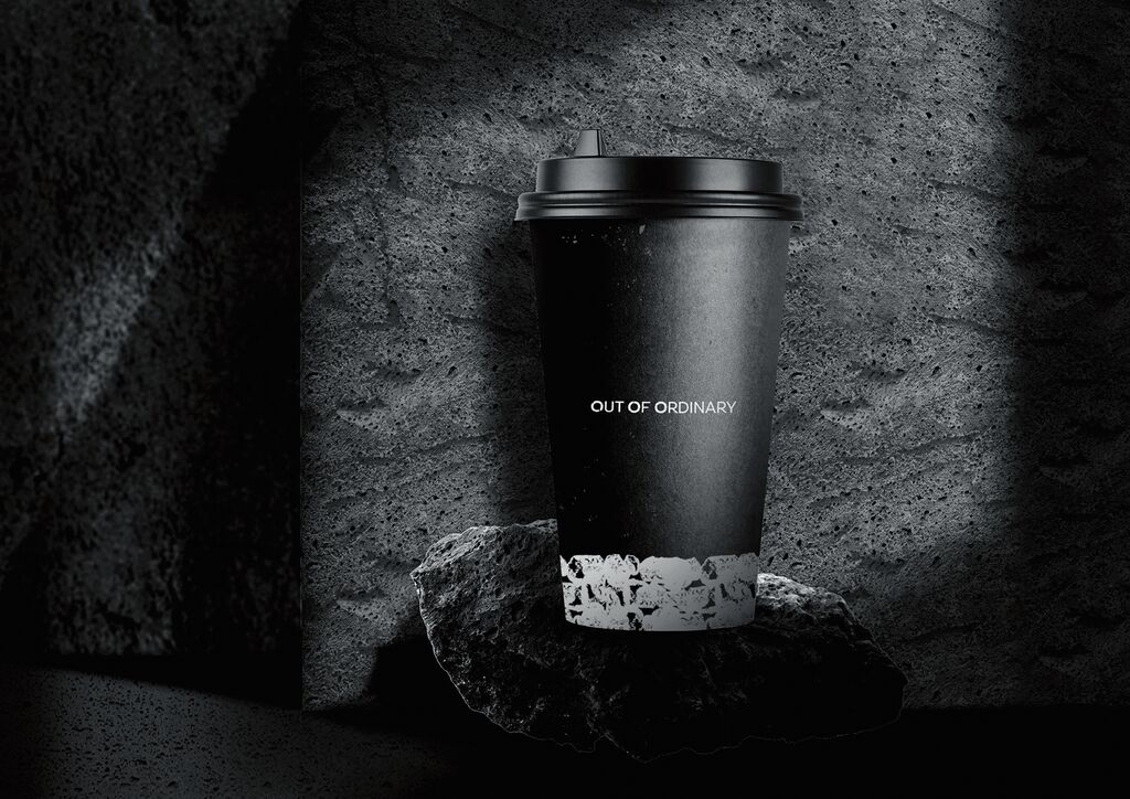
Brand Design

Bushe

Zurück Download

Bushe is a big chain of 40 city cafes in Saint Petersburg, the most European city in Russia. The philosophy of the coffee house chain, which has specialised in confectionery and bakery products, is based on a wordplay statement that translates as “keep eat [it] true [real]”. With a strong focus on content and not the external gloss, Bushe with its more than 20 years of work has become an integral symbol of Saint Petersburg, its architecture and its special weather with only 80 sunny days a year, as well as a special urban area for people and their stories. Against this background, Bushe’s new visual identity is based graphically on the city’s urban textures and a muted palette of colours reflecting crumbling wall plaster fragments, house facades and rusty site fences, complemented by clear and bold fonts. The visual accents of the urban environment derive from cut-outs in the form of a cake or a cup of coffee, for example, and are used on all printed media such as posters, souvenirs, packaging and outdoor advertising, fostering a lot of attention.

Begründung der Jury

The design of the new branding for the Bushe coffee house chain in Saint Petersburg succeeds to impressive effect in translating the typical urban textures of an urban environment into a consistent graphical imagery. Peeling varnish on a wooden door or lichen-covered masonry is staged together with a sans-serif font in such a purist way across all involved media that they create an entirely self-sufficient appearance.

Red Dot: Grand Prix

Andere interessierte auch