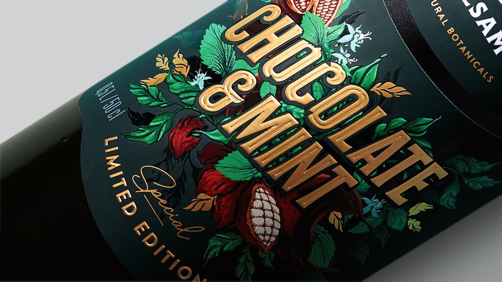
The Great Wall wine, known in China since the 1970s, was in need of a more contemporary brand identity to overcome the old brand image. The packaging design is inspired by traditional Chinese freehand landscape painting techniques, combined with a modern abstract design language. The labels are characterised by an uneven surface with ridges of differing heights and specific cut-outs, presenting the wine in its most majestic form. An exquisite illustration of the Great Wall and its mountains blends into the wine label. The emphasis on the number “9” in Chinese establishes a close relationship with consumers, while simultaneously marking the high quality of the product.
Credits
Client:
COFCO Penglai Co., Ltd., Penglai, China
Design:
TigerPan Packaging Design Lab., Shenzhen, China
Durch Starten des Videos erklären Sie sich damit einverstanden, dass Daten wie z.B. Ihre IP-Adresse an Vimeo übermittelt werden. vimeo.com/privacy