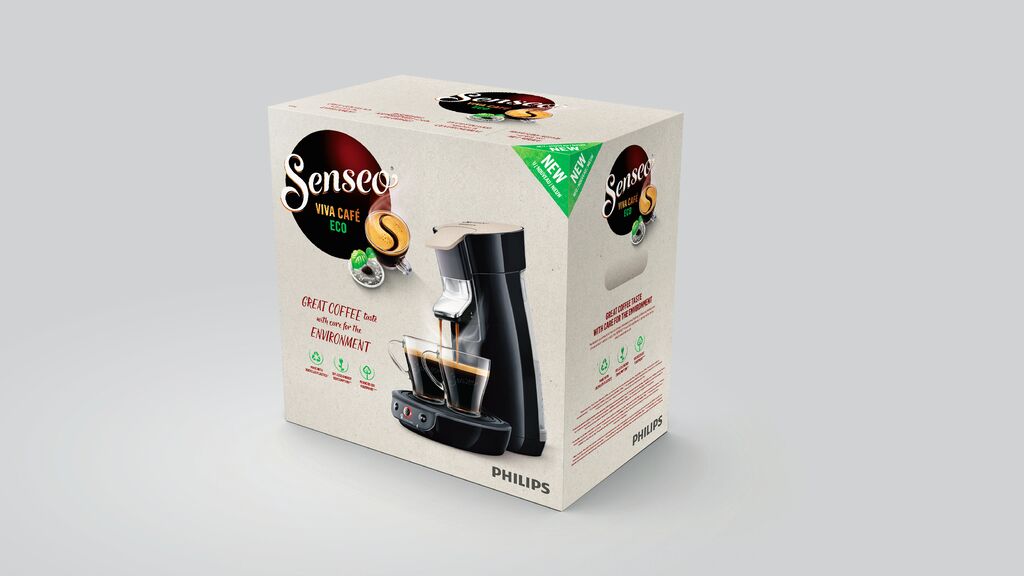
Packaging Relaunch

Hagenbeck Kaffee

Zurück Download

This packaging design is infused with the history of the long-established Hagenbeck Kaffee coffee brand. Inspired by the famous Hagenbeck Zoo in Hamburg, this coffee was also traded as the “tiger brand” in the mid 20th century. The relaunch is marked by graphic reduction with the goal of making the face of a tiger, created using shapes and lines, stare at and address customers directly from store shelves. The front of the packaging prominently features the brand name “Hagenbeck” placed directly between the eyes and nose of the illustrated tiger without disrupting the tiger image itself. The background is unusually white for a coffee brand yet looks sophisticated thanks to a stand-alone copper design that acts as an eye-catcher. Grabbing attention, the graphically integrated packaging text provides information about the history of coffee, its origin, the manufacturer and the roasting process. This is combined with a brewing recommendation visualised in icons.

Begründung der Jury

In an impressive manner, the Hagenbeck Kaffee packaging design subsumes a wide range of different flavours under the striking icon of a tiger. This reduced yet at the same time powerful appearance piques the interest of viewers. Moreover, the unusual design also succeeds in illustrating the connection between the famous brand and the zoo existing in Hamburg.

Red Dot: Best of the Best

Andere interessierte auch