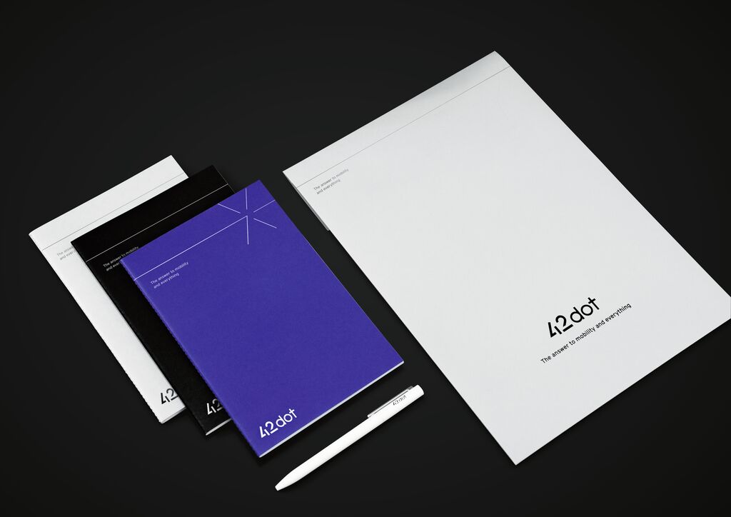
Red Dot Gala: Product Design 2025 Start Livestream: 8. Juli, 17:45 Uhr (MESZ)
00 days
00 hours
00 minutes
Corporate Design

Lugano Region

Zurück Download

The corporate design for the Swiss region of Lugano represents an atypical destination within Switzerland: palm trees, olive oil, Mediterranean weather and cuisine located in a Swiss environment. The brand essence, which emerged from this context, is “differently Swiss”, which has been translated visually in an alteration of the Swiss flag to form the letter “L” of Lugano. A graphic system, which aims at displaying the variety of the regional offerings, has been conceived through the reorganisation of the offerings into 12 different categories. For each category, a specific font has been created in order to give a different connotation to the letter “L” of Lugano, making it possible to express the many manifestations of a single reality.

Red Dot

Andere interessierte auch