Red Dot Gala: Product Design 2025 Start Livestream: 8. Juli, 17:45 Uhr (MESZ)
00 days
00 hours
00 minutes
Food Packaging

Mo?

Zurück Download

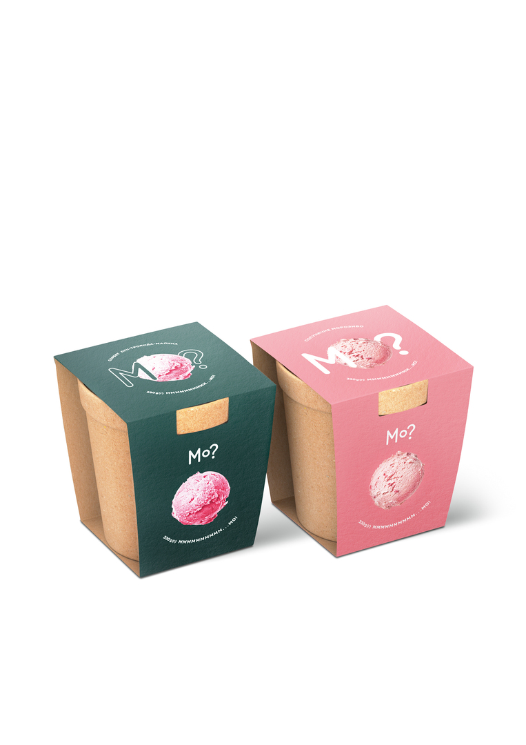
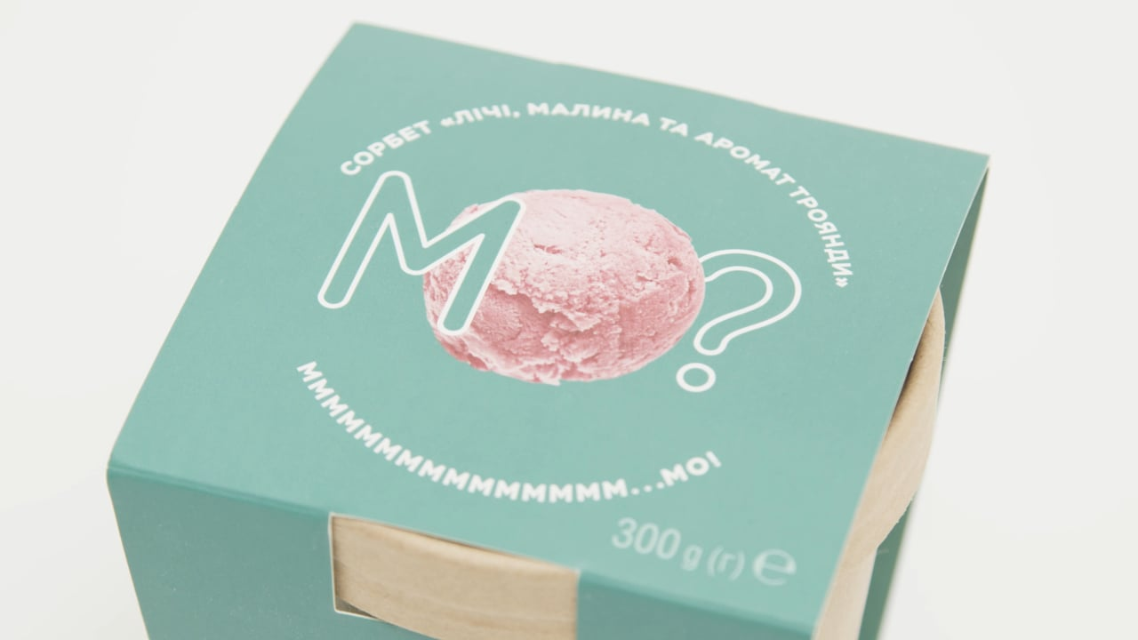
The task for the market launch of Ukrainian ice cream “Mo?” has been to create a purist yet attractive communication and packaging series. The name should be easy to remember and the design was intended to emphasise the craft tastiness of this ice cream. As the M and the O are the first two letters of the word “morozyvo” (ice cream in Ukrainian), the decision was made to build the entire concept on these two letters to stay in line with the brand’s minimalist approach. The name “Mo?” thus has been turned into an invitation to taste an ice cream, while the answer “Mmmm … Mo!” became its motto. The sustainable plain inner cardboard packaging is identical for all ice-cream flavours. The colour of the outer packaging has been adapted to match and distinguish the different ice-cream flavours. The word “Mo” should not only be perceived as a brand name or a catch phrase. Rather, it aimed to become a certain emotion of a tasty organic ice-cream foretaste.

Begründung der Jury

The “Mo?” packaging impresses with its structure and the fact that the primary container is made of unprinted cardboard and therefore sustainable. The various flavours are attractively visualised by means of natural and bright colours paired with a well-harmonising typography. This concept epitomises a new way of thinking about packaging, making it both effective and appetising.
Red Dot: Best of the Best

Durch Starten des Videos erklären Sie sich damit einverstanden, dass Daten wie z.B. Ihre IP-Adresse an Vimeo übermittelt werden. vimeo.com/privacy

Andere interessierte auch