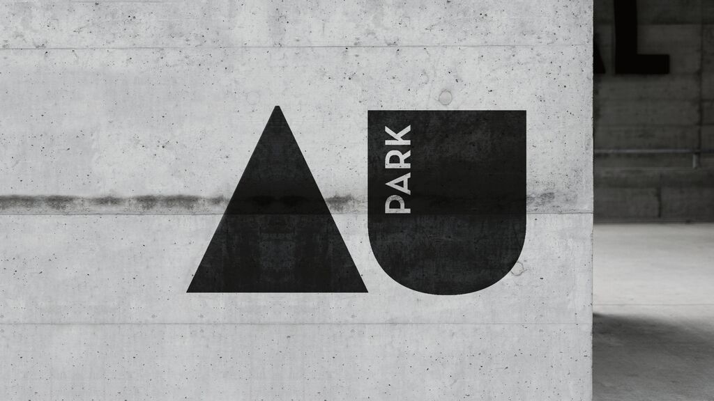
Brand Design

OH WOMAN®

Zurück Download

The OH WOMAN brand stands for early sex education in the 21st century and helps people to talk about their own bodies with fun and ease and without shame. The aim was to find a design language that is contemporary, tangible and at the same time playful. The design reflects the female body through organic shapes in the typography and other design elements. Icons and isotypes were developed based on the Chee font. The line breaks in the logo are deliberately chosen so that the syllable “MAN” is clearly recognisable and addresses all genders. Inspired by 1970s colour schemes, the brand design projects a young, fresh look.

Red Dot

Andere interessierte auch