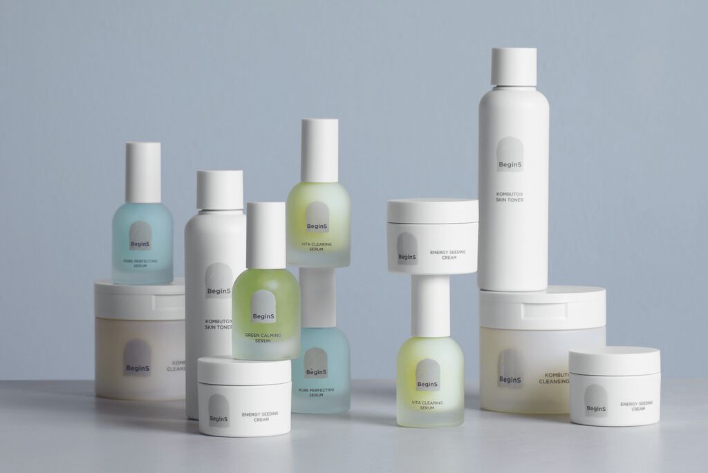
The “Packaging Designed by Orange” identity takes on the challenge of rethinking packaging to better brand the company’s homemade products, while reducing the impact of the packaging on the planet. The common box system for several countries is printed exclusively in black, facilitating two-dimensional perception and minimising ink consumption. The continuity between black outlines and the realistic view provided by the seal label gives rise to a case of dual perception, as the seal label is the only one printed in colour and can be customised according to local requirements. The concept places the focus on the unpacking experience by ensuring consistency between package and label.