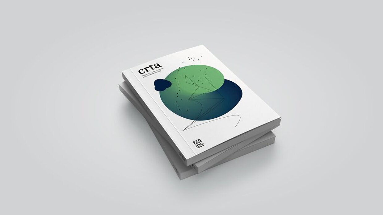
Client: Faculty of Mechanical Engineering and Naval Architecture, University of Zagreb, Zagreb, Croatia

Begründung der Jury
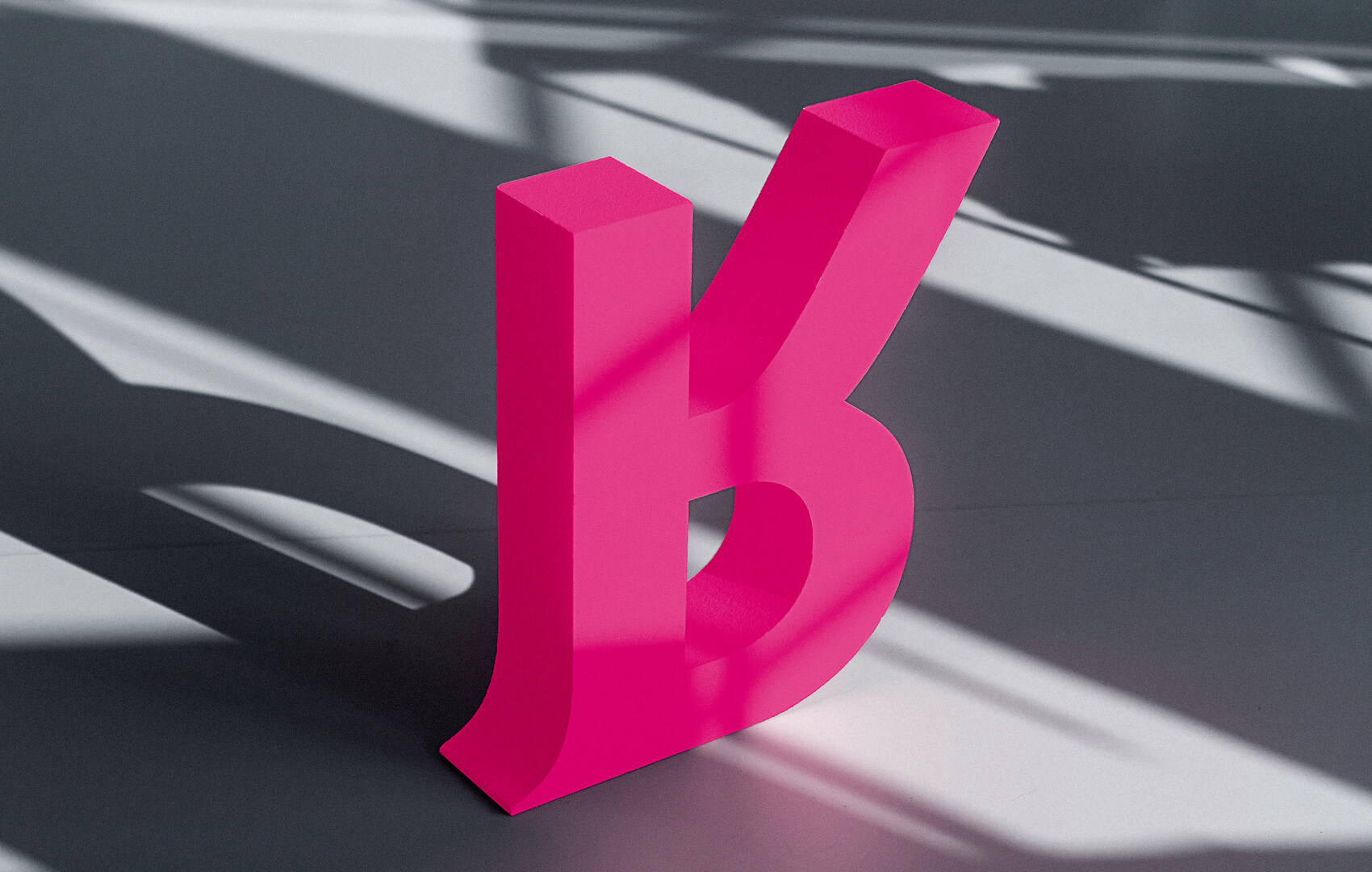
The idea of this corporate design, to turn the key visual of the “R” upside down with the aim of reflecting a rebellious approach embodied by the art prize and its name giver, has emerged as a highly appropriate and consistent implementation. Realised in striking pink, combined with gold and white, the appearance conveys a strong impression of both high quality and intended subversion, illustrating at the same time what art is capable of expressing.
