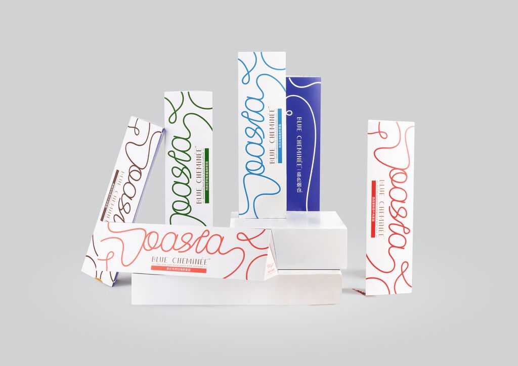
Packaging

Saldoro

Zurück Download

The focus of this packaging design, developed for a new salt product distributed in Germany, is on the origin of the product. It tells the story of the 250-million-year-old rock salt deposited by the primordial seas that once covered the entire European continent. This zero-emission rock salt is mined hundreds of metres underneath the plains of Northern Germany. The name SALDORO is a combination of SAL (salt) and ORO (gold) and is reminiscent of the importance of the “white gold” and the Hanseatic League. The logo shows a cog, a Hansa ship that transported salt in medieval times. A colour palette ranging from salt white and deep sea blue to slate grey conveys original purity. Moreover, the premium packaging is refined by a glossy silver hue.

Red Dot

Andere interessierte auch