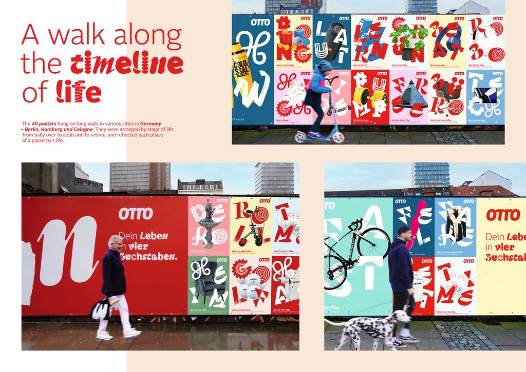
Typeface Design

Signifier

Zurück Download

Signifier is a Brutalist response to 17th-century typefaces. Its digital immateriality draws on a deeply material past. Acknowledging the processes and tools of digital form-making, type designer Kris Sowersby worked consciously with the computer to recast the lead, antimony and tin of the 17th-century Fell Types into ones and zeros. Signifier emerged from this alchemy with Bézier curves and sharp vectors determined by machine logic and a Brutalist ethos. Inspired by the realisation that “form is the void and void is the form”, the launch campaign uses a digital version of Yves Klein’s famous International Klein Blue, in reference to his art that dealt with immateriality, emptiness and metaphysics. The typeface is available in seven weights.

Begründung der Jury

The typeface Signifier perfectly combines the essence of traditional typeface designs from the 17th century, printed in lead type, with the expressiveness of contemporary, digitally created typefaces. The design has succeeded brilliantly in transferring the historical style in its structure of straight lines and finely rounded curves and serifs into the world of ones and zeros in such a way that it has emerged as a new, highly aesthetic and universally applicable interpretation.

Red Dot: Grand Prix

Andere interessierte auch