THE I/O ist ein Fitnessclub, der im Jahr 2021 im spanischen Küstenort Marbella an der Costa del Sol eröffnet wurde. Die Marke THE I/O sollte von Beginn an im Luxussegment positioniert werden. Mit der Markenentwicklung und der Gestaltung der visuellen Identität wurde die Agentur Zapiens Design aus Madrid beauftragt, die damit vor der Herausforderung stand, zunächst einmal sämtliche Klischees rund um Fitnesscenter und Workouts zu überwinden, um etwas wirklich Neues zu schaffen. „Unsere Aufgabe bestand darin, uns vom traditionellen Paradigma zu lösen, um ein einzigartiges Erlebnis zu kreieren, etwas Einprägsames und Menschliches, das über das Training hinausgeht. Kurz gesagt: Wir wollten die Fitness von morgen entwerfen“, so Álvaro Navio von Zapiens Design. „Mit diesem Anspruch ist es uns gelungen, eine Marke zu entwickeln, die ein Gefühl von Luxus vermittelt, ohne extravagant zu sein, und Fitness zu einem Ausdruck von Wellness zu machen.“ Der Markenname „THE I/O“ steht für Input und Output, Inside und Outside und reflektiert damit nicht nur den Energiefluss, also die sportliche Seite, sondern auch die räumlichen Gegebenheiten, da sich das Clubleben sowohl in Innenräumen als auch im Außenbereich abspielt. Kern der Marke ist jedoch die Philosophie der „Elegant Energy“. Die beiden Begriffe spiegeln einerseits die rationale Seite der Marke – „Energy“ als Ausdruck des Fitnessaspekts – und gleichzeitig ihre emotionale Komponente in Form der Eleganz wider. Damit transportiert der Claim kurz und bündig den Anspruch des Studios, ein gehobener, entspannter Ort zu sein, der nur noch wenig mit Anstrengung und Überwindung zu tun hat. Sichtbar wird dies auch in den Clubräumen, deren Gestaltungskonzept in Zusammenarbeit mit Archidom Studio entstand und von Luxushotels inspiriert ist.
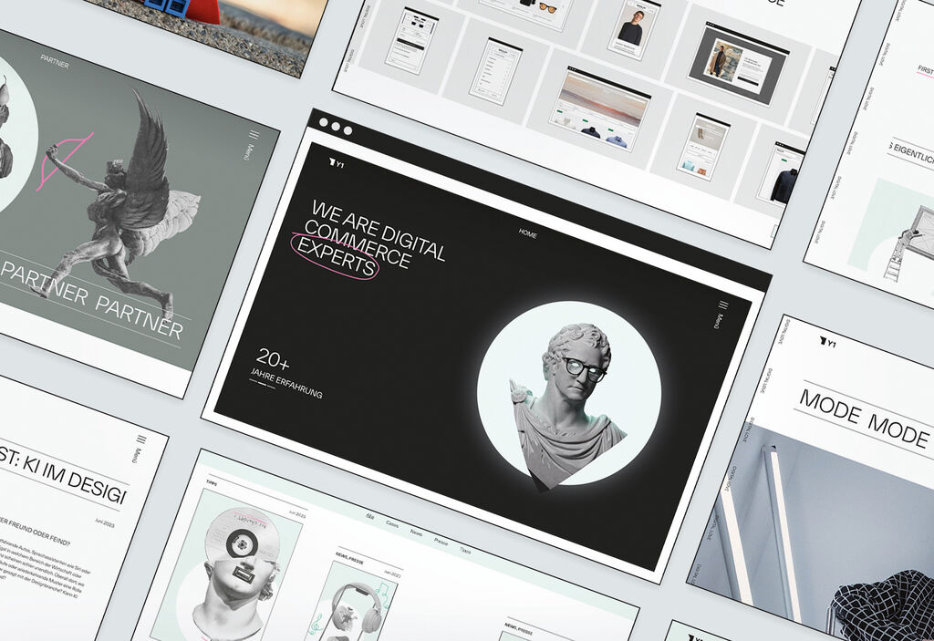
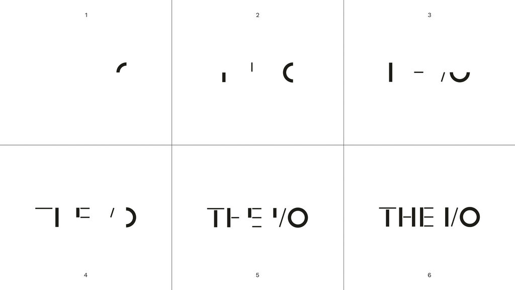
Die visuelle Identität der Marke basiert auf der Wortmarke „THE I/O“. In seine Einzelteile zerlegt, dient der Schriftzug als Grundlage für Icons und Zahlen, die ein in sich geschlossenes, einprägsames Zeichensystem bilden – ein Aspekt, der die Jury besonders begeisterte, die die gestalterische Qualität des Systems hervorhob. Primäre Markenfarben sind Schwarz, Off-White und Weiß, die eine ruhige Eleganz vermitteln. Ergänzt werden sie durch gesättigte Sekundärfarben, die auf mediterrane Elemente wie z. B. Palme, Meer oder Sonnenuntergang rekurrieren und durch den starken Kontrast den Aspekt der Energie aufgreifen. Ein besonderes Augenmerk lag darauf, die visuelle Identität nicht nur für die physische, sondern auch für die digitale Umgebung skalierbar zu machen, sodass alles konzeptionell und visuell miteinander verbunden ist – vom Club selbst bis hin zu dessen digitaler Erweiterung in Form einer App. Dahinter stand der Wunsch, den Mitgliedern durch ein durchgängiges Designkonzept auch eine nahtlose Erfahrung bei Inanspruchnahme digitaler Serviceleistungen wie Blended Classes, Personal Training aus der Distanz, Workout-Gamification etc. zu bieten. „In dieser Branche muss man lange suchen, um ein Brand Design von dieser Qualität zu finden“, so die Jury. „Auf Basis des Logos wurde hier ein ganzes Corporate-Design-System aufgebaut, das sich hervorragend analog wie digital verwenden lässt und zu einer hohen visuellen Eigenständigkeit der Marke beiträgt.“
THE I/O is a fitness club founded in the Spanish coastal resort of Marbella on the Costa del Sol in 2021. Right from the start, THE I/O brand was targeted at the luxury end of the market. The Zapiens Design agency in Madrid was commissioned with the development of the brand as well as the design of its visual identity. That meant overcoming the challenge of doing away with all the clichés related to fitness centres and workouts in order to produce something that was genuinely new. “Our task was to break away from the traditional paradigm so we could create a unique experience, one that was memorable and humane, and went beyond mere training. To put it in a nutshell, we wanted to design tomorrow’s fitness world,” Zapiens Design’s Miguel Ángel Gómez, CEO and Creative Director, said. “With this aim in mind, we managed to create a brand that communicates luxury without appearing extravagant, one that also makes fitness an expression of wellness.” The brand name “THE I/O” stands for Input and Output, Inside and Outside, and thus not only echoes the flow of energy, in other words, the sporting aspect, but also the characteristics of the space, as life in the club takes place in both indoor and outdoor settings. However, the core of the brand is its philosophy of “Elegant Energy”. The two terms on the one hand reflect the rational side of the brand – energy as an expression of fitness – and on the other hand its emotional component in the form of elegance. The tagline thus succinctly communicates the studio’s claim to be a sophisticated, relaxed place that has little to do with exertion and effort. This is also clearly evident in the club rooms, designed by Archidom in collaboration with Zapiens Design and inspired by luxury hotels.
The brand’s visual identity is based on the wordmark “THE I/O”. Broken up into its individual components, the logo forms the basis for icons and numbers that create a self-contained, striking sign system – an aspect that particularly appealed to the jury, which commended the design quality of the system. The main brand colours are black, off-white and white, which convey serene elegance. They are complemented by saturated secondary colours that recur on Mediterranean elements such as a palm, the sea or the sunset and, through their stark contrast, capture the energy aspect of the brand. Particular attention was given to ensuring that the visual identity would be scalable not only in physical but also digital environments so that everything is conceptually and visually linked – from the club itself through to its digital extension in the form of an app. The underlying aim was to create a consistent design concept that would offer members a seamless experience when using digital services such as blended classes, remote personal training, workout gamification, etc. “You have to search far and wide in this industry to find brand design of such quality,” the jury commented. “The logo gave rise to an entire corporate design system, which is perfectly suited to analogue as well as digital use and which significantly contributes to making the brand visually distinctive.”