Client: The Legacy Museum, Montgomery, Alabama, USA

Begründung der Jury
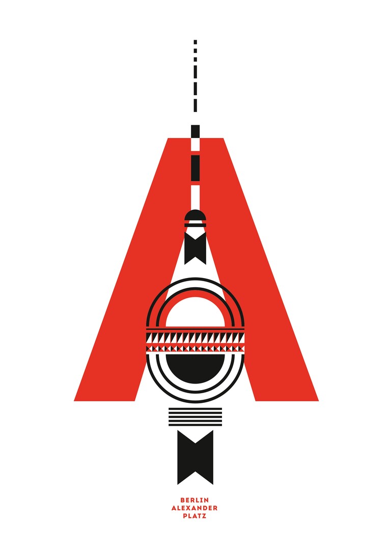
To merge the central symbols and typical buildings of Berlin in an illustrated alphabet for the capital is an excellent idea. Each letter thus represents a particular Berlin sight. The graphically clear and austere appearance makes the illustrations immediately understandable and fascinate with their highly unconventional style.
