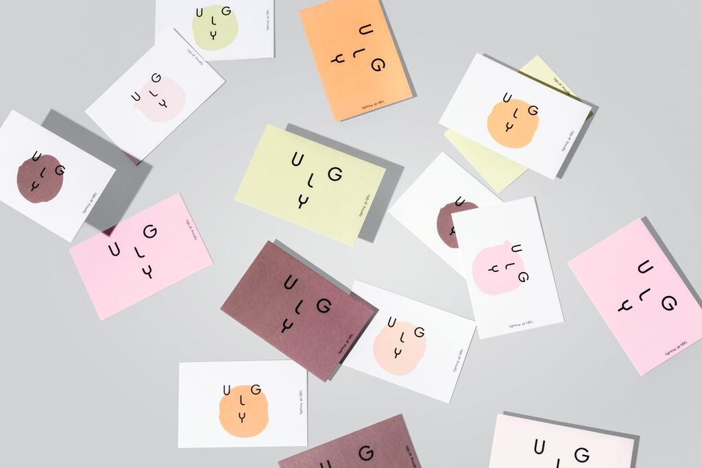
Brand Design

We Never Drop the Ball

Zurück Download

Japanese volleyball had an image problem because it was regarded as a conservative and boring sport, which also showed in a drop in investments. The newly developed brand design was inspired by the game itself, deriving a new look from the fierce passion, precise teamwork, zigzagging movements of the players and the beauty of its choreography. The word and figurative mark with its dynamic appearance resembles a player diving with outstretched arms, trying to control a ball with a dig. Its sharp, dynamic angles make it an attention-grabbing game. The strong and purposefully confrontational colours, framed on black and white, signalise a deliberate break from the League’s previous look, suggesting fearless thinking.

Red Dot

Andere interessierte auch