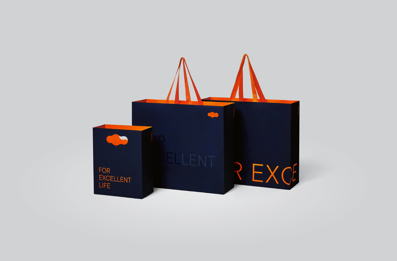
To mark their 20th anniversary, the logomark of E LIFE, a leading real-estate brand in South Korea, was given an update. The objective was to create a representative symbol emphasising that this is a lifestyle brand. The symbol has evolved several times in the past, but this latest update focuses on improving the shape of the cloud, which, based on a circle, represents satisfaction, pride and desire. Just as the shape of a cloud changes over time, the symbol can be applied to different customer touchpoints through a flexible graphic system. The logotypes and graphic motifs were also redesigned to create a stronger visual identity.
크레딧
Client:
DL E&C, Seoul, South Korea
Design:
DL E&C, Seoul, South Korea
cvnt, Seoul, South Korea
By starting the video, you agree that data, e.g. your IP address, will be sent to Vimeo. vimeo.com/privacy