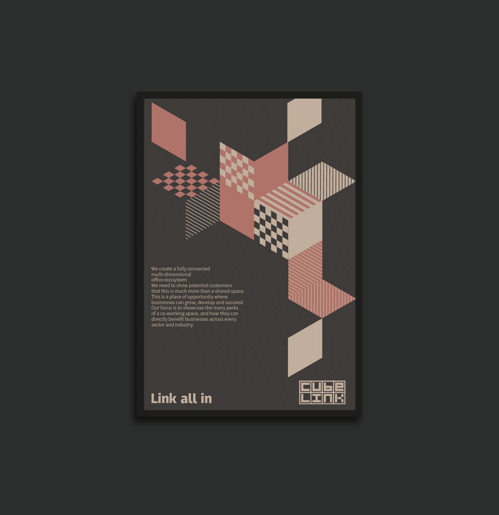
Client: Canadian National Institute for the Blind, Toronto, Canada
Brand Design
German Red Campaign
Aimed at promoting the German Red Cross (DRK) humanitarian aid organisation, this recruitment campaign redesigned the established logo to represent the organisation’s diverse areas of activity. Thus, for example, “Deutscher Roter Hund” (German Red Dog) stands for the mountain rescue team. With a simple change in design, this striking campaign has drawn a lot of attention by encouraging thought and action. The huge diversity of the organisation’s activities was thus effectively re-established in the public mind.
크레딧
-
Art Direction:Julian Windischmann
-
Chief Creative Officer:Andreas Pauli
-
Client:Deutsches Rotes Kreuz, Berlin, Germany
-
Design:Leo Burnett Germany, Frankfurt/Main, Germany
-
Creative Direction:Benjamin Merkel, Helge Kniess, Daniela Ewald, Jörg Hoffmann