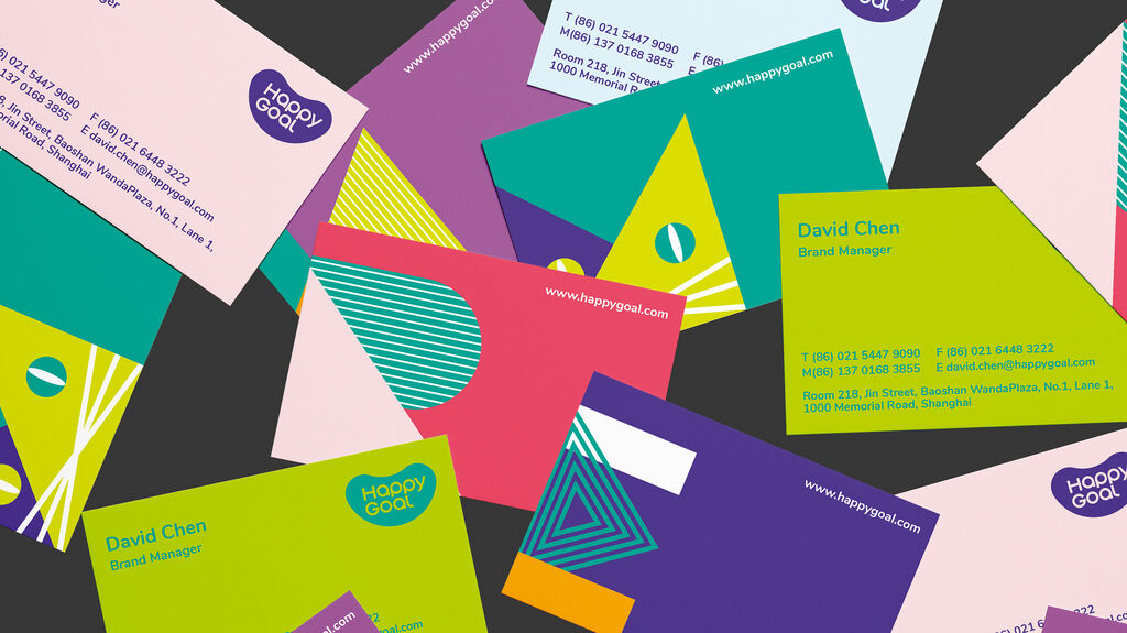
HappyGoal is one of the largest English training institutes in Shanghai with more than 30 learning centres for children aged 3 to 12. The company was founded in 2011 and is part of the Webi Group, which operates well over 120 language schools throughout China. As part of the country’s ongoing internationalisation and increasing demand for early childhood education, HappyGoal expanded and complemented its services by also including other relevant educational content alongside language skills. The company’s goal is to offer children an attractive, creative and healthy growth and learning environment in which they can fully develop and, in so doing, establish the company as a renowned brand synonymous of qualified education. The key idea of the new corporate identity, namely that children should first and foremost grow up happily, has been concentrated into the slogan “Happy on the go” and, together with the brand attributes of “explorative, approachable, caring, passionate”, is aimed at leading the company and the brand into the future. The new logo has retained the established shape of the bean, which has stood for trust and quality for eight years. The previously childlike typography has been replaced by a clearer and more modern one that works across all analogue and digital media. In addition, 26 playfully designed illustrations have been developed from the English alphabet. They are composed of geometric shapes, such as circles, triangles as well as lines, and feature across the entire appearance including in brochures, as stickers and on furniture. They lend the brand image a high degree of versatility and markedly set HappyGoal apart from its competitors. The bright green of the brand’s previous appearance has given way to a cooler turquoise to evoke the impression of high professionalism. The mascot comes in three characters denoting three age groups. They act as spokespersons of the brand, are part of the storytelling and interact with the children in courses, online learning sessions and promotions. Endowed with AI, these characters promote the new corporate philosophy commitment of bringing more comprehensive and creative education to children, as well as the goal of inspiring self-confidence and happiness through an emotional connection that these characters foster.
크레딧
Company:
Shanghai HappyGoal Education Training Co., Ltd.
Founding Year:
2011
Headquarters:
Shanghai, China
Lead Agency:
Zhangweixian, Changsha, China
Company Founder:
Clark Gao (Weiyu Gao)
Number of Employees:
1,353
Claim:
Happy on the go
By starting the video, you agree that data, e.g. your IP address, will be sent to Vimeo. vimeo.com/privacy