hellonature is a South Korean premium online foods store specialising in organically grown products. Founded in 2012, the company has been offering an early-morning delivery service for fresh food since 2017. In order to improve the public’s awareness of the brand and its presence in the fast-growing food delivery market, and promote its “dawn delivery” service in particular, the company opted to renew their brand design.
The company sees itself as a pioneer in terms of internal quality standards, fair ways of operation with suppliers and the delivery of products for a healthy lifestyle. That is why hellonature initially expanded its product portfolio to include carefully selected seasonal foods. In addition, new product ranges have been introduced that support food-related lifestyles such as veganism or LCHF (low-carb, high-fat) and which are flanked by recipes from popular restaurants. Moreover, hellonature excludes disposable items and non-recyclable materials as much as possible.
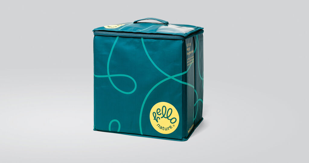
In the rebranding, the brand name “hellonature” was scrutinised because of its apparent simplicity, but the name was ultimately retained. Instead, it was decided to use the positive and clear meaning of those two words and redesign the word mark accordingly, making it communicate the brand values and the early-morning delivery service in an intuitive-to-understand way. For the new logo, the word “hello” was converted into a curved handwritten script and the word “nature” was placed underneath, making the new logo reminiscent of a hand raised in greeting. The already established green brand colour was used in an adjusted form for the lettering and complemented by lemon yellow, which is aimed at evoking a feeling of welcome and an association with dawn. Considering the fact that the main interface used by the customer is an app, the logo was designed to fit in a shape that is suitable for a mobile app icon. The sweeping arcs of the “hello” lettering in the logo play an additional role in the brand design: slightly pulled apart, they form a curved line that seems to consistently tie in everything – from the app’s various subpages and the products to the recipes and the packaging design. The new brand identity invites customers to become part of the hellonature world.