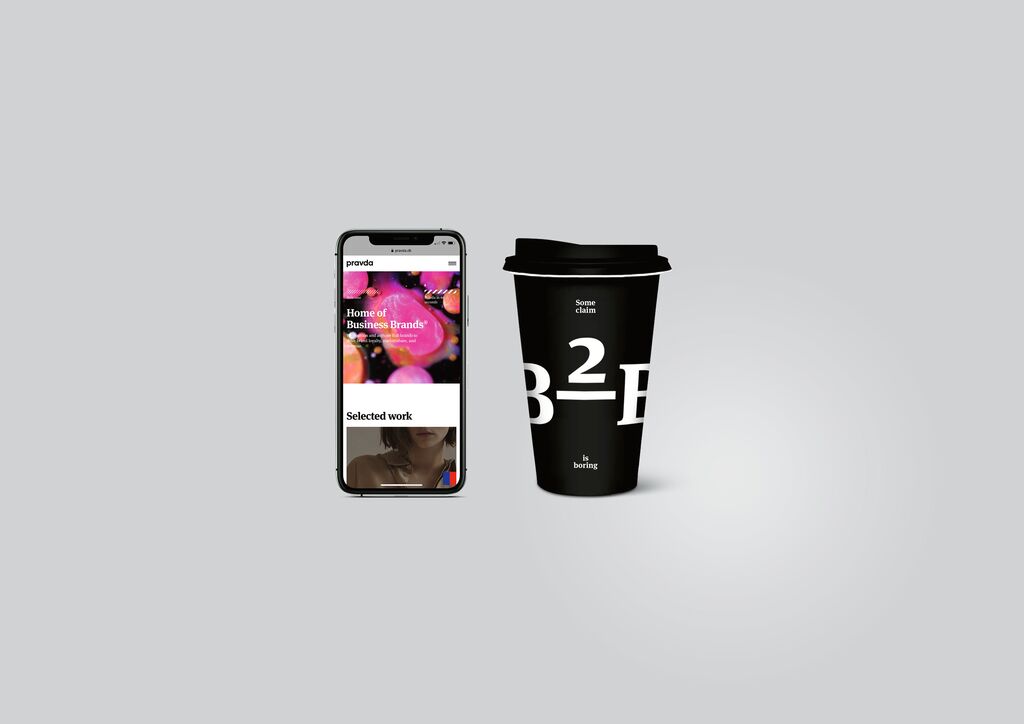
Red Dot Gala: Product Design 2025 Start Livestream: 8 July, 5:45 pm (CEST)
00 days
00 hours
00 minutes
Corporate Design

LIVING one Rüttenscheid

뒤로 다운로드

The objective was to position the first residential project of Kölbl Kruse Living as a premium brand. The word-image design invokes the project’s architectural concept: the two vertical orange stripes in the logo symbolise the two central building blocks of the construction plan, and the tilted addition “one” stands for the first project of this type. The word “Rüttenscheid” localises both project and logo geographically. The colour scheme ranges from a concrete grey, borrowed from the world of construction, to a vibrant orange which symbolises “living”. The visual identity comprises corporate and web design as well as the construction site itself: this way, a presentation cube and the employees’ clothing become ambassadors for the brand.

Red Dot

Others interested too