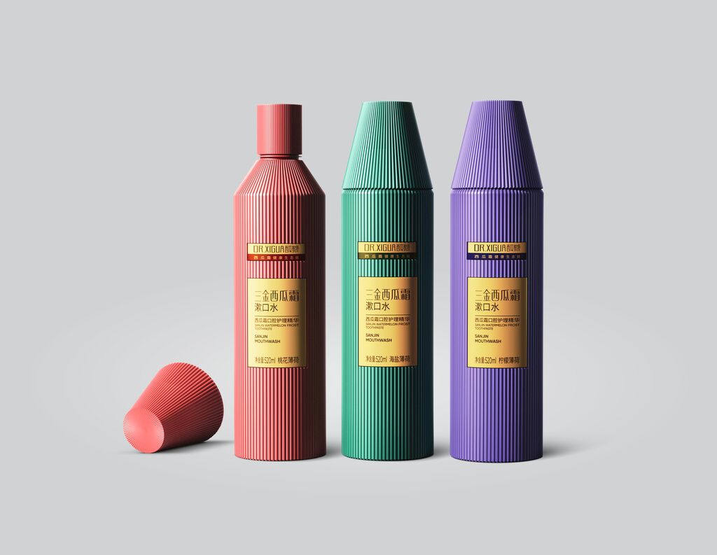
The design strategy for Off the Eaten Path is to satisfy an aspirational consumer group on the lookout for new culinary experiences. The brand offers plant-based snacks with unexpected blends of real vegetables like chickpeas, black beans and peas. The packaging brings to life the motto “Snacks for the curious” by combining close-ups of fresh ingredients with a photo of the finished product. Harmonising different typefaces, the graphic design remains true to the approach of surprising customers in a positive way. A striking colour, which stands for the flavour, rounds out the visual identity.