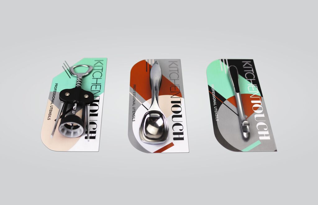
Client: Canadian National Institute for the Blind, Toronto, Canada
Brand Design
OMIBERRY
This South Korean brand stands for the collective philosophy of three generations: harvesting fruit from clean land. In order to modernise and globalise the fruit’s image, a word mark was created by combining the words “Omija” and berry. The design concept adds value to all elements, such as the bottle and the label, through a traditional but contemporary look. The illustration of the fruit is the key element that conveys authenticity and naturalness, while the systematic combination of Korean and English typography expresses modernity. The brand design can be flexibly applied with other products.
크레딧
-
Art Direction:Jihye Lee, S/O PROJECT Studio #2
-
Client:Hyojongwon, Gyeonggi Province
-
Illustration:Eunhye Lee, Seoul
-
Design:S/O PROJECT Studio #2, Seoul
-
Creative Direction:Hyun Cho, Korea National University of Arts, Seoul