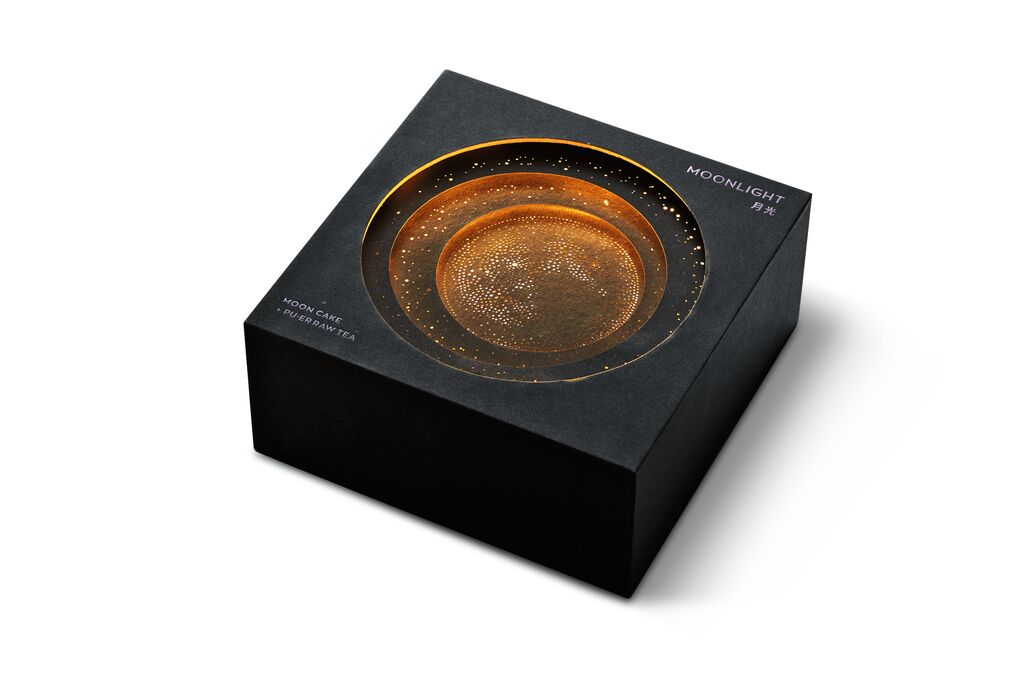
Red Dot Gala: Product Design 2025 Start Livestream: 8 July, 5:45 pm (CEST)
00 days
00 hours
00 minutes
Packaging for Household Products

QPOP

뒤로 다운로드

A series of bottles was created for the QPOP brand of detergents and disinfectants that differ from each other in terms of size and shape. The unifying feature is a striking detail on the tapering bottle necks: a shiny element reminiscent of a necklace being worn. The Q in the brand name stands for “Queen” with the aim of expressing appreciation for the female target group. This emotional appeal also includes the soft-touch surface, which makes haptic reference to the softness and purity of laundry. “The subtle colouring and harmonious choice of materials credibly convey the brand values to the outside world,” the jury said.

Red Dot

Others interested too