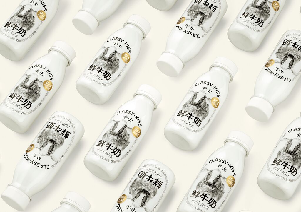
ShinkoQ is a product with anti-pollution functionality and four different line-ups of shampoo, hair treatment, oil and mist, as well as two types of fragrances. The product name derives from “shinkokyu”, which is Japanese for “deep breathing”. The minimalist packaging design for this product line aims to fulfil consumer demands and stand out on the market. The bottle fronts do without the product name and instead feature only a yellow “slash”. This minimalist slash mark denotes something “prohibited” and thus symbolises the theme of anti-pollution, while it is also easy to remember and recognise even in small product images.
크레딧
Client:
ShinkoQ Co., Ltd., Tokyo, Japan
Design:
Grand Design, Ltd., Tokyo, Japan
Project Team:
ShinkoQ Co., Ltd.: Kenta Nomoto
Weihsuan Wang
Grand Design, Ltd.: Katsunori Nishi (Executive Creative Direction)
Jun Fujiwara (Creative Direction)
Koji Kitada (Art Direction)
Natsuko Aoki (Graphic Design)
Kano Kameda (Graphic Design)
Xi Li (Graphic Design)
Nayuta Ozaki (Graphic Design)