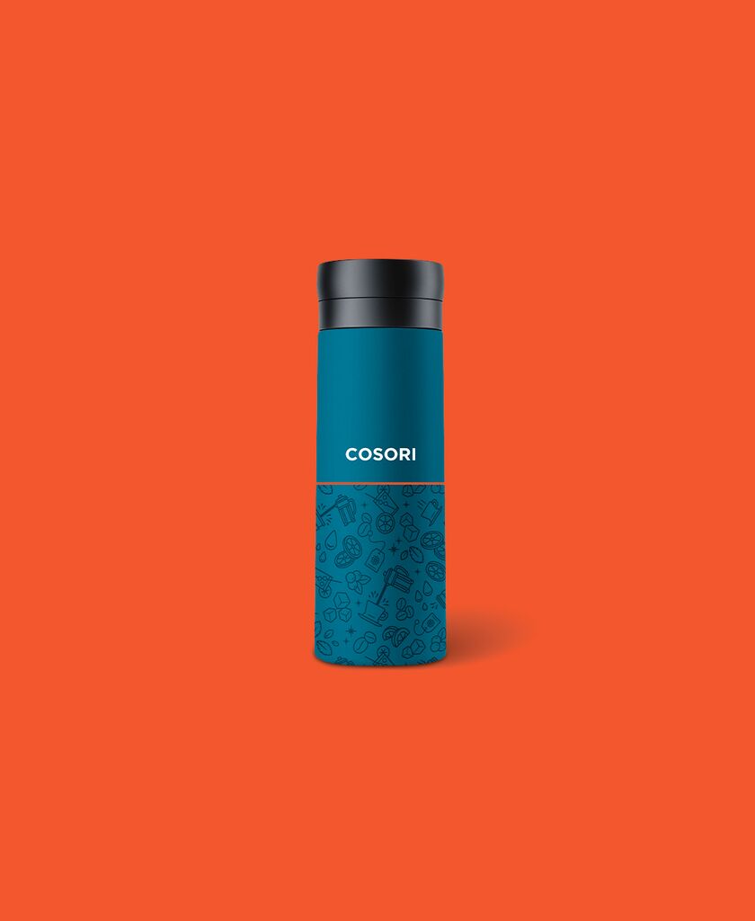
Brand Identity

Ugly Cookie

뒤로 다운로드

Ugly Cookie is a Helsinki-based biscuit company, run by a father and two teenagers, whose brand identity aims to convey the values of authenticity, friendliness and fun. The name “Ugly” comes from the fact that the company’s operators do not put much emphasis on appearances, but on how things actually are. The cookies are not meant to deceive consumers, but instead focus on their authentic essence, on simply tasting good. The creative idea came from the vision that the brand should celebrate imperfection and honesty. It is not about beauty ideals and looks, but about showing one’s real face with an assertive attitude. The key trademark is the logotype, which consists of the word “ugly” and the abstract, typically irregular shapes of the biscuits or blobs. The logo, in turn, features a charming face as a memorable and easily recognisable visual element for application across all touchpoints. The cornerstones of the implementation are natural materials in analogy to those used for the products themselves, pastel colours representing the various flavours, as well as unique dramatic photography. The cornerstones of the realisation are natural materials, analogous to the natural ingredients of the products themselves, pastel colours representing the different flavours, and distinct dramatic photography.

심사평

With an impressive sense of coherence and quality, this brand identity conveys what the biscuit company with the distinctive name Ugly Cookie is all about. The company’s genuine interest in the authenticity of both the look and taste of its products is expressed in the charming and playful logo, as well as in the natural colours and self-sufficient style of the photographs in a very credible and imaginative way.

Red Dot: Best of the Best

Others interested too