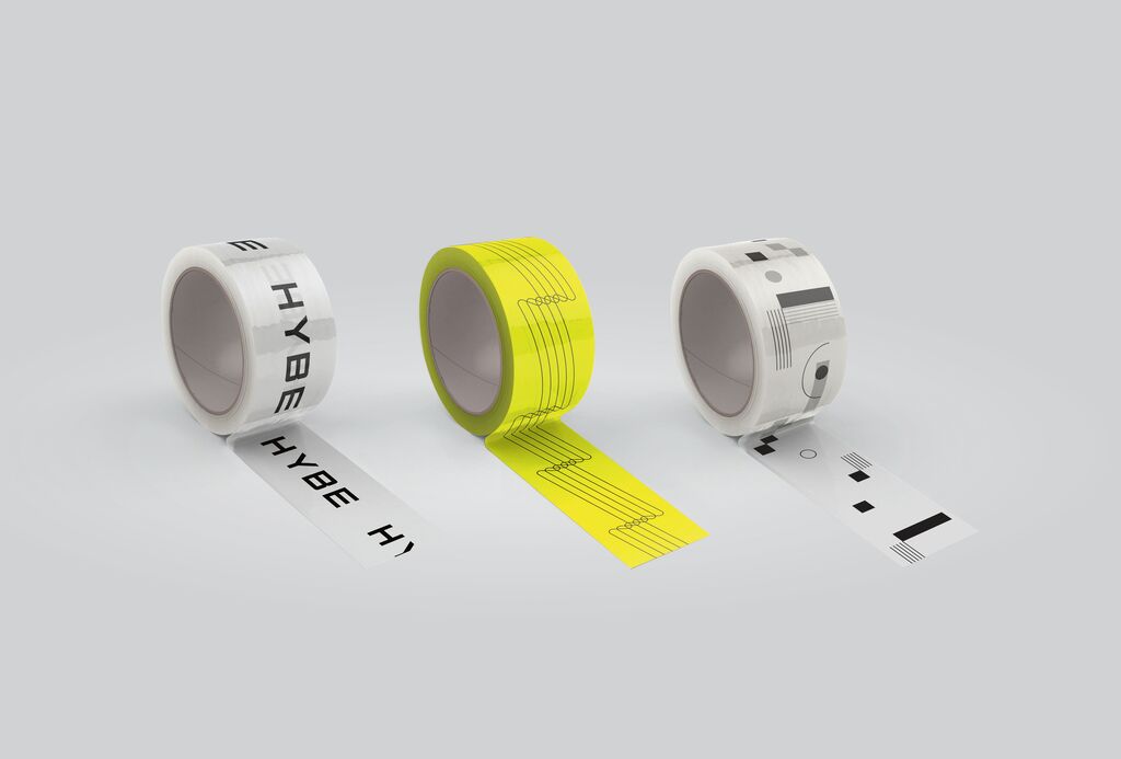
Visual Identity Relaunch,Typeface

WEMADE

뒤로 다운로드

WEMADE, a game company founded in 2000, needed a new visual identity to gain more creative freedom for business expansions as part of a thorough redesign of the corporate image. The new design system is based on a word mark in the newly developed custom font Infinity Sans, consisting of clearly readable and flexibly expandable letters. A design grid based on the golden section was created for the prominent placement of all letters and graphics. The colour scheme comprises a warm grey background colour, visualising the various business fields through different levels of brightness, as well as a bright green colour to express imagination and liveliness.

Red Dot

Others interested too