Cosmetics Packaging

THE BOOK

Back Download

The new beauty brand THE BOOK is based on two years of researching attitudes towards beauty. With the aim of placing importance not only on the visible outer aspects, the brand approaches beauty from both an external and an internal side to also factor in the mental aspects. Inspired by the fact that one often finds hints about life in books, the cosmetics line has been called THE BOOK. Building on the communication concept “Hint of Beauty”, it focuses on the question of “What is your beauty?” to inspire women to search for their own unique beauty independent of someone else’s standards. The packaging is designed in the shape of a book and even comes in a kind of slipcase, for the user to feel as if each droplet of the product encapsulates important words. Each given a name that could become someone’s life hint, such as “inspire”, “release” or “discover”, the products in the line are elegantly placed together in the box to form the letter “B”. The refined cream colour with delicate writing in gold further underlines the vital significance of inner beauty.

Statement by the Jury

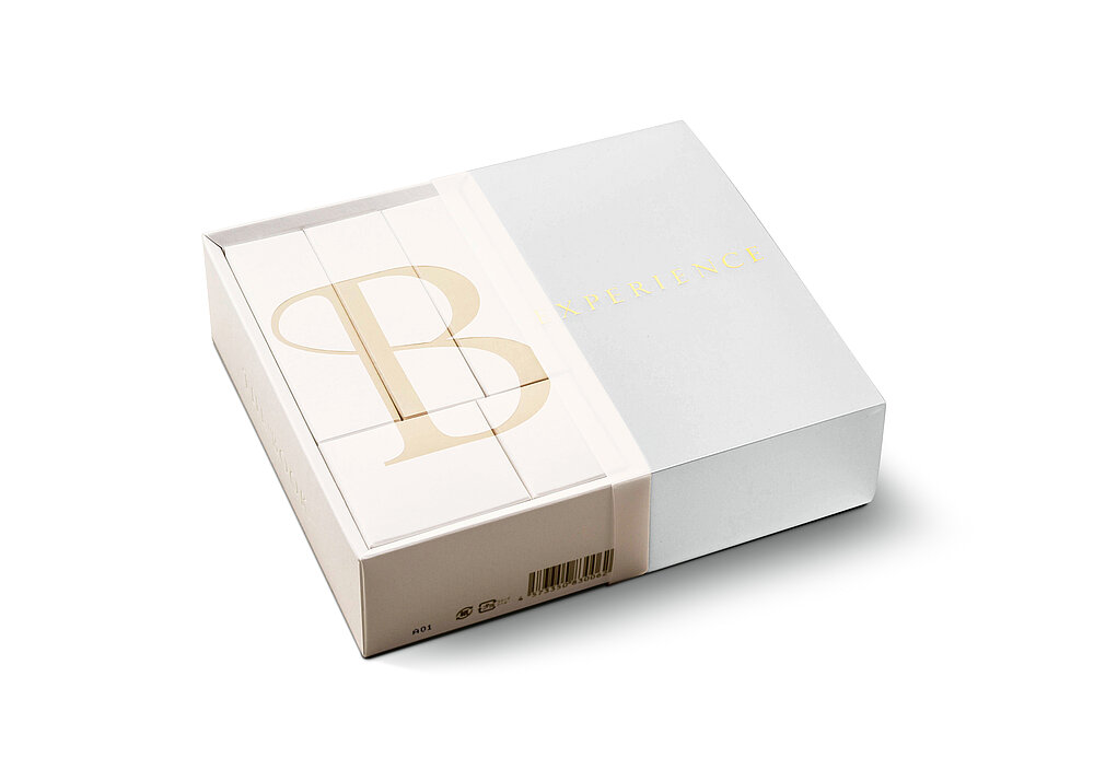
Striking in the simplicity of its design, fantastic in its idea, and highly aesthetic in its execution – these are immediately eye-catching features of the packaging design for the cosmetics series THE BOOK. The idea that clues to beauty can be found in oneself just like in a good book, consistently merges with the clear design, exclusive colour choice and haptic quality to form a wonderfully harmonious whole.

Red Dot: Best of the Best

By starting the video, you agree that data, e.g. your IP address, will be sent to Vimeo. vimeo.com/privacy

Others interested too