Unique cityscape gives cafe chain a new face - Bushe receives a Red Dot: Grand Prix for its brand design
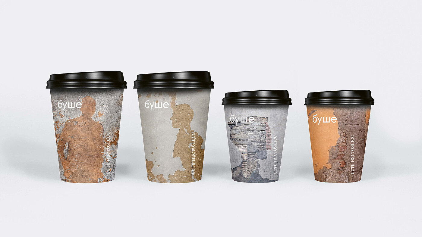
Muted palette of colours, crumbling wall plaster and rusty site fences – this is how parts of the urban textures in Saint Petersburg could be described. The structures, colours and architecture of the Russian city were the source of inspiration for the new visual identity of the coffee house chain “Bushe”. In 2019, the design was awarded the highest distinction in the "Communication Design" section in the Red Dot Award: Brands & Communication Design. The Red Dot: Grand Prix for the “Bushe” project was awarded to the brand of the same name and the responsible Moscow agency “Supermatika”.
Strong visual identity for well-known café
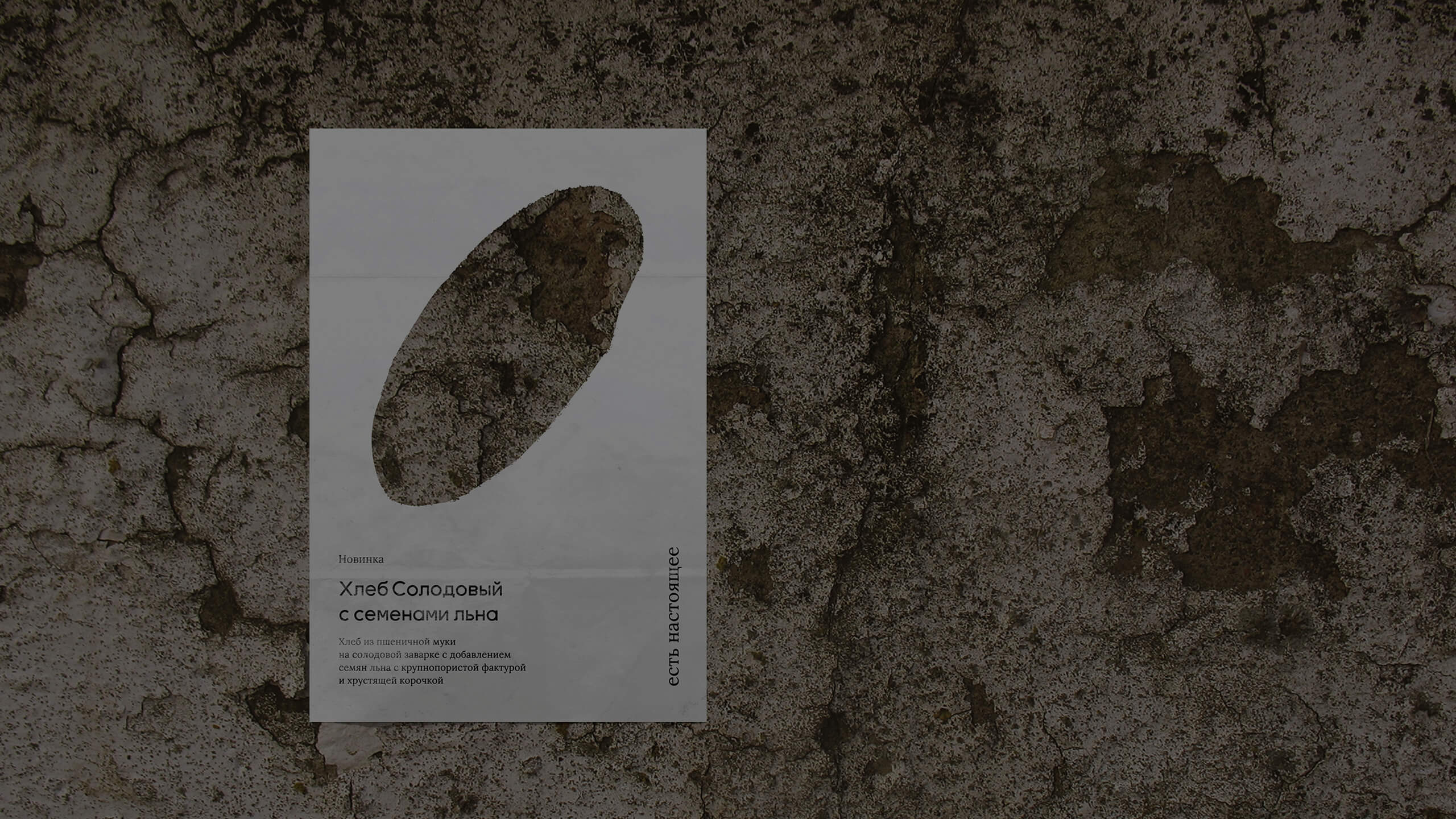
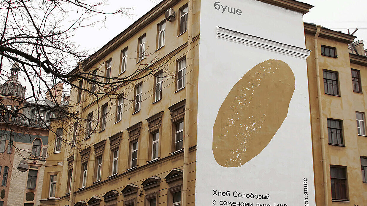
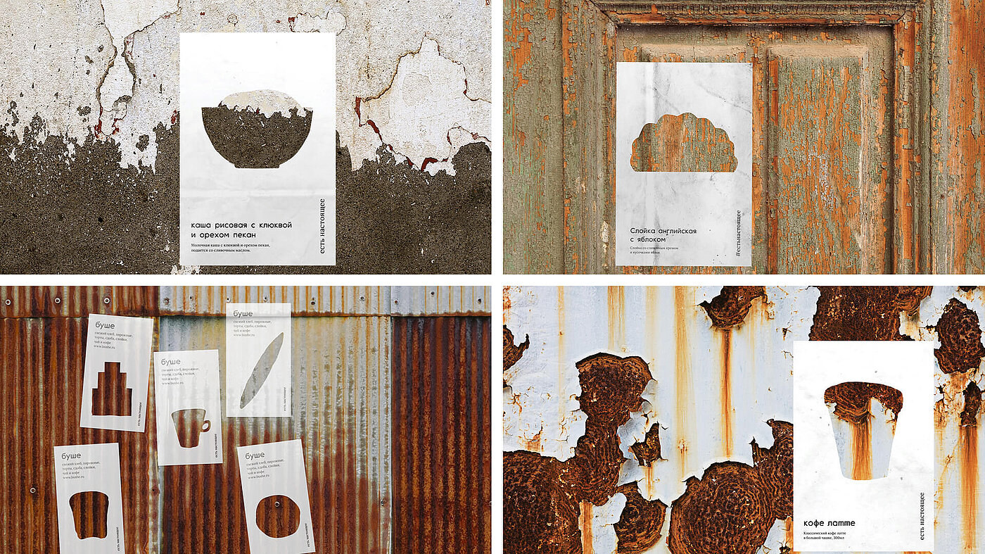
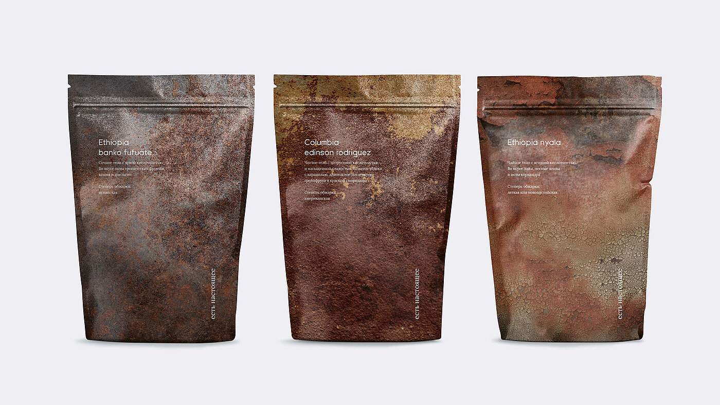
There are about 40 Bushe branches in Saint Petersburg. The café specialises in confectionery and bakery products. The company’s philosophy is based on a Russian pun, which can be translated as “keep eat [it] true [real]”. In this way, they clarifiy their focus on content and not on external glamour. Over the last 20 years, Bushe has become a symbol for the city and its architecture, for the special weather with only 80 sunny days per year, for the people and their stories. In keeping with this, the Russian agency “Suprematika” has succeeded in creating a new brand design for the chain that authentically reflects the city and thus Bushe itself in all its facets.
House walls with flaked paint or rusty doors – what at first glance seems unattractive, characterises the unique cityscape of St. Petersburg. Such visual details, textures and special surfaces, are the basis of Bushe’s visual identity. The design is complemented by a clear and modern typography. The new branding can be found on all print products of the café, such as posters, bean packaging, coffee mugs or souvenirs.
The statement of the jury
The Red Dot jury was enthusiastic about the brand design: “The design of the new branding for the Bushe coffee house chain in Saint Petersburg succeeds to impressive effect in translating the typical urban textures of an urban environment into a consistent graphical imagery. Peeling varnish on a wooden door or lichen-covered masonry is staged together with a sans-serif font in such a purist way across all involved media that they create an entirely self-sufficient appearance.”

Red Dot Award: Brands & Communication Design 2020
In the design competition, the experts evaluate creative works and brands every year, and finally awards prizes to those who have been able to convince with their design quality. In 2020, the international jury already made its decision at the end of June during an online jury session spanning several days. The winners will be presented in the online exhibition on the Red Dot website from 23 October. At the same time, it will also be announced who was able to convince the experts in a special way and can look forward to a Red Dot: Grand Prix this year.