Communication design – beastly good
Trends come and go. Especially in the age of the Internet, when our communication needs to keep up with our fast-paced society, new phenomena spring up like mushrooms. Some of them even become long runners like the so-called “cat content” which is very popular around the world. Animals are omnipresent and much-loved motives as they address consumers in an emotional way. How this can be achieved in an excellent way is demonstrated by numerous works which won a prize in the Red Dot Award: Communication Design and which the jury found beastly good.

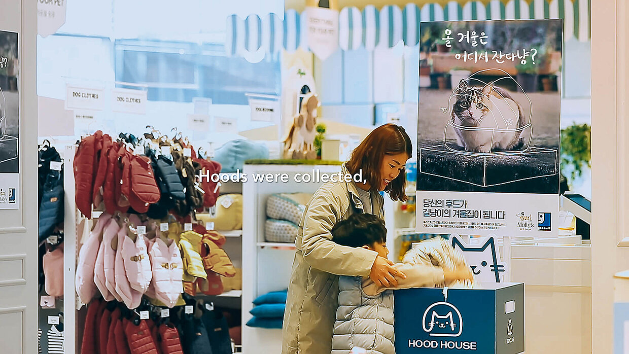
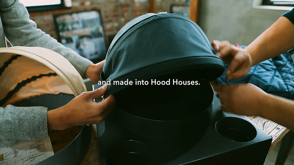
In the category “Advertising”, the Red Dot awarded out-of-home/ambient work “Hood House” convinced the jury. It attracts attention to a project that offers stray cats, which became more and more in the last decade in South Korea, a home. In collaboration with the national pet shop chain Molly’s Petshop, the retailer E-mart realised an eco-friendly solution: padded clothes were collected and transformed into portable cat shelters. They provide over 2,000 cats with a shelter which includes bowls for food and water. The accompanying campaign by Cheil Worldwide and YIGIL Co. from South Korea informed people that the shelters were given away for free at all Molly’s Petshop branches to customers who bought food for stray cats during a two-week period in December 2017.
Year of the dog
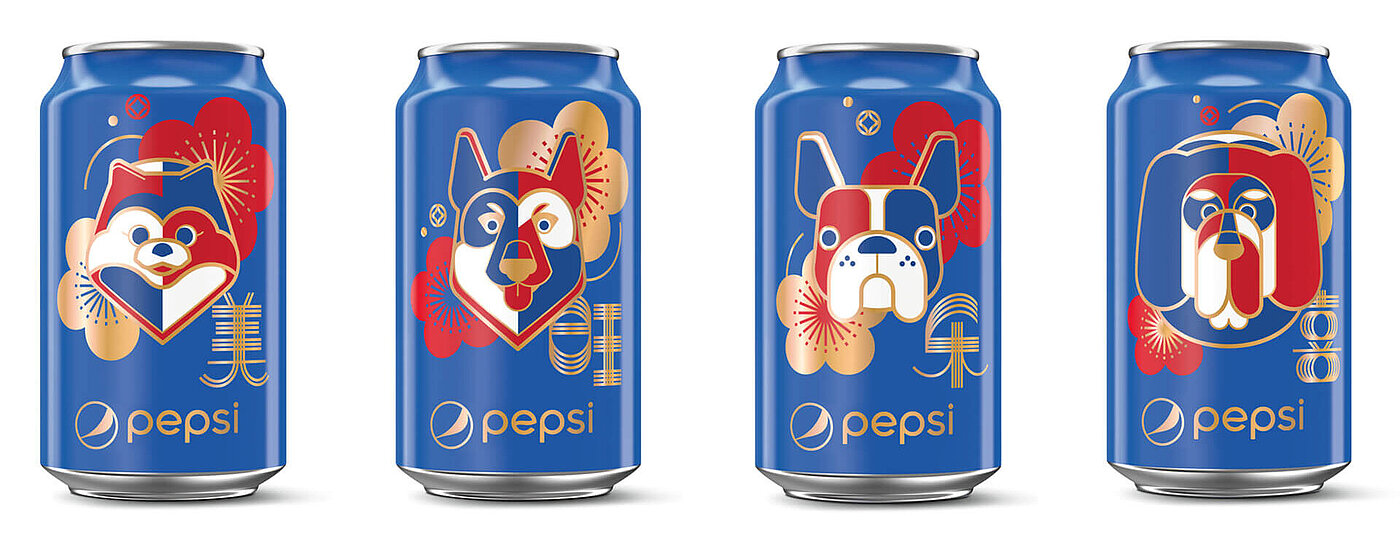
This limited edition by PepsiCo focuses on dogs. The Red Dot awarded can collection which was only available on e-commerce platforms came into being on the occasion of the Chinese New Year 2018. It shows the zodiac sign of the year, the dog, which is commemorated with a minimalist design. Solid colours framed with bold lines illustrate the various breeds and their unique personality traits. The design creates an impactful, daringly aspirational brand experience meant to resonate emotionally with the consumer.
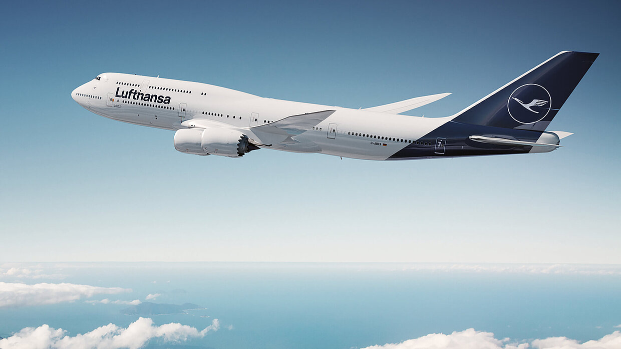

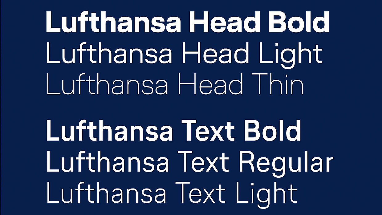
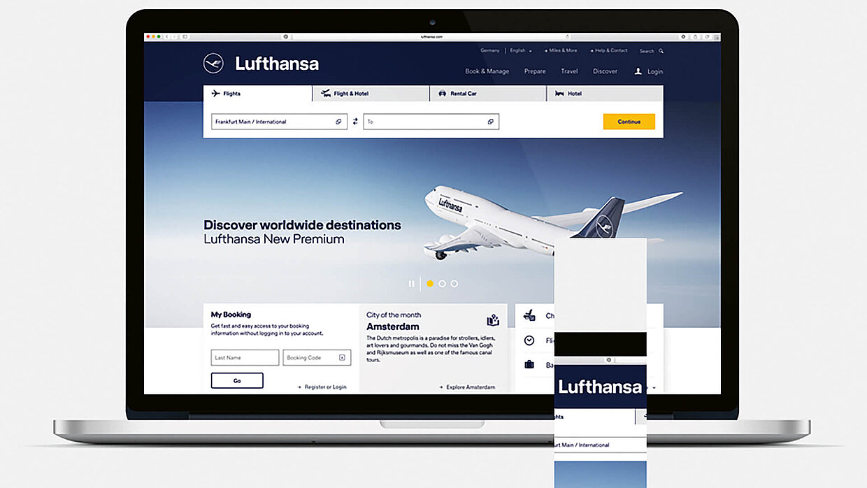
The corporate design is the core of a company’s public appearance. All the more brave is it to change one’s own visual identity. In 2018, Lufthansa dared to do so – 100 years after Otto Firle created the airline’s world-famous heraldic animal, the crane. The Red Dot awarded design relaunch which was realised by Munich-based agency Martin et Karczinski meets the requirements of digitalisation, globalisation and complexity. It expresses the company’s positioning as a premium brand what is especially reflected in the re-design of the logo that features a slimmer bird. The contemporary visual appearance which focuses increasingly on the blue colour is among others supported by a new typography.
Terrific appearance
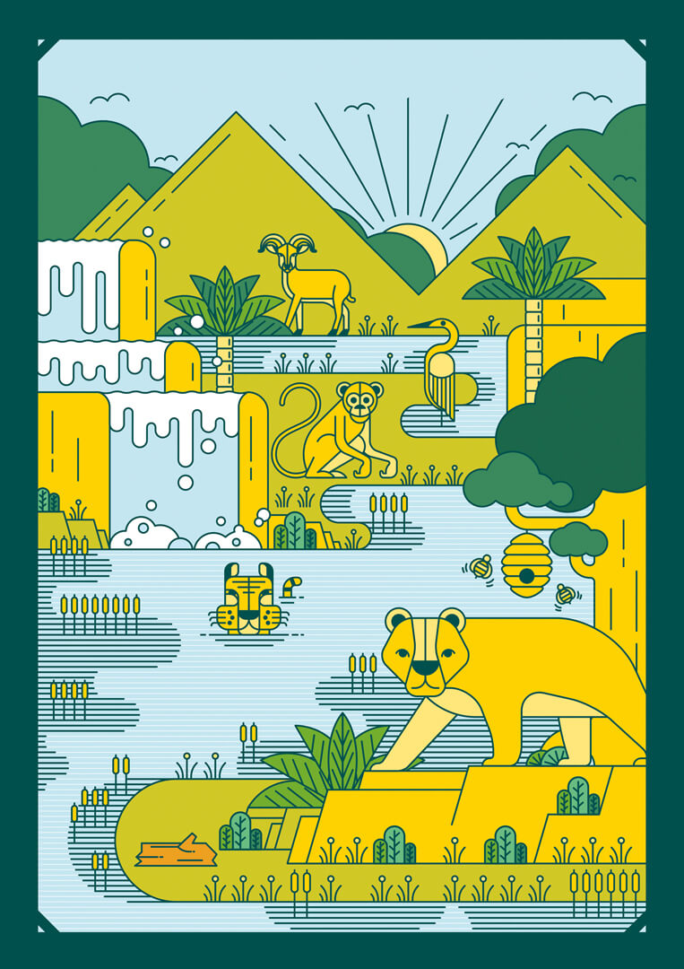
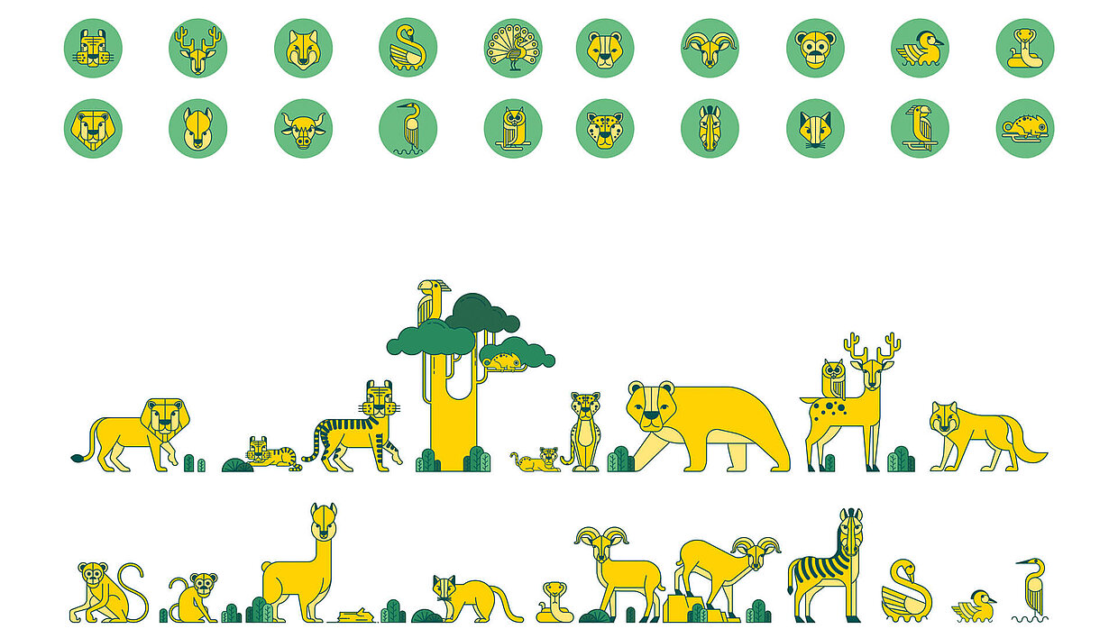
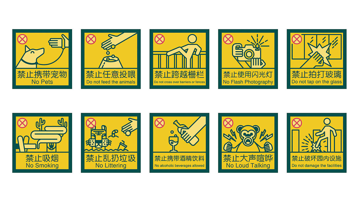
urrounded by hills and waters, “Qianling Zoo”, which extends to a space of approximately 13.3 hectares, is embedded in a beautiful landscape. “Qianling” means monkey in Chinese, which is why the zoo houses among others more than 500 monkeys. In order to intensify the branding of the zoo and provide vistors with a better orientation on this huge area, Hefei Weiguo Design Studio designed a clear and recognisable visual identity which was awarded with the Red Dot in 2018. Appropriate to the topic, it is based on natural colours and fairytale-like images. The orientation system meets the requirements of navigation, education and interaction. Plain pictograms and repeated colour patterns help international visitors to find their way around and convey fascinating information about the animals.

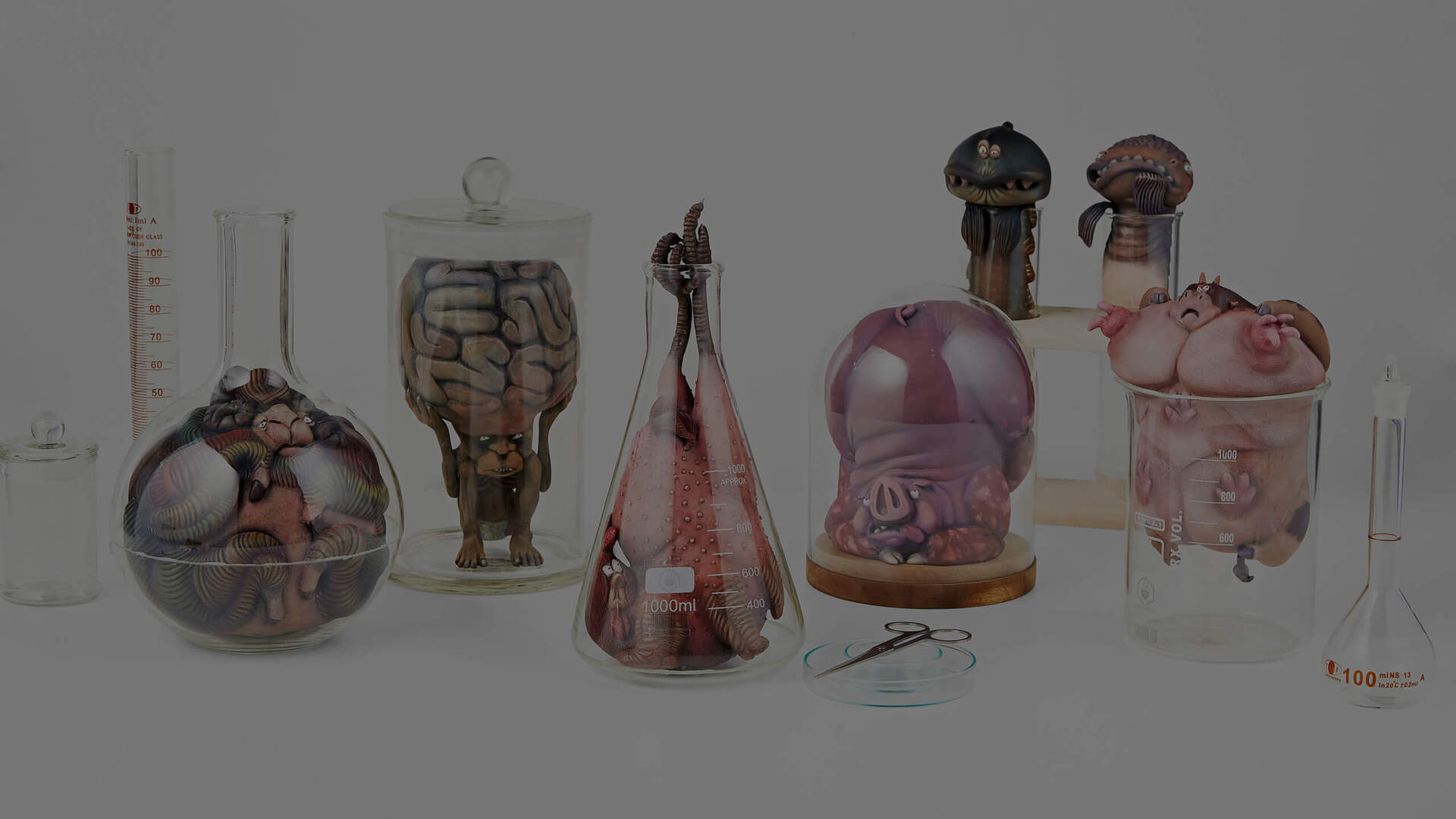
For the rights of animals
The character design “Monster Laboratory” deals with the topic of the rights of animals and visualises the unpredictable consequences of genetic modification impressively. The illustration which won a Red Dot: Best of the Best depicts the suffering of the animals which become part of the “monster laboratory” as genetically deformed, scary creatures. They are affected by further deformation through the apparatuses in which they are jammed and from which they likewise originated.
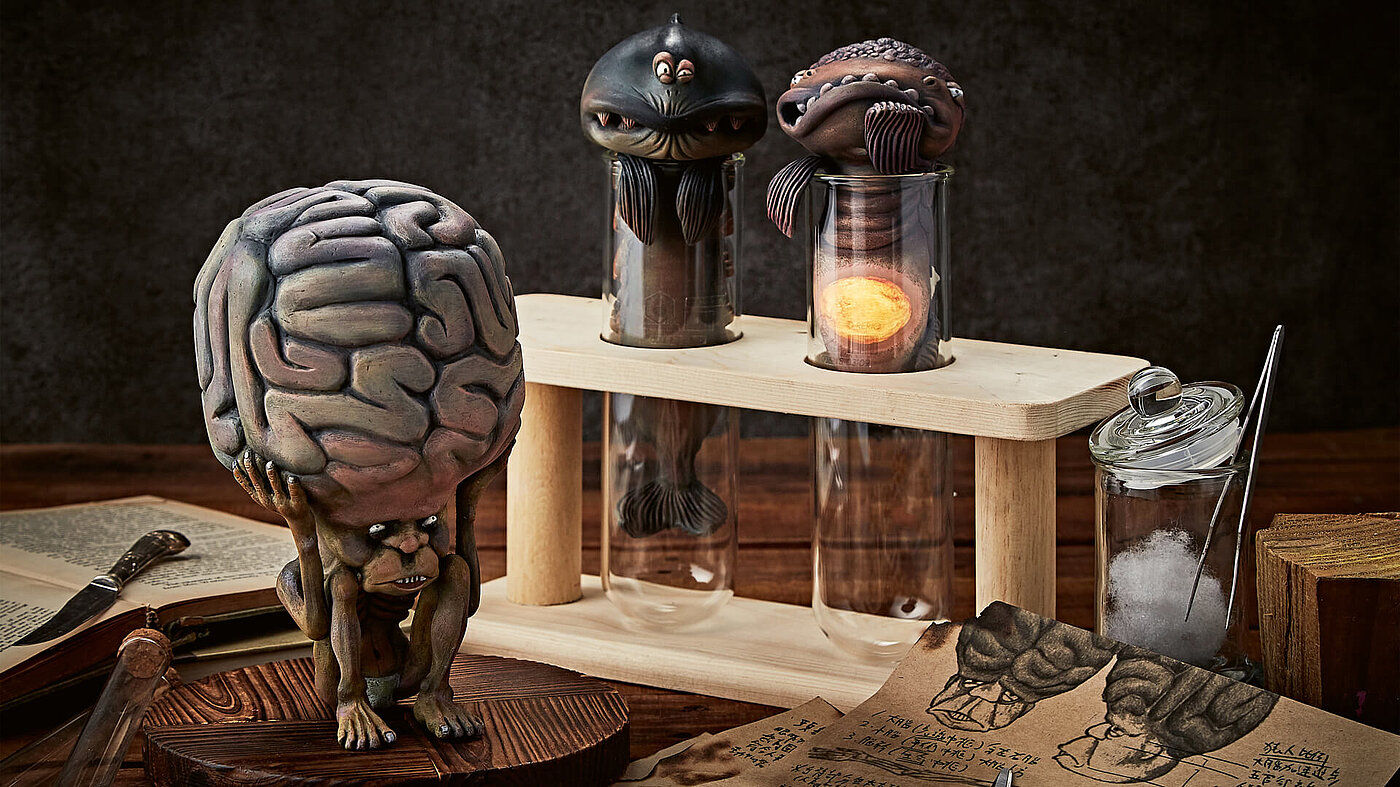
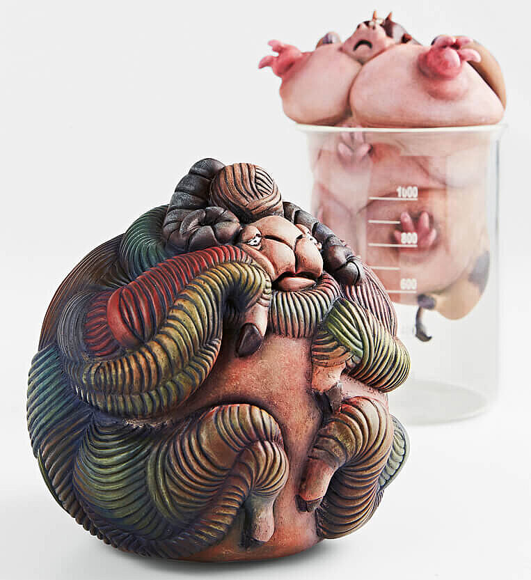
“The fact that the design of these illustrations chooses such a realistic approach towards depicting the topic of genetic engineering reinforces the creeping effect that it seeks to evoke,” said the Red Dot Jury 2018 about the work which was designed by Wen-Chun Chao, Chong-Fu Huang, Chao-Chun Yu, He-Ting Hsieh and Yu-Wei Chen from Tainan University of Technology in Taiwan. “The idea to realise the ‘monsters’ not as two but three-dimensional illustrations makes these depictions both fascinating and utterly repugnant. The intended message of weighing the benefits of genetic manipulation against the agony of the animals is thus conveyed in a highly impressive manner.”
Red Dot Award: Communication Design 2019
Companies and designers who want to score points before the jury with their beastly good communications projects can enter their works in the Red Dot Award: Communication Design from 4 March. For taking part, they can choose from 17 categories which spread the entire range of contemporary communication design.