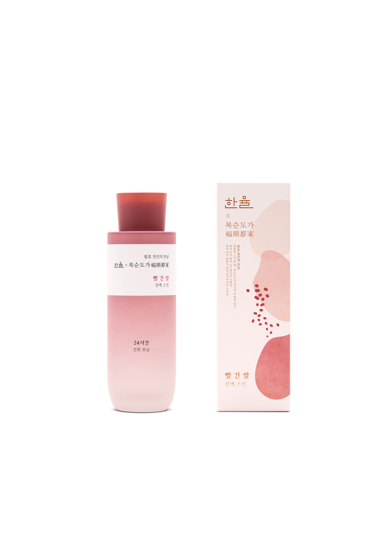
This high-quality skincare product is formulated with red rice. A lengthy fermentation process gives the originally brown rice its red colour and the intention was to reflect that in the packaging. The dynamic colour gradient on the bottle is conspicuously disrupted by an ivory band. The external packaging references the fermentation process of the key ingredient in the form of an illustration that depicts three organic shapes in different colour shades as well as grains of red rice.
评审团评语
The expressive packaging of this skincare product succeeds in subtle storytelling that is convincing both visually and in terms of content.
参与人士
Manufacturer:
AMOREPACIFIC, Seoul, South Korea
In-house design:
Brand Creative 2 Team (Rami Kang, Jeehyo In, Ah Ran Kwak)