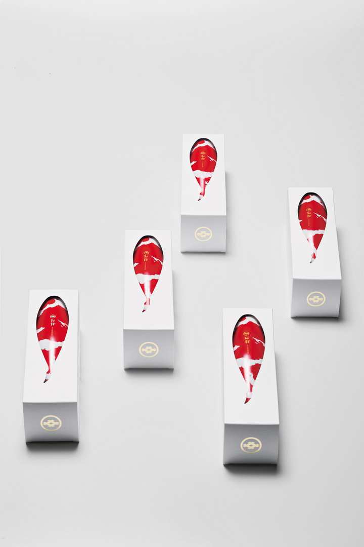
This packaging design for Sake, called “KOI”, has chosen the most famous Japanese ornamental koi fish as a key visual. Its typical red pattern is printed directly onto the white bottle, which resembles the shape of a koi, using a Japanese brushstroke technique. By cutting the shape of the fish silhouette out of the box, the image of a koi is visually emphasised. The colour contrast in combination with the gold-hued accents creates a luxury impression and achieves a high degree of differentiation from competing products at the point of sale. The beauty of the design encourages reuse of the bottle as a decorative object.
参与人士
Printing:
Tatsuhiro Yamagishi, Yamaharu Glass Co. Ltd., Tokyo Shunsuke Kayama, Taiyo Printing Co. Ltd., Tokyo