Mr. Eco is a sub-brand of the company MARTINI SPA, a leader in Italy in the field of home care and personal care accessories. MARTINI SPA has taken an environmentally friendly and more sustainable approach for many years. However, it is in 2020 that the brand Mr. Eco was presented as the company’s response to the increasing demand for environmentally friendly products. Under the brand name Mr. Eco, a new collection of sponges and accessories for household cleaning are being launched, all made from organic, biodegradable raw materials. The product range comprises sponges made of vegetable cellulose, loofah and natural fibre scrubbers, antibacterial dish brushes made of copper and stainless steel, scouring sponges made of wood with sisal bristles and viscose cloths made of bamboo and cotton.
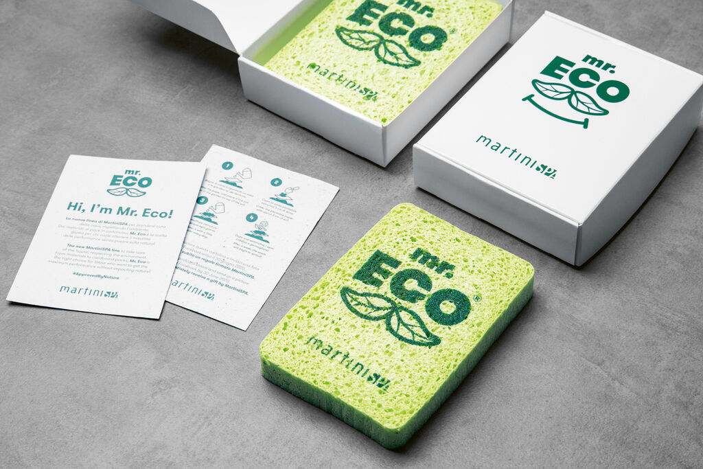
Constituting the key element of the visual brand identity, the logotype of the brand name reminds one of a face due to the lettering and two complementing leaves, which are positioned below the brand name and thus look like a moustache. The “Mr.” stands in a smaller font above “Eco”, drawing additional attention to the message that the products are environmentally friendly. The font Walsheim with its geometric sans-serif letters was chosen as it projects the notions of openness and friendliness. As for the visual language, the logo is placed on a green sponge turning it into the charming brand ambassador Mr. Eco, who even has grown arms and legs in order to come to life in both print media and short films to provide consumers with tips on recycling and environmental protection.
The packaging, in which all Mr. Eco products present themselves in retail, consists exclusively of FSC-certified paper. The packaging design too is dominated by the dark green logo on a white background. It is complemented by product information placed prominently below it in different font sizes, yet in the same typography and colour. The MARTINI SPA lettering forms the footer, which is also featured here in the same colour, so that a harmonious overall appearance is created despite the co-branding.