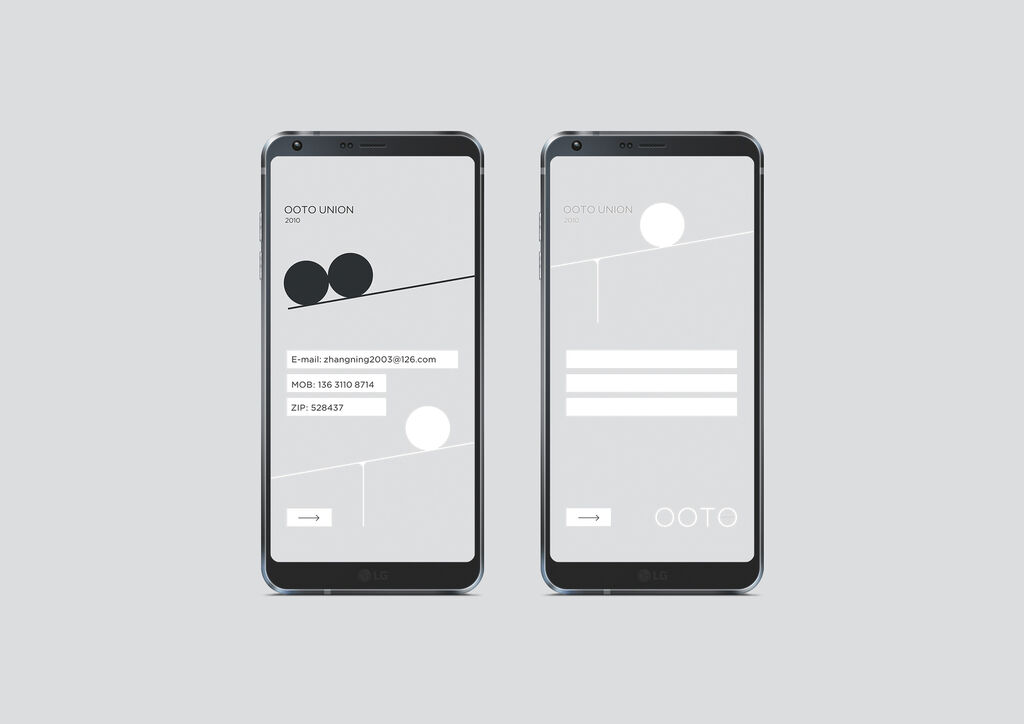
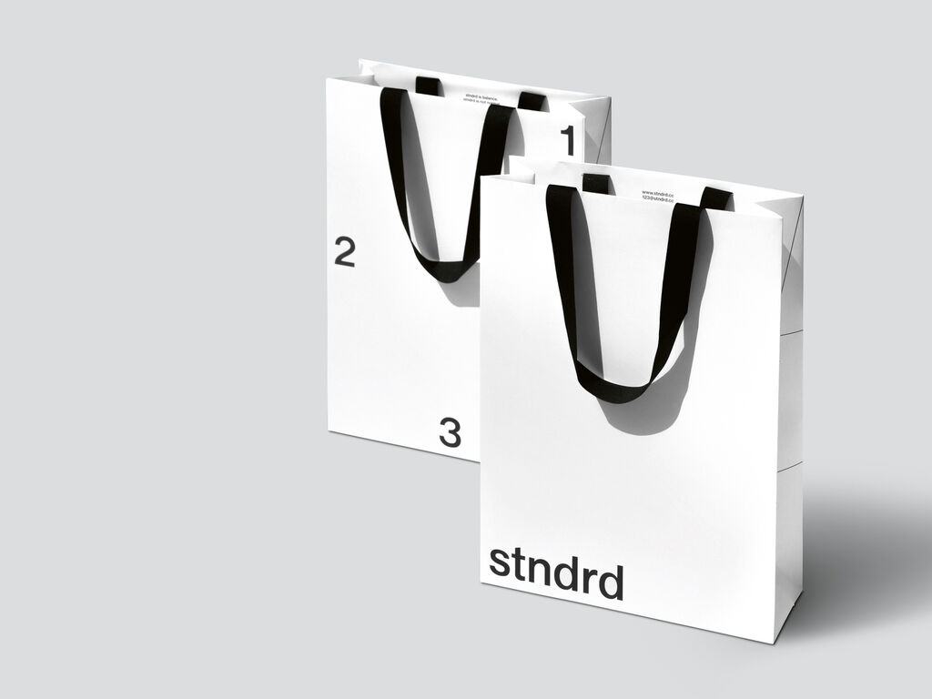
Client: Kia Corporation, Seoul, South Korea
Visual Identity
OOTO UNION
OOTO UNION is a consultancy company focusing on Internet New Media Marketing, especially creating marketing alliances for small and medium-sized enterprises to win more market share. A visual identity was created to match the name, showing a graphical representation of the letters in OOTO. The logo shows the T in the form of a see-saw and the three Os as spheres which express the core idea of the concept: companies achieve together more weight and significance. The visually attractive appearance creates a puristic, elegant feel. The contrast of black and white is used in different variations for effect.
参与人士
-
Client:OOTO UNION, Dongguan, China
-
Design:Zhang Ning Design Studio, Zhongshan, China
-
Art Direction:Zhang Ning