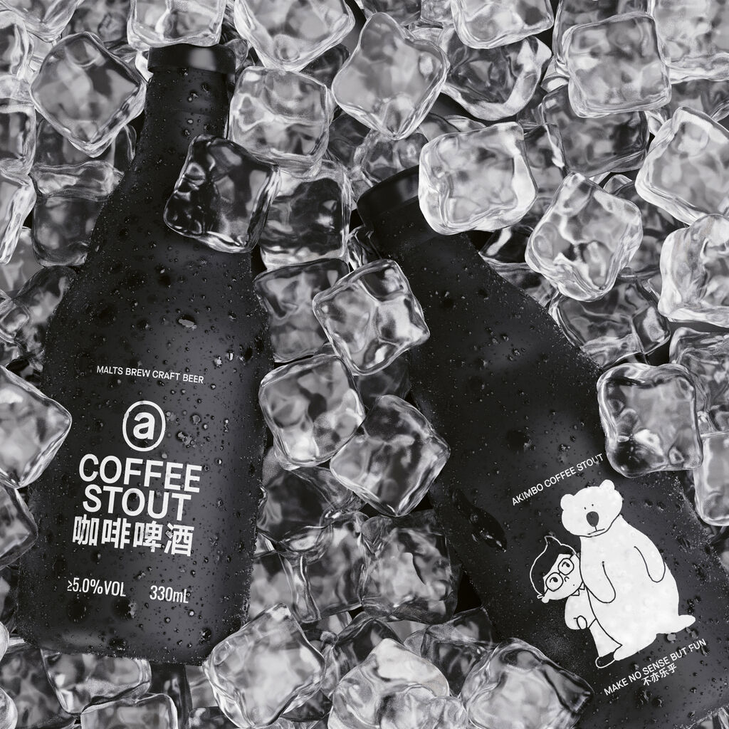
The Paretto brand targets sophisticated, educated Russians. The task of this packaging concept is based on the product promise of subtle coffee nuances and the highest quality. By creating a high-end feel for the brand, a specific visual language was created. In addition, mystical coloured shapes were chosen to represent each blend. The basic colour of black in combination with detailed pictograms fosters a unique design language to strengthen the brand image. This has resulted in distinctive packaging, which effectively increases market share.