Cosmetics Packaging

POLA White Shot

返回 Download

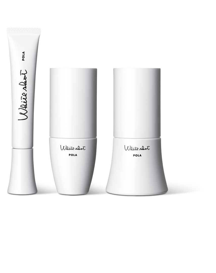
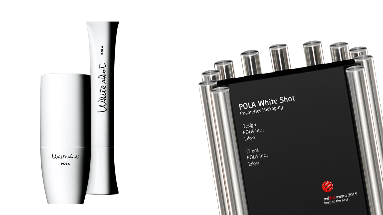
White Shot is a line of skin-lightening products from Japanese manufacturer POLA that, for over eight decades, has earned a global reputation for advanced, high-quality skincare and cosmetic products. The logo is rendered in cursive, suggesting a handwritten promise to deliver the desired results. The glossy black dispenser atop the white matte bottle provides a contrast in textures that makes the white stand out. The two containers fit together perfectly thanks to their complementary shapes and convey a sense of superior, waste-free functionality. The presentation is that of a small but powerful product. The clear form with slightly convex and concavely shaped elegant lines, the reduced lettering and the purist colour design further contribute to conveying the intended message that these products are not only natural and effective but also highly exclusive.

评审团评语

The packaging design for the POLA cosmetics products is marked by a superimposed minimalism: pure in black and white colour, clear in form and self-assertive in typography, the design emerged as the reduction to the absolute essential, a design that stands out for its consistency, resulting in a highly aesthetic appearance.

Red Dot: Best of the Best

By starting the video, you agree that data, e.g. your IP address, will be sent to Vimeo. vimeo.com/privacy

Others interested too