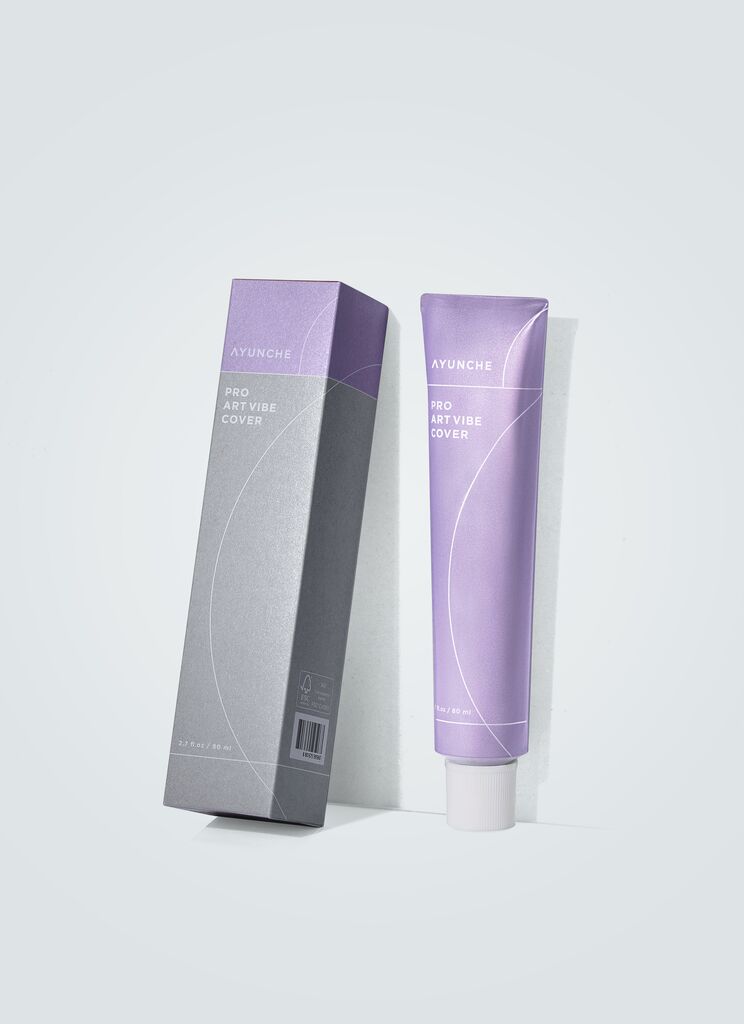
Red Dot Gala: Product Design 2025 Start Livestream: 8 July, 5:45 pm (CEST)
00 days
00 hours
00 minutes
Beverage Packaging, Visual Identity

ProViva

返回 Download

Since its launch in the early 1990s, the brand ProViva has become a key functional beverage in Sweden, particularly popular with older consumers. To appeal to a younger audience and better differentiate the packaging, the brand strategy, visual identity and packaging have been completely redesigned to reflect the excellent bacteria that the juices contain. They were brought to life in a confident and fun way and developed as a variety of charismatic fruit and bacteria “promojis”. These can be incorporated into the design on the front of each pack in different ways to both communicate the healthy benefits of the good bacteria and highlight the various flavours. The new logo, the word mark, was designed to be simple and appealing, with the particular subtlety of the “O” visualising the individual fruit and highlighting it by its size. The combination of typography and the unmistakable charm of the bacteria as playful elements swirling as if weightless on the packaging thus gives the brand an innovative, invigorating identity.Statement by the juryThe new packaging design for ProViva convinces with an idea that conveys the core message in a particularly light-hearted and original way. The addition of the healthy bacteria, visualised as small humorous icons, is thematically ideal and – even without clear naming – immediately comprehensible. With a wink of the eye, intestinal health and the range of different types of fruit are thus linked in a vivid and appealing way.

Red Dot: Best of the Best

Others interested too