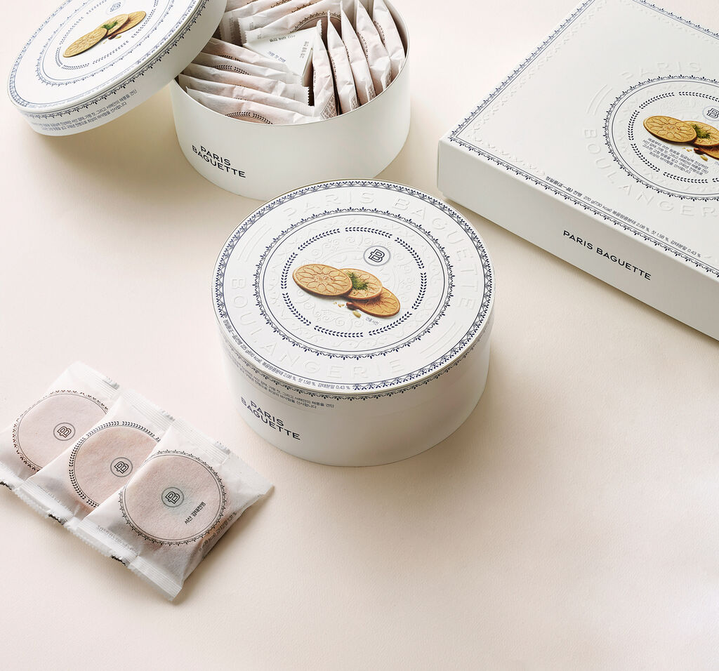
This beverage packaging for Serenity Valley wine was inspired by its place of origin in the Yunnan province of China, a pristine, high-altitude region. With spring-like seasons and a pleasant climate, it is suited to organic grape-growing, including various wild grape varieties with a rich and mild flavour. The simple and intuitive design stages the Serenity Valley logotype as a vine branch, while ten Arabic numerals form a cluster of ripe grapes. The colours distinguish between different ages and prices. The image of a large vineyard is created when many products are placed next to each other.
参与人士
Client:
8DAO Design Studio, Shenzhen, China
Design:
8DAO Design Studio, Shenzhen, China
Project Team:
Wu Xianfeng (Designer)
Long Manlan (Designer)
Tan Chao (Designer)