Transit Sangbong is a redevelopment project that transforms a former intercity bus terminal into a vibrant mixed-use complex. The goal is to turn the site from a transportation hub into a community-centred space, bringing renewed vitality by fostering connections among people and regions. The brand identity was developed around the central question: how can the project's core value, which is to connect people and places through community, be effectively communicated?
The logotype is created based on the practical and universal DIN typeface, customised with rounded edges to create a friendly yet modern impression. This reflects the intention for the space to be one of interaction and connection. The two connected 'T's in the logo symbolise Transit Sangbong's role as a conduit between individuals and communities.
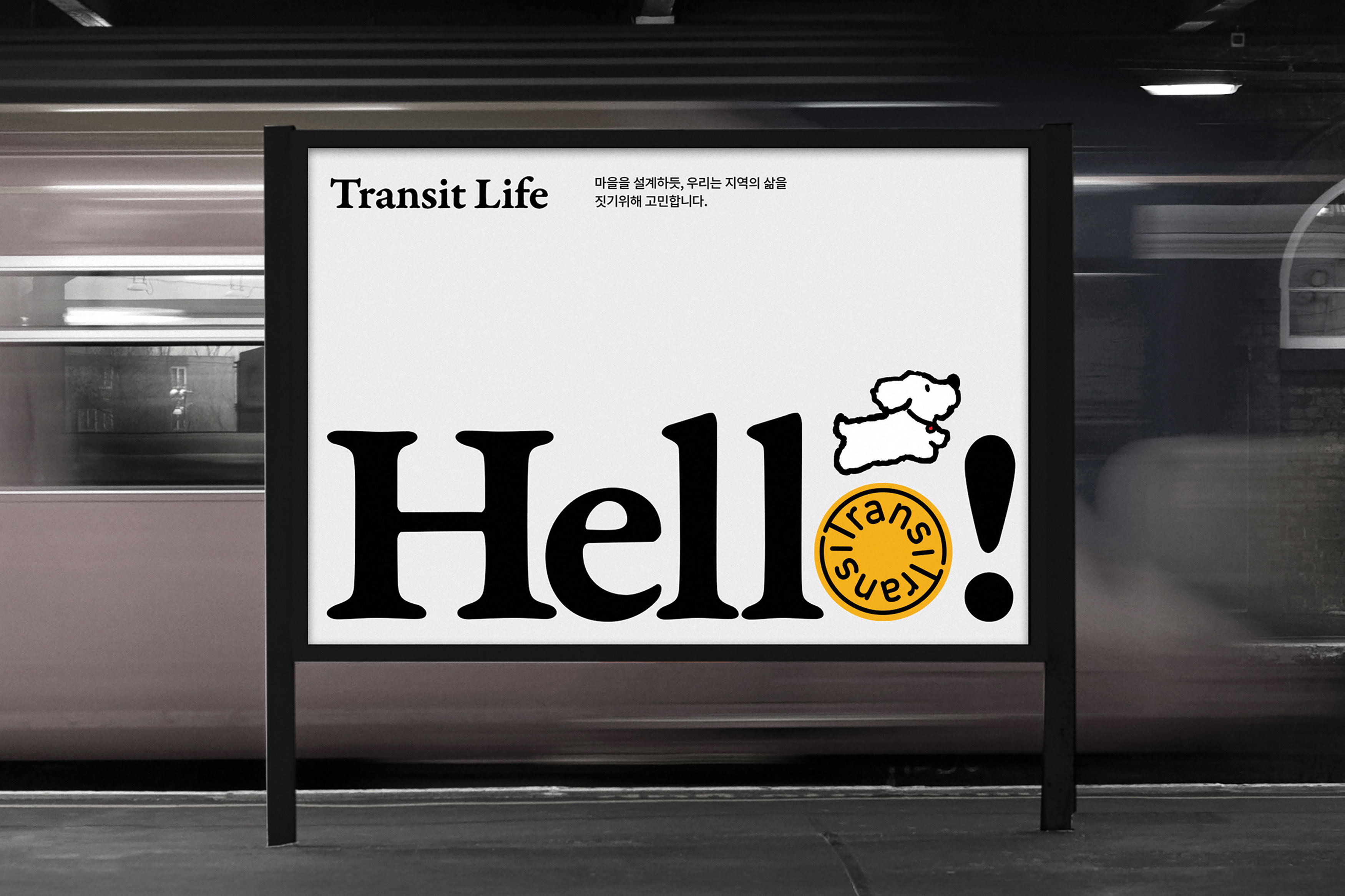
The round frame around the logo references the site's past as a bus terminal, drawing visual cues from familiar traffic signs. This design honours the location's legacy while introducing a modern sensibility, balancing the old and new. Additionally, graphic elements that reinforce connectivity were applied to convey the site's lively atmosphere, conveying that Transit Sangbong is more than just a physical place — it is a hub for interaction, exchange, and community building.
Red Dot Award: Design Concept | Concept | Brand Design and Identity