Xiom embodies universal harmony and endless interaction, constantly evolving to create new opportunities. Rooted in the spirit of table tennis — a sport built on interaction, connection, and harmony — Xiom's philosophy is clear: 'Connecting everything to create sustainable value.' The brand continues to explore the essence of people, sport, and technology through continuous evolution.
At the heart of Xiom is the concept of 'interaction', representing the connections between people, technology, and sport and the dynamic exchanges that give table tennis its vitality ('inter'); reflecting energy and transformation, driving Xiom's relentless innovation and growth ('action'). Together, 'interaction' signifies a broader vision of communication, collaboration, and growth, creating new bridges between the brand, its users, and the technology.
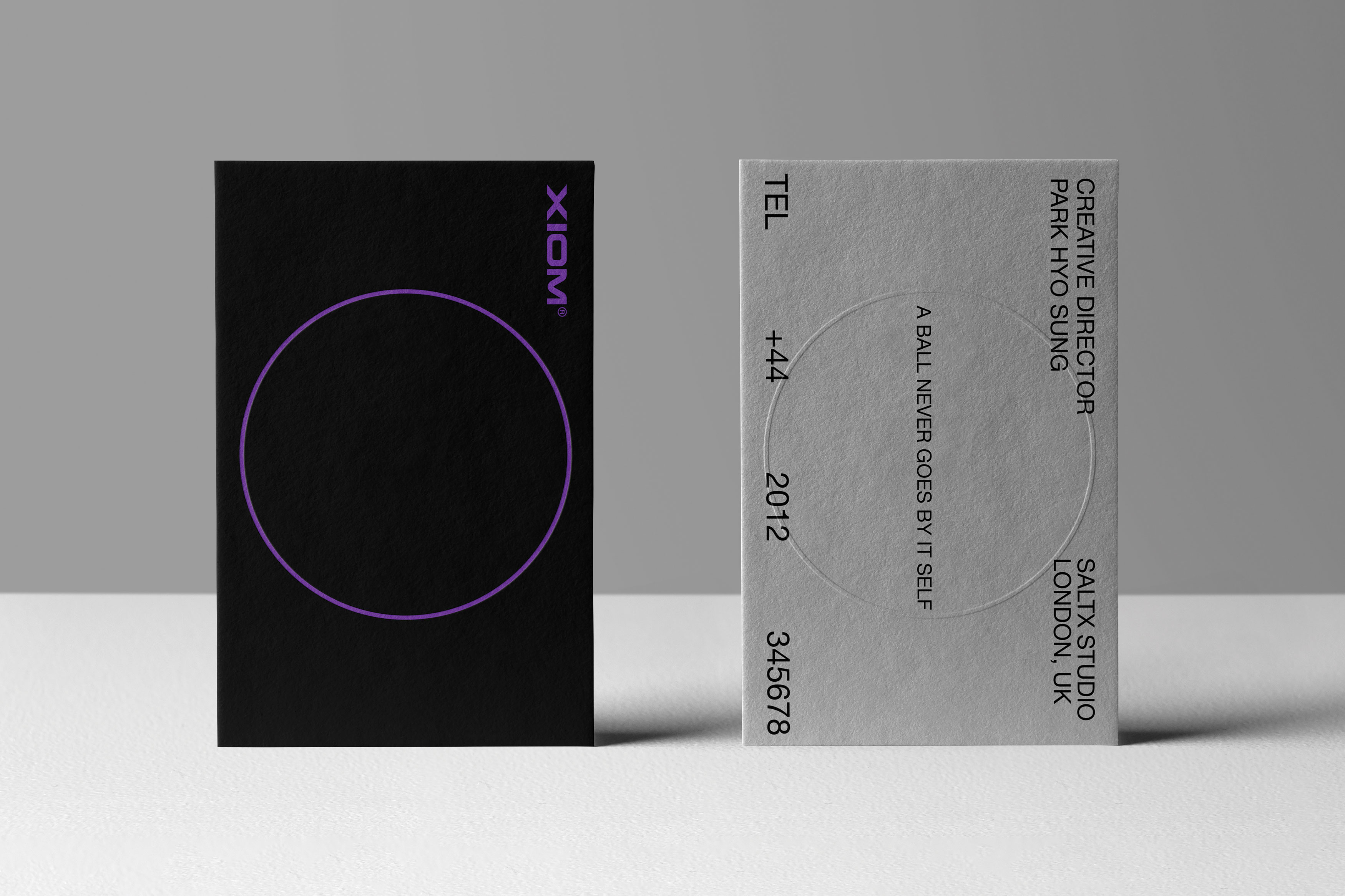
Xiom's key visual, the 'Solid Wave', captures the brand's bold presence through a dynamic composition of curves, expansion, and circular forms. The flowing curves echo the fluid motion of table tennis and suggest natural harmony and connection. Expansion symbolises growth, innovation, and endless forward motion. The circle, referencing the table tennis ball, embodies unity, balance, and interaction. Through this visual language, Xiom blends tradition with innovation, unlocking new paradigms while fostering interaction, connection, and infinite possibilities.
Red Dot Award: Design Concept | Concept | Brand Design and Identity