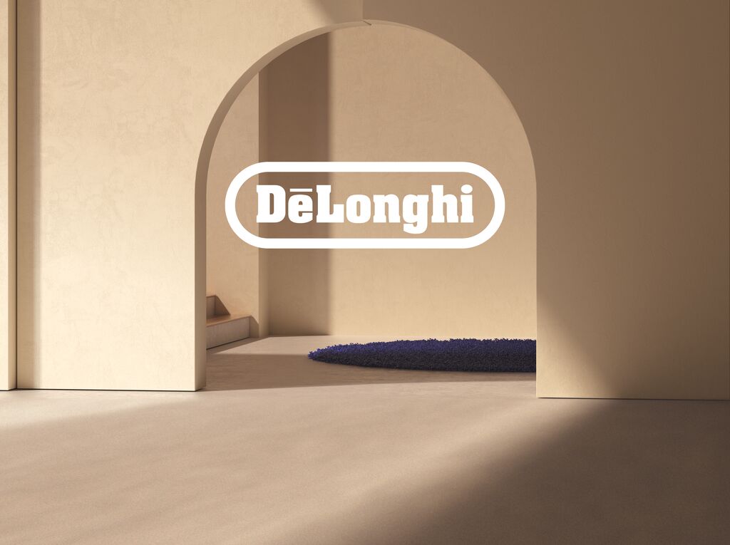
A new, visually powerful corporate design was created to lend the manufacturer of lamps which are available in DIY stores an image of international flair. The conciseness of the word mark, which consists of capital letters, is effectively enhanced by its signal red colour. In combination with white or dark backgrounds as well as emotionally appealing key visuals, the distinctive corporate image consistently runs from the POS to the website. The claim “Light. Inspired by life.” represents a lifestyle brand which, with its three design areas of Urban, Nature and Classic, caters to different customer preferences.