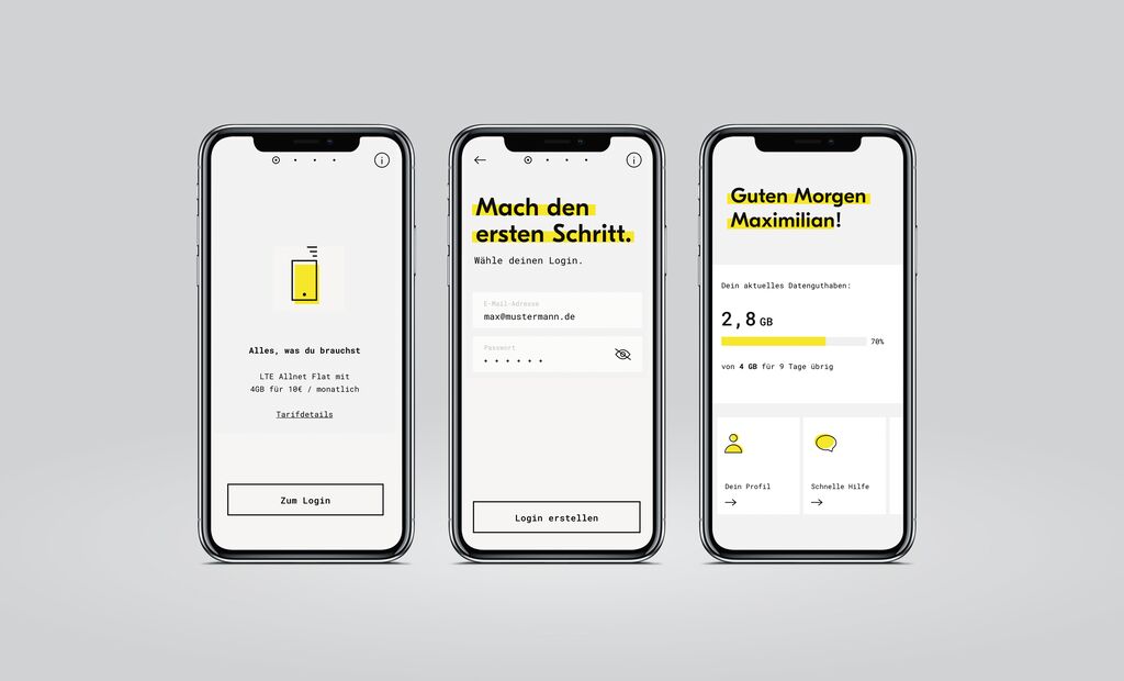
Corporate Design,Visual Identity

City of Oslo

Zurück Download

In recent years, about 250 different logos related to Oslo had built up, cluttering the perception of a clear and recognisable image of the city, its various institutions and many services. The new visual identity is based on a logo that was created by modernising and simplifying the city’s seal showing the patron Saint Hallvard. In addition, a flexible system of shapes has been developed that are inspired by architectural details of the city and which can be reconfigured almost infinitely. They can also spell the name “Oslo” as a word picture. The new identity is easily recognisable as a unity and at the same time offers broad application flexibility. The design is suitable across all 2D and 3D communication media and features versatile communication styles from sober and authoritative to playful and dynamic. The identity is also in keeping with the requirements of universal design. The Digital Design Assistant allows any of the city’s employees to input information and upload photos to receive automatically designed and exportable layouts, and thus use the new identity as an efficient tool that helps the city to connect with its residents.

Begründung der Jury

The new visual identity of the city of Oslo impresses with a contemporary and transparent revision of the city seal logo. The modularly designed building block system for the word mark is fascinating. Allowing for a myriad of different configurations, its angular and round elements are not only playful and aesthetically appealing, they can also be handled flexibly and easily by any employee.

Red Dot: Best of the Best

Durch Starten des Videos erklären Sie sich damit einverstanden, dass Daten wie z.B. Ihre IP-Adresse an Vimeo übermittelt werden. vimeo.com/privacy

Andere interessierte auch