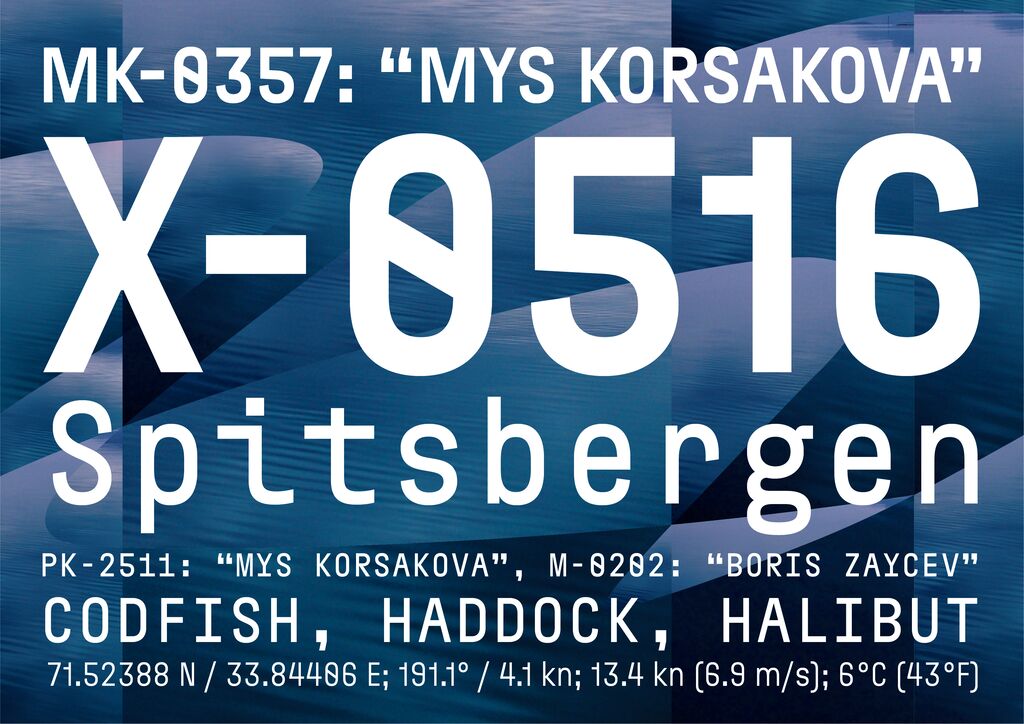
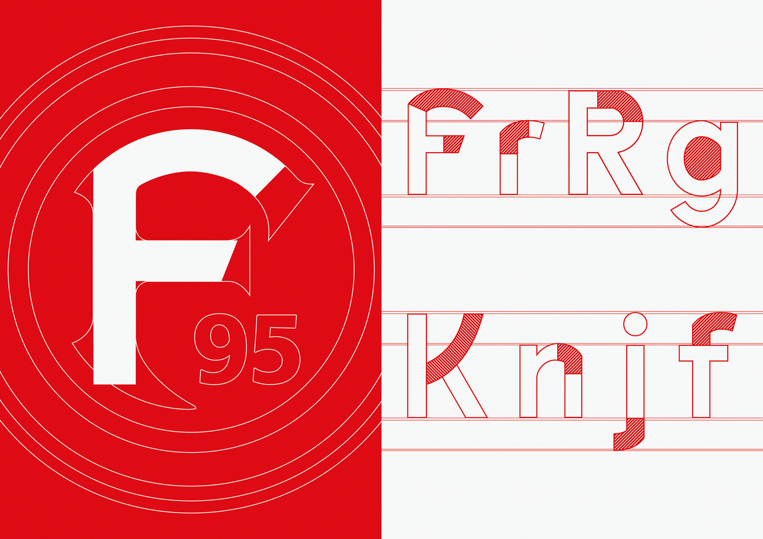
Typeface

Fortuna Sans

Zurück Download

The font is an essential element for transporting content. The new corporate typeface for Fortuna Düsseldorf also reflects the philosophy and the somewhat bumpy history of the club. Consequently, the design of Fortuna Sans is based on the logo of the club. The characteristic “F” from the logo with its striking forms serves as a basis of the typeface, giving it an unmistakable character with a mind of its own. For the sake of readability, the shapes are subtle yet very distinct in order to build a strong appearance throughout the club’s visual communication.

Red Dot

Andere interessierte auch