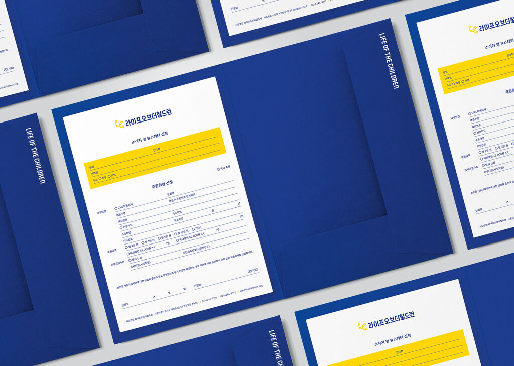
The company mmcité+ is active in public space and transport infrastructure projects by contributing city furniture designs including park benches, bike racks, waiting halls and information systems. The overall concept of its visual identity is inspired by the mission statement that the company’s products and projects should not attract attention primarily through their design, but rather through their guarantee of functionality and appropriate placement in the environment. The result is a typographic logotype supplemented by an encircled “+” symbol aimed at visualising the main features of the companies belonging to the group: bold visions, interconnections and closeness. The newly designed Cité Grotesk font contains rounded, vertical and horizontal shapes originating in the graphic symbol of the logotype. The three font styles ensure a consistent visual language across digital presentations, invoices and other documents. For short claims and posters, a graphic system connecting key words can be used, such as “DESIGN + CONSTRUCTION” or “FORM + FUNCTION”.
Credits
Client:
mmcité+ a.s., Bílovice, Czech Republic
Design:
Jan Novák, Marek Nedelka, Prague, Czech Republic
Durch Starten des Videos erklären Sie sich damit einverstanden, dass Daten wie z.B. Ihre IP-Adresse an Vimeo übermittelt werden. vimeo.com/privacy